本文目录🧾
-
CSS tutorial
- 1)CSS简介
- 2)CSS语法
- 3)CSS选择器
- 4)如何添加CSS
- 5)CSS注释
- 6)CSS颜色
- 7)CSS背景 background
- 8)CSS边框 border
- 9)CSS边距 margin
- 10)CSS填充 padding
- 11)CSS高度和宽度 height&width
- 12)CSS盒子模型 box model
- 13)CSS轮廓 outline
- 14)CSS文字 text
- 15)CSS字体 font
- 16)CSS图标 i
- 17)CSS链接 a
- 18)CSS列表 list
- 19)CSS表格 table
- 20)CSS布局 display
- 21)CSS 宽度和最大宽度 width&max-width
- 22)CSS布局 position
- 23)CSS溢出 overflow
- 24)CSS 浮动和清除 float&clear
- 25)CSS display: inline-block
- 26)CSS对齐 align
- 27)CSS组合器 combinators
- 28)CSS伪类
- 29)伪元素
- 30)CSS不透明度/透明度
- 31)CSS导航栏
- 34)CSS下拉菜单
- 35)CSS图片库
- 36)图像精灵 image sprites
- 37)CSS属性选择器
- 38)CSS表格
- 39)CSS计数器
- 40)网站布局
- 41)CSS单位
- 42)CSS特异性
正文部分📝
🥳开始我的CSS学习之旅啦~
希望尽快能在五天内学完吧~
CSS tutorial
1)CSS简介
-
什么是CSS?
- CSS代表Cascading Style Sheets
- CSS描述了如何在屏幕,纸张或其他媒体上显示HTML元素
- CSS 节省了大量工作。它可以一次控制多个网页的布局
- 外部样式表存储在CSS文件中
-
CSS演示:一个页面多种样式
戳这里查看不同样式表👉一个页面多种样式
-
CSS用于定义网页的样式,包括针对不同设备和屏幕尺寸的显示设计,布局和变体。
body { background-color: lightblue; } h1 { color: white; text-align: center; } p { font-family: verdana; font-size: 20px; } -
HTML从未打算包含用于格式化网页的标签!创建HTML来描述网页的内容,例如:
<h1>这是标题</ h1>
<p>这是一个段落。</ p>
将
<font>之类的标签和color属性添加到HTML 3.2规范后,这对Web开发人员来说是一场噩梦。大型网站的开发将字体和颜色信息添加到每个页面中,这是一个漫长而昂贵的过程。为了解决此问题,万维网联盟(W3C)创建了CSS。CSS从HTML页面中删除了样式格式! -
样式定义通常保存在外部.css文件中。使用外部样式表文件,您只需更改一个文件即可更改整个网站的外观!
2)CSS语法
-
CSS规则集由一个选择器和一个声明块组成:
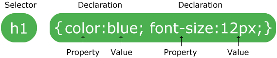
- 选择器指向您要设置样式的HTML元素。
- 声明块包含一个或多个用分号分隔的声明。
- 每个声明都包含一个CSS属性名称和一个值,以冒号分隔。
- CSS声明始终以分号结尾,并且声明块用花括号括起来。
在以下的示例中,所有
<p>元素都将居中对齐,并带有红色文本颜色:p { color: red; text-align: center; }🌰说明:
-
p是CSS中的选择器(它指向要设置样式的HTML元素:<p>)。 -
color是一个属性,并且red是属性值 -
text-align是一个属性,并且center是属性值
3)CSS选择器
-
CSS选择器用于“查找”(或选择)要设置样式的HTML元素。我们可以将CSS选择器分为五类:
- 简单选择器(根据名称,ID,类选择元素)
- 组合器选择器(根据它们之间的特定关系选择元素)
- 伪类选择器(根据特定状态选择元素)
- 伪元素选择器(选择元素的一部分并设置其样式)
- 属性选择器(根据属性或属性值选择元素)
此节将解释最基本的CSS选择器。
-
元素选择器根据元素名称选择HTML元素:
p {
  text-align: center;
  color: red;
}
页面上的所有
<p>元素都将居中对齐,并带有红色文本颜色。 -
id选择器使用HTML元素的id属性来选择特定元素。元素的ID在页面中是唯一的,因此ID选择器用于选择一个唯一的元素!要选择具有特定ID的元素,请写一个井号(#),后跟该元素的ID。
以下CSS规则将应用于id =“ para1”的HTML元素:
#para1 {
  text-align: center;
  color: red;
}
注意📌: ID名称不能以数字开头!
-
类选择器选择具有特定类属性的HTML元素。要选择具有特定类的元素,请写一个句点(.)字符,后跟类名。
在此示例中,所有带有class =“ center”的HTML元素将为红色且居中对齐:
.center {
  text-align: center;
  color: red;
}
还可以指定仅特定的HTML元素应受类影响。
在此示例中,只有具有class =“ center”的
<p>元素将居中对齐:p.center { text-align: center; color: red; }HTML元素也可以引用多个类。
在此示例中,
<p>元素将根据class =“ center”和class =“ large”进行样式设置:<p class="center large">This paragraph refers to two classes.</p>注意📌: 类名不能以数字开头!
-
通用选择器(*)选择页面上的所有HTML元素。下面的CSS规则将影响页面上的每个HTML元素:
* { text-align: center; color: blue; } -
分组选择器选择所有具有相同样式定义的HTML元素。查看以下CSS代码(h1,h2和p元素具有相同的样式定义):
h1 {
  text-align: center;
  color: red;
}

h2 {
  text-align: center;
  color: red;
}

p {
  text-align: center;
  color: red;
}
最好对选择器进行分组,以最大程度地减少代码。
要对选择器进行分组,请用逗号分隔每个选择器。
注意📌:HTML元素引用多个类,用空格隔开,这里分组选择器用逗号
h1, h2, p { text-align: center; color: red; } -
所有CSS简单选择器列表:
Selector Example Example description .class .intro Selects all elements with class=”intro” #id #firstname Selects the element with id=”firstname” * * Selects all elements element p Selects all <p>elementselement,element,.. div, p Selects all <div>elements and all<p>elements
4)如何添加CSS
-
当浏览器阅读样式表时,它将根据样式表中的信息来格式化HTML文档。
-
有三种插入样式表的方法:
- 外部CSS
- 内部CSS
- 内联CSS
-
外部CSS:使用外部样式表,您只需更改一个文件即可更改整个网站的外观!每个HTML页面的头部必须在
<link>元素内包含对外部样式表文件的引用。<!DOCTYPE html> <html> <head> <link rel="stylesheet" type="text/css" href="mystyle.css"> </head> <body> <h1>This is a heading</h1> <p>This is a paragraph.</p> </body> </html>外部样式表可以在任何文本编辑器中编写,并且必须以.css扩展名保存。外部.css文件不应包含任何HTML标记。
以下是“ mystyle.css”文件:
body { background-color: lightblue; } h1 { color: navy; margin-left: 20px; }注意📌:请勿在属性值和单位之间添加空格(例如
margin-left: 20 px;)。正确的方法是:margin-left: 20px; -
内部CSS:如果一个HTML页面具有唯一样式,则可以使用内部样式表。内部样式是在HTML页面的
<head>部分内的<style>元素内定义的:<!DOCTYPE html> <html> <head> <style> body { background-color: linen; } h1 { color: maroon; margin-left: 40px; } </style> </head> <body> <h1>This is a heading</h1> <p>This is a paragraph.</p> </body> </html> -
内联CSS:内联样式可用于为单个元素应用唯一样式。要使用内联样式,请将style属性添加到相关元素,样式属性可以包含任何CSS属性。
<!DOCTYPE html> <html> <body> <h1 style="color:blue;text-align:center;">This is a heading</h1> <p style="color:red;">This is a paragraph.</p> </body> </html>提示📌:内联样式失去了样式表的许多优点(通过将内容与表示混合在一起),谨慎使用此方法。
-
如果在不同的样式表中为同一选择器(元素)定义了一些属性,则将使用最后读取的那个样式表中的值。
假定外部样式表的
<h1>元素具有以下样式:h1 { color: navy; }然后,假定内部样式表的
<h1>元素也具有以下样式:h1 { color: orange; }如果内部样式是在链接到外部样式表的链接之后定义的,则
<h1>元素将为“橙色”:<head> <link rel="stylesheet" type="text/css" href="mystyle.css"> <style> h1 { color: orange; } </style> </head>但是,如果在链接到外部样式表之前定义了内部样式,则
<h1>元素将为“navy”:<head> <style> h1 { color: orange; } </style> <link rel="stylesheet" type="text/css" href="mystyle.css"> </head> -
级联顺序:页面中的所有样式将按照以下规则“级联”为新的“虚拟”样式表,其中排名第一的优先级最高:
- 内联样式(在HTML元素内)
- 外部和内部样式表(在头部)
- 浏览器默认
因此,内联样式具有最高优先级,并将覆盖外部和内部样式以及浏览器默认设置。
5)CSS注释
-
注释用于解释代码,以后在您编辑源代码时可能会有所帮助。
-
浏览器将忽略注释。
-
CSS注释以
/*和开头*/:/* This is a single-line comment */ p { color: red; }您可以在代码中的任何位置添加注释:
p {
  color: red;  /* Set text color to red */
}
注释也可以跨越多行:
/* This is
a multi-line
comment */

p {
  color: red;
}
6)CSS颜色
-
使用预定义的颜色名称或RGB,HEX,HSL,RGBA,HSLA值指定颜色。
-
在CSS中,可以通过使用颜色名称来指定颜色。
🔗:CSS / HTML支持140种标准颜色名称。
-
您可以设置HTML元素的背景色:
Hello World
Lorem ipsum...
<h1 style="background-color:DodgerBlue;">Hello World</h1> <p style="background-color:Tomato;">Lorem ipsum...</p> -
您可以设置文本的颜色:
Hello World
Lorem ipsum...
Ut wisi enim...
<h1 style="color:Tomato;">Hello World</h1> <p style="color:DodgerBlue;">Lorem ipsum...</p> <p style="color:MediumSeaGreen;">Ut wisi enim...</p> -
您可以设置边框的颜色:
Hello World
Hello World
Hello World
<h1 style="border:2px solid Tomato;">Hello World</h1> <h1 style="border:2px solid DodgerBlue;">Hello World</h1> <h1 style="border:2px solid Violet;">Hello World</h1> -
在CSS中,还可以使用RGB值,HEX值,HSL值,RGBA值和HSLA值来指定颜色:与颜色名称“西红柿”相同:
<h1 style="background-color:rgb(255, 99, 71);">...</h1>
<h1 style="background-color:#ff6347;">...</h1>
<h1 style="background-color:hsl(9, 100%, 64%);">...</h1>

<h1 style="background-color:rgba(255, 99, 71, 0.5);">...</h1>
<h1 style="background-color:hsla(9, 100%, 64%, 0.5);">...</h1>
7)CSS背景 background
-
CSS背景色:
background-color属性指定元素的背景色。body { background-color: lightblue; }对于CSS,颜色通常是通过以下方式指定的:
- 有效的颜色名称:如“红色”
- 十六进制值:例如“#ff0000”
- RGB值:例如“ rgb(255,0,0)”
🔗查看CSS颜色值获取颜色值的完整列表。
-
CSS背景图片:
background-image属性指定要用作元素背景的图像,默认情况下,将重复图像,使其覆盖整个元素。body { background-image: url("paper.gif"); }注意📌:使用背景图像时,请使用不会干扰文本的图像。
-
CSS背景重复:默认情况下,
background-image属性在水平和垂直方向上重复图像。一些图像应仅在水平或垂直方向上重复,否则它们看起来会很奇怪,如下仅为水平重复:body { background-image: url("gradient_bg.png"); background-repeat: repeat-x; }提示📌:要垂直重复图像,请设置
background-repeat: repeat-y;background-repeat属性指定仅显示背景图像一次:body { background-image: url("img_tree.png"); background-repeat: no-repeat; } -
background-position属性用于指定背景图像的位置。将背景图片放在右上角:
body { background-image: url("img_tree.png"); background-repeat: no-repeat; background-position: right top; } -
background-attachment属性指定背景图像是滚动的还是固定的(不会与页面的其余部分一起滚动):指定背景图像应固定:
body {
  background-image: url("img_tree.png");
  background-repeat: no-repeat;
  background-position: right top;
  background-attachment: fixed;
}
指定背景图像应与页面的其余部分一起滚动:
body { background-image: url("img_tree.png"); background-repeat: no-repeat; background-position: right top; background-attachment: scroll; } -
为了缩短代码,也可以在一个属性中指定所有背景属性,这称为速记属性。背景的简写属性是
background。使用shorthand属性在一个声明中设置所有背景属性:
body {
  background: #ffffff url("img_tree.png") no-repeat scroll right top;
}
使用简写属性时,属性值的顺序为:
background-colorbackground-imagebackground-repeatbackground-attachmentbackground-position
缺失其中某些属性值是没有关系的。
-
所有CSS背景属性列表:
Property Description background Sets all the background properties in one declaration background-attachment Sets whether a background image is fixed or scrolls with the rest of the page background-clip Specifies the painting area of the background background-color Sets the background color of an element background-image Sets the background image for an element background-origin Specifies where the background image(s) is/are positioned background-position Sets the starting position of a background image background-repeat Sets how a background image will be repeated background-size Specifies the size of the background image(s)
8)CSS边框 border
-
CSS
border属性允许您指定元素边框的样式,宽度和颜色。 -
该
border-style属性指定要显示的边框类型。允许设置为以下值:-
dotted-定义虚线边框 -
dashed-定义虚线边框 -
solid-定义实线边框 -
double-定义双边框 -
groove-定义3D沟槽边框。效果取决于边框颜色值 -
ridge-定义3D棱形边框。效果取决于边框颜色值 -
inset-定义3D嵌入边框。效果取决于边框颜色值 -
outset-定义3D起始边框。效果取决于边框颜色值 -
none-没有边界 -
hidden-定义一个隐藏的边框
该
border-style属性可以具有一到四个值(用于顶部边框,右侧边框,底部边框和左侧边框)。p.dotted {border-style: dotted;} p.dashed {border-style: dashed;} p.solid {border-style: solid;} p.double {border-style: double;} p.groove {border-style: groove;} p.ridge {border-style: ridge;} p.inset {border-style: inset;} p.outset {border-style: outset;} p.none {border-style: none;} p.hidden {border-style: hidden;} p.mix {border-style: dotted dashed solid double;}This property specifies what kind of border to display:
A dotted border.
A dashed border.
A solid border.
A double border.
A groove border.
A ridge border.
An inset border.
An outset border.
No border.
A hidden border.
A mixed border.
注意📌:除非
border-style设置了其他CSS边框属性,否则以下描述的任何属性都不会有任何效果 ! -
-
border-width属性指定四个边框的宽度。可以将宽度设置为特定大小(以px,pt,cm,em等为单位),也可以使用以下三个预定义值之一:thin, medium, 或thick。p.one { border-style: solid; border-width: 5px; } p.two { border-style: solid; border-width: medium; } p.three { border-style: dotted; border-width: 2px; } p.four { border-style: dotted; border-width: thick; }This property specifies the width of the four borders:
Some text.
Some text.
Some text.
Some text.
Some text.
Some text.
注意📌:
border-width属性单独使用是无效的,必须要先设置border-style属性后才有效。
border-width 属性可以具有一到四个值(用于顶部边框,右侧边框,底部边框和左侧边框):
  p.one {
    border-style: solid;
    border-width: 5px 20px; /* 5px top and bottom, 20px on the sides */
  }

  p.two {
    border-style: solid;
    border-width: 20px 5px; /* 20px top and bottom, 5px on the sides */
  }

  p.three {
    border-style: solid;
    border-width: 25px 10px 4px 35px; /* 25px top, 10px right, 4px bottom and 35px left */
  }
-
border-color属性用于设置四个边框的颜色。可以通过以下方式设置颜色:
- 名称-指定颜色名称,例如“红色”
- 十六进制-指定十六进制值,例如“#ff0000”
- RGB-指定RGB值,例如“ rgb(255,0,0)”
- HSL-指定HSL值,例如“ hsl(0,100%,50%)”
- 透明
注意📌:如果
border-color未设置,它将继承元素的颜色。p.one { border-style: solid; border-color: red; } p.two { border-style: solid; border-color: green; } p.three { border-style: dotted; border-color: blue; }This property specifies the color of the four borders:
A solid red border
A solid green border
A dotted blue border
border-color属性可以具有一到四个值(用于顶部边框,右侧边框,底部边框和左侧边框)。
  p.one {
    border-style: solid;
    border-color: red green blue yellow; /* red top, green right, blue bottom and yellow left */
  }
边框的颜色也可以使用十六进制值(HEX)指定:
  p.one {
    border-style: solid;
    border-color: #ff0000; /* red */
  }
或使用RGB值:
  p.one {
    border-style: solid;
    border-color: rgb(255, 0, 0); /* red */
  }
还可以使用HSL值:
  p.one {
    border-style: solid;
    border-color: hsl(0, 100%, 50%); /* red */
  }
-
在CSS中,还有一些属性可用于指定每个边框(顶部,右侧,底部和左侧):
p {
  border-top-style: dotted;
  border-right-style: solid;
  border-bottom-style: dotted;
  border-left-style: solid;
}
上面的示例给出的结果与此相同:
p {
  border-style: dotted solid;
}
如果该
border-style属性具有四个值:- 边框样式:点线双点划线;
- 顶部边框是虚线
- 右边框是实心的
- 底部边框是双
- 左边框是虚线
如果
border-style属性具有三个值:- 边框样式:虚线实心双;
- 顶部边框是虚线
- 左右边界是固定的
- 底部边框是双
如果该
border-style属性具有两个值:- 边框样式:点状实心;
- 顶部和底部边框被点缀
- 左右边界是固定的
如果
border-style属性具有一个值:- 边框样式:点缀;
- 所有四个边框都点缀
/* Four values */
p {
  border-style: dotted solid double dashed;
}

/* Three values */
p {
  border-style: dotted solid double;
}

/* Two values */
p {
  border-style: dotted solid;
}

/* One value */
p {
  border-style: dotted;
}
📌:
border-style在上面的示例中使用了该属性。但是,它也可用于border-width和border-color。 - 边框样式:点线双点划线;
-
就像您在上一页中看到的那样,处理边框时要考虑许多属性。为了缩短代码,也可以在一个属性中指定所有单个边框属性。
该
border属性是以下各个边框属性的简写属性:border-width-
border-style(必须) border-color
p {
  border: 5px solid red;
}
您还可以只为一侧指定所有单个边框属性:
左边框:
p {
  border-left: 6px solid red;
  background-color: lightgrey;
}
底边框:
p { border-bottom: 6px solid red; background-color: lightgrey; } -
border-radius属性用于向元素添加圆角边框:p { border: 2px solid red; border-radius: 5px; } -
更多例子:
一个声明中的所有顶部边框属性 此示例演示了一种速记属性,用于在一个声明中设置顶部边框的所有属性。
设置底部边框的样式 本示例演示如何设置底部边框的样式。
设置左边框的宽度 此示例演示如何设置左边框的宽度。
设置四个边框的颜色 本示例演示如何设置四个边框的颜色。它可以具有一种到四种颜色。
设置右边框的颜色 本示例演示如何设置右边框的颜色。
-
所有CSS边框属性:
Property Description border Sets all the border properties in one declaration border-bottom Sets all the bottom border properties in one declaration border-bottom-color Sets the color of the bottom border border-bottom-style Sets the style of the bottom border border-bottom-width Sets the width of the bottom border border-color Sets the color of the four borders border-left Sets all the left border properties in one declaration border-left-color Sets the color of the left border border-left-style Sets the style of the left border border-left-width Sets the width of the left border border-radius Sets all the four border-*-radius properties for rounded corners border-right Sets all the right border properties in one declaration border-right-color Sets the color of the right border border-right-style Sets the style of the right border border-right-width Sets the width of the right border border-style Sets the style of the four borders border-top Sets all the top border properties in one declaration border-top-color Sets the color of the top border border-top-style Sets the style of the top border border-top-width Sets the width of the top border border-width Sets the width of the four borders
9)CSS边距 margin
-
CSS
margin属性用于创建围绕在元素边框外的空白区域。使用CSS,您可以完全控制边距。有一些属性可以为元素的每一侧(上,右,下和左)设置边距。 -
CSS具有用于指定元素各边距的属性:
margin-topmargin-rightmargin-bottommargin-left
所有边距属性都可以具有以下值:
- 自动:浏览器计算边距
- 长度 :以px,pt,cm等指定边距。
- % :指定包含元素宽度百分比的边距
- 继承:指定应从父元素继承边距
提示❗️:允许使用负值。
p { margin-top: 100px; margin-bottom: 100px; margin-right: 150px; margin-left: 80px; } -
为了缩短代码,可以在一个属性中指定所有边距属性。
该
margin属性是以下各个边距属性的简写属性:margin-topmargin-rightmargin-bottommargin-left
如果该
margin属性具有四个值:-
margin:25px 50px 75px 100px;(顺时针)- 上边距为25px
- 右边距为50px
- 底边距是75px
- 左边距为100px
- 如果
margin属性具有三个值:-
margin:25px 50px 75px;- 上边距为25px
- 左右边距为50px
- 底边距是75px
-
- 如果该
margin属性具有两个值:- margin:25px 50px;
- 顶部和底部边距均为25px
- 左右边距为50px
- margin:25px 50px;
- 如果
margin属性具有一个值:- margin:25px;
- 所有四个边距均为25px
- margin:25px;
-
auto值:可以将margin属性设置为
auto使元素在其容器中水平居中。然后,元素将占用指定的宽度,剩余空间将在左右边界之间平均分配。div { width: 300px; margin: auto; border: 1px solid red; } -
继承值:此示例使
<p class =“ ex1”>元素的左边缘继承自父元素(<div>):div { border: 1px solid red; margin-left: 100px; } p.ex1 { margin-left: inherit; } -
元素的顶部和底部边距有时会折叠成一个等于两个边距中最大边距的单个边距。这不会发生在左边距和右边距!只有顶部和底部的边距!
h1 {
  margin: 0 0 50px 0;
}

h2 {
  margin: 20px 0 0 0;
}
在这个例子中,h1底边距50px和h2底边距20px,h1和h2的垂直边距应该为70px,然而由于边距折叠,实际的边距变成了50px。
-
所有margin的属性汇总:
Property Description margin A shorthand property for setting the margin properties in one declaration margin-bottom Sets the bottom margin of an element margin-left Sets the left margin of an element margin-right Sets the right margin of an element margin-top Sets the top margin of an element
10)CSS填充 padding
-
CSS
padding属性用于在任何定义的边界内在元素内容周围生成空间。使用CSS,您可以完全控制填充。有一些属性可以为元素的每一侧(顶部,右侧,底部和左侧)设置填充。 -
CSS具有用于为元素的每一侧指定填充的属性:
padding-toppadding-rightpadding-bottompadding-left
所有填充属性都可以具有以下值:
- 长度 :以px,pt,cm等指定填充。
- % :指定包含元素宽度百分比的填充
- 继承:指定填充应从父元素继承
注意❗️:不允许使用负值。
div { padding-top: 50px; padding-right: 30px; padding-bottom: 50px; padding-left: 80px; } -
padding属性是以下各个填充属性的简写属性:padding-toppadding-rightpadding-bottompadding-left
因此,这是它的工作方式:
如果该
padding属性具有四个值:- padding:25px 50px 75px 100px;
- 顶部填充为25px
- 右填充为50px
- 底部填充为75px
- 左填充为100px
如果
padding属性具有三个值:- padding:25px 50px 75px;
- 顶部填充为25px
- 左右填充为50px
- 底部填充为75px
如果该
padding属性具有两个值:- padding:25px 50px;
- 顶部和底部填充为25px
- 左右填充为50px
如果
padding属性具有一个值:- padding:25px;
- 所有四个填充都是25px
-
CSS
width属性指定元素内容区域的宽度。内容区域是元素(框模型)的填充padding,边框border和边距margin内的部分。因此,如果元素具有指定的宽度,则添加到该元素的填充将添加到元素的总宽度中。这通常是不希望的结果。在这里,
<div>元素的宽度为300px。但是,<div>元素的实际宽度将为350px(300px +左填充25px +右填充25px):div { width: 300px; padding: 25px; }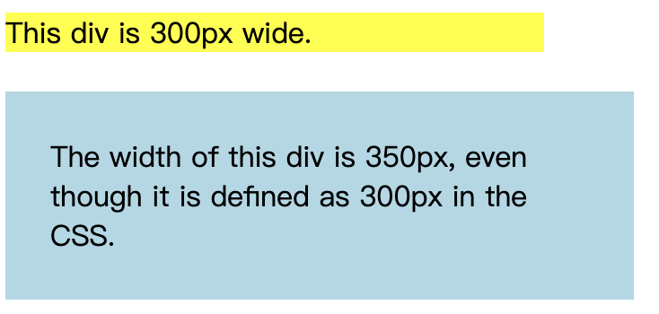
若要将宽度保持在300px,无论填充量如何,都可以使用
box-sizing属性。这将导致元素保持其宽度。如果增加填充,则可用的内容空间将减少。div { width: 300px; padding: 25px; box-sizing: border-box; }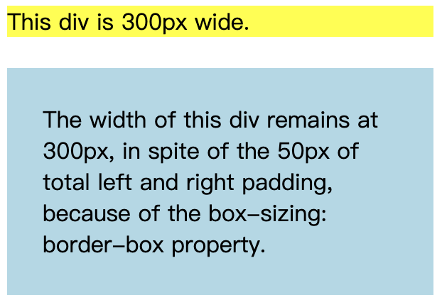
-
更多例子:
设置左填充 本示例演示如何设置
<p>元素的左填充。设置正确的填充 本示例演示如何设置
<p>元素的正确的填充。设置顶部填充 本示例演示如何设置
<p>元素的顶部填充。设置底部填充 本示例演示如何设置
<p>元素的底部填充。 -
所有CSS padding属性:
Property Description padding A shorthand property for setting all the padding properties in one declaration padding-bottom Sets the bottom padding of an element padding-left Sets the left padding of an element padding-right Sets the right padding of an element padding-top Sets the top padding of an element
11)CSS高度和宽度 height&width
-
height和width特性被用来设置一个元素的高度和宽度。height和width属性不包括padding填充,border边框或margin边距。它设置元素的padding填充,border边框或margin边距内部区域的高度/宽度。 -
height和width属性可能具有以下值:-
auto:这是默认设置。浏览器计算高度和宽度 -
length:以px,cm等定义高度/宽度。 -
%:定义包含块的百分比的高度/宽度 -
initial:将高度/宽度设置为其默认值 -
inherit:高度/宽度将从其父值继承
-
-
设置
<div>元素的高度和宽度:div { height: 200px; width: 50%; background-color: powderblue; } -
注意📌:请记住,
height和width属性不包括填充padding,边框border或边距margin!它们设置元素的内边距padding,边框border和边距margin内区域的高度/宽度! -
max-width属性用于设置元素的最大宽度。max-width可以设置为长度值,像素,厘米等,或包含块的百分比(%),或设置为none(这是缺省值,意味着没有最大宽度)。当浏览器窗口比元件(500px)的宽度小时,<div>上会出现问题。浏览器会将水平滚动条添加到页面。在这种情况下,使用max-width代替水平滚动条将改善浏览器对小窗口的处理。
注意📌:max-width属性的值覆盖width。
-
更多例子:
设置元素的高度和宽度 此示例演示如何设置不同元素的高度和宽度。
使用百分比 设置图像的高度和宽度此示例演示如何使用百分比值设置图像的高度和宽度。
-
所有CSS尺寸属性:
Property Description height Sets the height of an element max-height Sets the maximum height of an element max-width Sets the maximum width of an element min-height Sets the minimum height of an element min-width Sets the minimum width of an element width Sets the width of an element
12)CSS盒子模型 box model
-
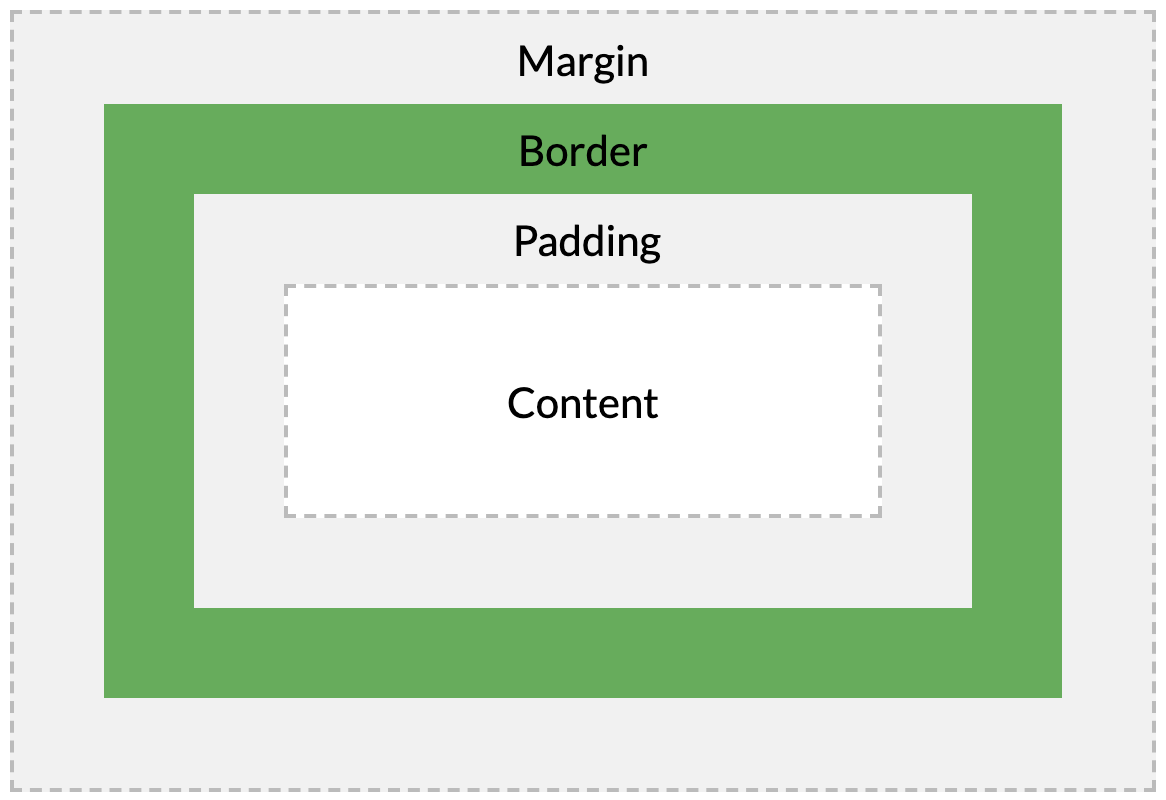
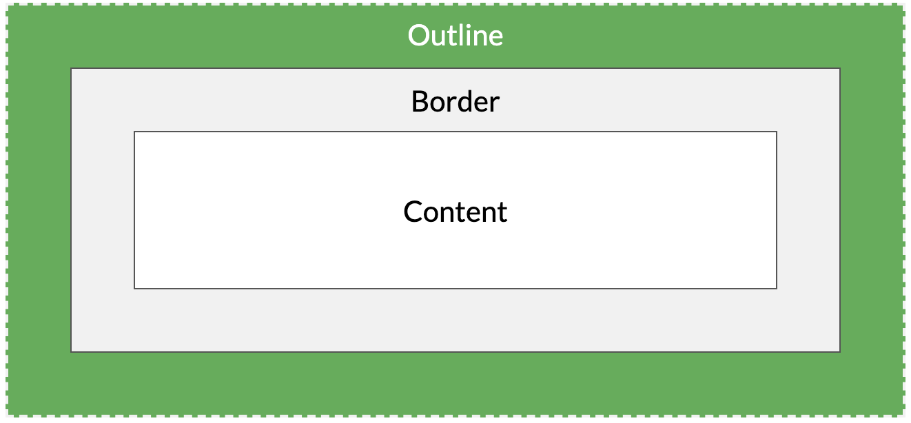
所有HTML元素都可以视为盒子。在CSS中,谈论设计和布局时使用术语“盒子模型”。CSS框盒模型本质上是一个包含每个HTML元素的框。它包括:页边距,边框,填充和实际内容。下图说明了盒子模型:
不同部分的说明:
- 内容content :框的内容,其中显示文本和图像
- 填充padding :清除内容周围的区域。填充是透明的
- 边框border :围绕边框和内容的边框
- 边距margin: 清除边界外的区域。边距是透明的
盒子模型允许我们在元素周围添加边框,并定义元素之间的空间。
div { width: 300px; border: 15px solid green; padding: 50px; margin: 20px; } -
为了在所有浏览器中正确设置元素的宽度和高度,您需要了解框模型如何工作。
重要提示❗️:使用CSS设置元素的width和height属性时,只需设置内容区域的width和height 。要计算元素的完整大小,还必须添加填充,边框和边距。
div {
  width: 320px;
  padding: 10px;
  border: 5px solid gray;
  margin: 0;
}
此
<div>元素的总宽度为350px=320px(宽度)+10x2px (左+右填充)+5x2 px(左+右边框)+0px(左+右空白) -
元素的总宽度应如下计算:
元素总宽度=宽度+左填充+右填充+左边框+右边框+左空白+右空白
元素的总高度应如下计算:
元素总高度=高度+顶部填充+底部填充+顶部边框+底部边框+顶部边距+底部边距
13)CSS轮廓 outline
-
轮廓线是在元素周围绘制的一条线,超出边框,以使元素“突出”。
CSS具有以下轮廓outline属性:
outline-styleoutline-coloroutline-widthoutline-offsetoutline
注意📌:轮廓与边框不同!与边框不同,轮廓绘制在元素边框之外,并且可能与其他内容重叠。同样,轮廓也不是元素大小的一部分,元素的总宽度和高度不受轮廓线宽度的影响。
-
outline-style属性指定轮廓的样式,并且可以具有以下值之一:-
dotted-定义虚线轮廓 -
dashed-定义虚线轮廓 -
solid-定义了坚实的轮廓 -
double-定义双重轮廓 -
groove-定义3D凹槽轮廓 -
ridge-定义3D脊形轮廓 -
inset-定义3D插入轮廓 -
outset-定义3D起始轮廓 -
none-没有轮廓 -
hidden-定义一个隐藏的轮廓
A dotted outline
A dashed outline
A solid outline
A double outline
A groove outline. The effect depends on the outline-color value.
A ridge outline. The effect depends on the outline-color value.
An inset outline. The effect depends on the outline-color value.
An outset outline. The effect depends on the outline-color value.
注意:除非设置了
outline-style属性,否则其他所有outline属性都不会起作用 ! -
-
outline-color属性用于设置轮廓的颜色。可以通过以下方式设置颜色:
- 名称:指定颜色名称,例如“红色”
- RGB:指定RGB值,例如“ rgb(255,0,0)”
- 十六进制:指定十六进制值,例如“#ff0000”
- 反转:执行颜色反转(确保轮廓可见,而不管颜色背景如何)
以下示例显示了一些具有不同颜色的不同轮廓。还要注意,这些元素在轮廓内还具有黑色细边框:
A solid red outline.
A double green outline.
An outset yellow outline.
p.ex1 {
  border: 1px solid black;
  outline-style: solid;
  outline-color: red;
}

p.ex2 {
  border: 1px solid black;
  outline-style: double;
  outline-color: green;
}

p.ex3 {
  border: 1px solid black;
  outline-style: outset;
  outline-color: yellow;
}
以下示例使用outline-color: invert进行颜色反转。这样可以确保无论颜色背景如何,轮廓都是可见的:
A solid invert outline.
p.ex1 {
    border: 1px solid yellow;
    outline-style: solid;
    outline-color: invert;
  }
-
该
outline-width属性指定轮廓的宽度,并且可以具有以下值之一:- 细thin(通常为1px)
- 中medium(通常为3px)
- 厚thick(通常为5px)
- 特定尺寸(以px,pt,cm,em等为单位)
p.ex1 { border: 1px solid black; outline-style: solid; outline-color: red; outline-width: thin; } p.ex2 { border: 1px solid black; outline-style: solid; outline-color: red; outline-width: medium; } p.ex3 { border: 1px solid black; outline-style: solid; outline-color: red; outline-width: thick; } p.ex4 { border: 1px solid black; outline-style: solid; outline-color: red; outline-width: 4px; } -
该
outline属性是用于设置以下各个大纲属性的简写属性:outline-width-
outline-style(必须) outline-color
该
outline属性从上面的列表中指定为一个,两个或三个值。值的顺序无关紧要。p.ex1 {outline: dashed;} p.ex2 {outline: dotted red;} p.ex3 {outline: 5px solid yellow;} p.ex4 {outline: thick ridge pink;} -
outline-offset属性在轮廓和元素的边缘/边框border之间添加空间。元素及其轮廓之间的空间是透明的。下面的示例指定边框边缘外15px的轮廓:
This paragraph has an outline 15px outside the border edge.
p { margin: 30px; border: 1px solid black; outline: 1px solid red; outline-offset: 15px; } -
所有css大纲属性:
Property Description outline A shorthand property for setting outline-width, outline-style, and outline-color in one declaration outline-color Sets the color of an outline outline-offset Specifies the space between an outline and the edge or border of an element outline-style Sets the style of an outline outline-width Sets the width of an outline
14)CSS文字 text
-
color属性用于设置文本的颜色。颜色由以下指定:- 颜色名称:如“红色”
- 十六进制值:例如“#ff0000”
- RGB值:例如“ rgb(255,0,0)”
🔗:查看CSS颜色值以获取颜色值的完整列表。
body { color: blue; } h1 { color: green; }注意📌:对于符合W3C的CSS:如果定义
color属性,则还必须定义background-color。 -
text-align属性用于设置文本的水平对齐方式。文本可以左对齐或右对齐,居中或对齐。
下面的示例显示居中对齐以及左右对齐的文本(如果文本方向是从左到右,则默认为左对齐;如果文本方向是从右到左,则默认为右对齐):
h1 { text-align: center; } h2 { text-align: left; } h3 { text-align: right; } -
当
text-align属性设置为“ justify”时,在两端对齐文本中,文本行的左右两端都放在父元素的内边界上。然后,调整单词和字母间的间隔,使各行的长度恰好相等。您也许已经注意到了,两端对齐文本在打印领域很常见。div { text-align: justify; } -
text-decoration属性用于设置或删除文本装饰,text-decoration: none;通常用于从链接中删除下划线:a { text-decoration: none; }其他
text-decoration值用于装饰文本:h1 { text-decoration: overline; } h2 { text-decoration: line-through; } h3 { text-decoration: underline; }注意📌:建议不要在不是链接的文本下划线,因为这经常会使读者感到困惑。
-
text-transform属性用于在文本中指定大写和小写字母。它可用于将所有内容转换为大写或小写字母,或将每个单词的首字母大写:p.uppercase { text-transform: uppercase; } p.lowercase { text-transform: lowercase; } p.capitalize { text-transform: capitalize; } -
text-indent属性用于指定文本第一行的缩进:p { text-indent: 50px; } -
letter-spacing属性用于指定文本中字符之间的间隔,下面的示例演示如何增加或减少字符之间的间距:h1 { letter-spacing: 3px; } h2 { letter-spacing: -3px; } -
line-height属性用于指定行之间的间隔:p.small { line-height: 0.8; } p.big { line-height: 1.8; } -
direction和unicode-bidi特性可用于改变一个元素的文本方向:p { direction: rtl; unicode-bidi: bidi-override; } -
word-spacing属性用于指定文本中单词之间的间隔。下面的示例演示如何增加或减少单词之间的间距:h1 { word-spacing: 10px; } h2 { word-spacing: -5px; } -
text-shadow属性为文本添加阴影。下面的示例指定水平阴影的位置(3px),垂直阴影的位置(2px)和阴影的颜色(红色):h1 { text-shadow: 3px 2px red; } -
更多例子:
禁用元素内的文本换行 此示例演示如何禁用元素内的文本换行。
图像的垂直对齐方式 本示例演示如何设置文本中图像的垂直对齐方式。
-
所有css text属性:
Property Description color Sets the color of text direction Specifies the text direction/writing direction letter-spacing Increases or decreases the space between characters in a text line-height Sets the line height text-align Specifies the horizontal alignment of text text-decoration Specifies the decoration added to text text-indent Specifies the indentation of the first line in a text-block text-shadow Specifies the shadow effect added to text text-transform Controls the capitalization of text text-overflow Specifies how overflowed content that is not displayed should be signaled to the user unicode-bidi Used together with the direction property to set or return whether the text should be overridden to support multiple languages in the same document vertical-align Sets the vertical alignment of an element white-space Specifies how white-space inside an element is handled word-spacing Increases or decreases the space between words in a text
15)CSS字体 font
-
CSS字体属性定义了字体系列,粗体,大小和文本样式。
-
在CSS中,有两种类型的字体系列名称:
-
泛型族:外观相似的一组字体族(例如“ Serif”或“ Monospace”)
-
字体家族 :特定的字体家族(例如“ Times New Roman”或“ Arial”)
Generic family Font family Description Serif Times New Roman Georgia Serif fonts have small lines at the ends on some characters Sans-serif Arial Verdana “Sans” means without - these fonts do not have the lines at the ends of characters Monospace Courier New Lucida Console All monospace characters have the same width 注意📌:在计算机屏幕上,无衬线字体被认为比衬线字体更易于阅读。
-
-
文本的字体系列是使用
font-family属性设置的。font-family属性应包含多个字体名称作为“后备”系统。如果浏览器不支持第一个字体,它将尝试下一个字体,依此类推。如果没有其他可用字体,请从所需字体开始,然后以通用系列结束,以使浏览器选择通用系列中的相似字体。
注意📌:如果字体系列的名称超过一个单词,则它必须用引号引起来,例如:“ Times New Roman”。
在逗号分隔的列表中指定了多个字体系列:
p { font-family: "Times New Roman", Times, serif; }🔗:对于常用的字体组合,请查看我们的Web安全字体组合。
-
font-style属性主要用于指定斜体文本。此属性具有三个值:
- 正常normal:文本正常显示
- 斜体italic:文字以斜体显示
- 斜线oblique:文字为“倾斜”(斜线与斜体非常相似,但支持较少)
p.normal { font-style: normal; } p.italic { font-style: italic; } p.oblique { font-style: oblique; } -
font-size属性设置文本的大小。在网页设计中,能够管理文本大小很重要。但是,不应使用字体大小调整来使段落看起来像标题,或者标题看起来像段落。始终使用正确的HTML标记,例如
<h1>-<h6>用于标题,而<p>用于段落。字体大小值可以是绝对或相对大小。
绝对尺寸:
- 将文本设置为指定大小
- 不允许用户在所有浏览器中更改文本大小(由于可访问性原因不佳)
- 当已知输出的物理尺寸时,绝对尺寸非常有用
相对尺寸:
- 设置相对于周围元素的大小
- 允许用户在浏览器中更改文本大小
注意📌:如果未指定字体大小,则普通文本(如段落)的默认大小为16px(16px = 1em)。
-
使用像素设置文本大小可让您完全控制文本大小:
h1 { font-size: 40px; } h2 { font-size: 30px; } p { font-size: 14px; }提示📌:如果使用像素,则仍然可以使用缩放工具来调整整个页面的大小。
-
为了允许用户调整文本大小(在浏览器菜单中),许多开发人员使用em而不是像素,W3C建议使用em尺寸单位,1em等于当前字体大小。浏览器中的默认文本大小为16px,因此,默认大小1em为16px。
可以使用公式来计算从像素到em的大小:pixel* / 16 = em
h1 {
  font-size: 2.5em; /* 40px/16=2.5em */
}

h2 {
  font-size: 1.875em; /* 30px/16=1.875em */
}

p {
  font-size: 0.875em; /* 14px/16=0.875em */
}
在上面的示例中,em中的文本大小与上一个示例中的像素大小相同。但是,使用em大小,可以在所有浏览器中调整文本大小。不幸的是,旧版本的IE仍然存在问题,文本需要变大时变得比应该变得大,需要变小时变得比应该变得小。
-
在所有浏览器中均可使用的解决方案是为
<body>元素设置默认的字体大小(以百分比为单位):body { font-size: 100%; } h1 { font-size: 2.5em; } h2 { font-size: 1.875em; } p { font-size: 0.875em; }我们的代码现在可以很好地工作了!它在所有浏览器中显示相同的文本大小,并允许所有浏览器缩放或调整文本大小!
-
font-weight属性指定字体的粗细:p.normal { font-weight: normal; } p.thick { font-weight: bold; } -
文本大小可以用
vw单位设置,即“视口宽度”。这样,文本大小将遵循浏览器窗口的大小。Hello World
视口是浏览器窗口的大小。1vw =视口宽度的1%。如果视口为50厘米宽,则1vw为0.5厘米。
-
font-variant属性指定是否以小写字体显示文本。在小写字体中,所有小写字母都将转换为大写字母。但是,转换后的大写字母的字体大小小于文本中原始大写字母的字体大小。
My name is Hege Refsnes.
My name is Hege Refsnes.
-
更多例子:
一个声明中的所有字体属性 本示例演示如何使用简写属性在一个声明中设置所有字体属性。
-
所有CSS字体属性:
Property Description font Sets all the font properties in one declaration font-family Specifies the font family for text font-size Specifies the font size of text font-style Specifies the font style for text font-variant Specifies whether or not a text should be displayed in a small-caps font font-weight Specifies the weight of a font
16)CSS图标 i
-
向HTML页面添加图标的最简单方法是使用图标库,例如Font Awesome。将指定图标类的名称添加到任何内联HTML元素(如
<i>或<span>)。下面的图标库中的所有图标都是可缩放矢量,可以使用CSS(大小,颜色,阴影等)进行自定义。 -
要使用Font Awesome图标,请访问 fontawesome.com,登录并获取代码添加到
<head>HTML页面的部分中:<script src="https://kit.fontawesome.com/yourcode.js"></script>在我们的Font Awesome 5教程中阅读有关如何开始使用Font Awesome的更多信息 。
注意❗️:无需下载或安装!
<!DOCTYPE html>
<html>
<head>
<script src="https://kit.fontawesome.com/a076d05399.js"></script>
</head>
<body>

<i class="fas fa-cloud"></i>
<i class="fas fa-heart"></i>
<i class="fas fa-car"></i>
<i class="fas fa-file"></i>
<i class="fas fa-bars"></i>

</body>
</html>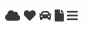
-
要使用Bootstrap图标,请在HTML页面的
<head>部分内添加以下行:<link rel="stylesheet" href="https://maxcdn.bootstrapcdn.com/bootstrap/3.3.7/css/bootstrap.min.css">注意❗️:无需下载或安装!
<!DOCTYPE html>
<html>
<head>
<link rel="stylesheet" href="https://maxcdn.bootstrapcdn.com/bootstrap/3.3.7/css/bootstrap.min.css">
</head>
<body>

<i class="glyphicon glyphicon-cloud"></i>
<i class="glyphicon glyphicon-remove"></i>
<i class="glyphicon glyphicon-user"></i>
<i class="glyphicon glyphicon-envelope"></i>
<i class="glyphicon glyphicon-thumbs-up"></i>

</body>
</html>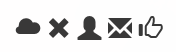
-
要使用Google图标,
<head>请在HTML页面的部分内添加以下行:<link rel="stylesheet" href="https://fonts.googleapis.com/icon?family=Material+Icons">注意❗️:无需下载或安装!
<!DOCTYPE html>
<html>
<head>
<link rel="stylesheet" href="https://fonts.googleapis.com/icon?family=Material+Icons">
</head>
<body>

<i class="material-icons">cloud</i>
<i class="material-icons">favorite</i>
<i class="material-icons">attachment</i>
<i class="material-icons">computer</i>
<i class="material-icons">traffic</i>

</body>
</html>
17)CSS链接 a
-
使用CSS,可以用不同的方式设置链接的样式。
-
链接可以使用任何CSS属性(如设置样式
color,font-family,background,等)。a { color: hotpink; } -
此外,可以根据链接处于何种状态来设置其样式。
四个链接状态为:
-
a:link:正常,未访问的链接 -
a:visited:用户访问过的链接 -
a:hover:用户将鼠标悬停在链接上时的链接 -
a:active:单击后的链接
/* unvisited link */
a:link {
  color: red;
}

/* visited link */
a:visited {
  color: green;
}

/* mouse over link */
a:hover {
  color: hotpink;
}

/* selected link */
a:active {
  color: blue;
}
为多个链接状态设置样式时,有一些顺序规则:
- a:hover必须在a:link和a:visited之后
- a:active必须在a:hover之后
-
-
text-decoration属性主要用于从链接中删除下划线:a:link { text-decoration: none; } a:visited { text-decoration: none; } a:hover { text-decoration: underline; } a:active { text-decoration: underline; } -
background-color属性可用于指定链接的背景色:a:link { background-color: yellow; } a:visited { background-color: cyan; } a:hover { background-color: lightgreen; } a:active { background-color: hotpink; } -
此示例演示了一个更高级的示例,其中我们组合了多个CSS属性以将链接显示为框/按钮。
a:link, a:visited { background-color: #f44336; color: white; padding: 14px 25px; text-align: center; text-decoration: none; display: inline-block; } a:hover, a:active { background-color: red; } -
更多例子:
向超链接添加不同的样式 此示例演示如何向超链接添加其他样式。
高级-创建带边框的链接按钮 如何创建链接框/按钮的另一个示例。
更改光标 cursor属性指定要显示的光标类型。本示例演示了不同类型的游标(对链接有用)。
18)CSS列表 list
-
在HTML中,列表有两种主要类型:
- 无序列表(
<ul>):列表项用项目符号标记 - 有序列表(
<ol>):列表项用数字或字母标记
CSS列表属性使您可以:
- 为有序列表设置不同的列表项标记
- 为无序列表设置不同的列表项标记
- 将图像设置为列表项标记
- 向列表和列表项添加背景色
- 无序列表(
-
list-style-type属性指定列表项标记的类型。以下示例显示了一些可用的列表项标记:ul.a { list-style-type: circle; } ul.b { list-style-type: square; } ol.c { list-style-type: upper-roman; } ol.d { list-style-type: lower-alpha; }注意:有些值用于无序列表,有些值用于有序列表。
-
list-style-image属性将图像指定为列表项标记:ul { list-style-image: url('sqpurple.gif'); } -
list-style-position属性指定列表项标记的位置(项目符号点)。list-style-position: outside;”表示项目符号点将不在列表项中。列表项每行的开头将垂直对齐,这是默认值:
list-style-position: inside;表示项目符号点将在列表项内。由于它是列表项的一部分,因此将成为文本的一部分,并在开始处推送文本:
ul.a { list-style-position: outside; } ul.b { list-style-position: inside; } -
list-style-type:none属性还可以用于删除标记/项目符号。请注意,该列表还具有默认边距和填充。要删除此内容,请在<ul>或<ol>中添加margin:0和padding:0:ul { list-style-type: none; margin: 0; padding: 0; } -
list-style属性是简写属性,它用于在一个声明中设置所有列表属性:ul { list-style: square inside url("sqpurple.gif"); }使用简写属性时,属性值的顺序为:
-
list-style-type(如果指定了列表样式图像,则由于某种原因而无法显示图像时,将显示此属性的值) -
list-style-position(指定列表项标记应显示在内容流的内部还是外部) -
list-style-image(将图像指定为列表项标记)
如果缺少上述属性值之一,则将插入缺少属性的默认值(如果有)。
-
-
我们还可以使用颜色设置列表样式,使它们看起来更有趣。
添加到
<ol>或<ul>标记的所有内容都会影响整个列表,而添加到<li>标记的属性将影响各个列表项:ol { background: #ff9999; padding: 20px; } ul { background: #3399ff; padding: 20px; } ol li { background: #ffe5e5; padding: 5px; margin-left: 35px; } ul li { background: #cce5ff; margin: 5px; }
-
更多例子:
带有红色左边框的自定义列表 此示例演示如何创建带有红色左边框的列表。
全角边框列表 本示例演示如何创建没有项目符号的边框列表。
列表的所有不同列表项标记 本示例演示CSS中所有不同的列表项标记。
-
所有CSS清单属性:
Property Description list-style Sets all the properties for a list in one declaration list-style-image Specifies an image as the list-item marker list-style-position Specifies the position of the list-item markers (bullet points) list-style-type Specifies the type of list-item marker
19)CSS表格 table
-
使用CSS可以大大改善HTML表格的外观
Company Contact Country Alfreds Futterkiste Maria Anders Germany Berglunds snabbköp Christina Berglund Sweden Centro comercial Moctezuma Francisco Chang Mexico Ernst Handel Roland Mendel Austria Island Trading Helen Bennett UK Königlich Essen Philip Cramer Germany Laughing Bacchus Winecellars Yoshi Tannamuri Canada Magazzini Alimentari Riuniti Giovanni Rovelli Italy North/South Simon Crowther UK Paris spécialités Marie Bertrand France -
要在CSS中指定表格边框,请使用
border属性。下面的示例为
<table>,<th>和<td>元素指定黑色边框:#test1, #test1 th, #test1 td { border: 1px solid black; }Firstname Lastname Peter Griffin Lois Griffin 注意❗️:上面示例中的表具有双边框。这是因为table和
<th>和<td>元素都有单独的边框。 -
border-collapse属性设置是否将表格边框折叠为单个边框:table { border-collapse: collapse; } table, th, td { border: 1px solid black; }Firstname Lastname Peter Griffin Lois Griffin 如果只想在表格周围添加边框,则只需
border为<table>指定属性:table { border: 1px solid black; }Firstname Lastname Peter Griffin Lois Griffin -
表格的宽度和高度有
width和height属性定义,下面示例中将表格的宽度设置为100%,将<th>元素的高度设置为50px:table { width: 100%; } th { height: 50px; } -
text-align属性在<th>或<td>中设置内容的水平对齐方式(如左,右或中心)。默认情况下,<th>元素的内容居中对齐,而<td>元素的内容左对齐。下面的示例使
<th>元素中的文本左对齐:th { text-align: left; } -
vertical-align属性设置<th>或<td>中内容的垂直对齐方式(例如顶部,底部或中间)。默认情况下,表中内容的垂直对齐方式是居中的(对于<th>和<td>元素)。下面的示例将<td>元素的垂直文本对齐方式设置为底部:td { height: 50px; vertical-align: bottom; } -
要控制边框和表格内容之间的间隔,请在
<td>和<th>元素上使用padding的属性:th, td { padding: 15px; text-align: left; } -
横向分割线:
Firstname Lastname Savings Peter Griffin $100 Lois Griffin $150 Joe Swanson $300 Cleveland Brown $250 将
border-bottom属性添加到水平分隔线的<th>和<td>:th, td { border-bottom: 1px solid #ddd; } -
使用
:hover选择器在<tr>上的突出显示鼠标悬停时的表行:tr:hover {background-color: #f5f5f5;}First Name Last Name Points Peter Griffin $100 Lois Griffin $150 Joe Swanson $300 Cleveland Brown $250 -
条纹表格:对于斑马纹的表,请使用
nth-child()选择器并添加一个background-color向所有偶数(或奇数)表行 :tr:nth-child(even) {background-color: #f2f2f2;}First Name Last Name Points Peter Griffin $100 Lois Griffin $150 Joe Swanson $300 Cleveland Brown $250 -
表格颜色:下面的示例指定
<th>元素的背景颜色和文本颜色:th { background-color: #4CAF50; color: white; } -
响应表:如果屏幕太小而无法显示全部内容,则响应表将显示水平滚动条
First Name Last Name Points Points Points Points Points Points Points Points Points Points Jill Smith 50 50 50 50 50 50 50 50 50 50 Eve Jackson 94 94 94 94 94 94 94 94 94 94 Adam Johnson 67 67 67 67 67 67 67 67 67 67 添加一个带有
overflow-x:auto属性的容器元素(例如<div>)在<table>元素周围,以使其具有响应性:<div style="overflow-x:auto;"> <table> ... table content ... </table> </div>注意❗️:在OS X Lion(在Mac上为Mac OS)中,滚动条默认情况下是隐藏的,并且仅在使用时显示(即使设置了“ overflow:scroll”)。
-
更多例子:
制作花式表 此示例演示如何创建花式表。
设置表格标题的位置 本示例演示如何放置表格标题。
-
所有CSS table属性:
Property Description border Sets all the border properties in one declaration border-collapse Specifies whether or not table borders should be collapsed border-spacing Specifies the distance between the borders of adjacent cells caption-side Specifies the placement of a table caption empty-cells Specifies whether or not to display borders and background on empty cells in a table table-layout Sets the layout algorithm to be used for a table
20)CSS布局 display
-
display属性是用于控制布局的最重要的CSS属性。 -
display属性指定是否/如何显示元素。每个HTML元素都有默认的显示值,具体取决于元素的类型。大多数元素的默认显示值为block或inline。 - 块级元素block总是从新行开始,并占据可用的全部宽度(尽可能向左和向右伸展)。
<div>-
<h1>-<h6> <p><form><header><footer><section>
-
内联元素inline不会在新行上开始,而仅占用必要的宽度。
<span><a><img>
-
display: none;通常与JavaScript一起使用以隐藏和显示元素,而不删除和重新创建它们。<script>元件使用display: none;的默认值。 -
如前所述,每个元素都有一个默认的显示值。但是,您可以覆盖它。
将inline元素更改为block元素,反之亦然,对于使页面看起来特定的方式并仍然遵循Web标准可能很有用。
一个常见的示例是为水平菜单制作
<li>内联元素:li { display: inline; }注意📌:设置元素的显示属性仅会更改元素的显示方式,而不会更改元素的种类。因此,一个设置为
display: block;的内联元素不允许在其中包含其他块元素。以下示例将
<span>元素显示为块元素:span { display: block; }以下示例将
<a>元素显示为块元素:a { display: block; } -
隐藏一个元素可以通过设置
display属性为none,元素将被隐藏并且页面呈现为好像元素没在这里。h1.hidden { display: none; }visibility:hidden;也可以隐藏元素。但是,该元素仍将占用与以前相同的空间。元素将被隐藏,但仍会影响布局。h1.hidden { visibility: hidden; } -
更多例子:
显示之间的差异:无;和可见性:隐藏; 此示例演示显示:无;相对可见度:隐藏;
结合使用CSS和JavaScript来显示内容 此示例演示如何使用CSS和JavaScript来显示单击元素。
-
CSS display/visibility属性:
Property Description display Specifies how an element should be displayed visibility Specifies whether or not an element should be visible
21)CSS 宽度和最大宽度 width&max-width
-
如上一章所述;块级元素始终占用可用的全部宽度(尽可能向左和向右伸展)。设置
width块级元素的会阻止其延伸到其容器的边缘。然后,您可以将边距设置为auto,以将元素在其容器中水平居中。元素将占用指定的宽度,剩余空间将在两个边距之间平均分配。注意📌:当浏览器窗口比元素的宽度小时,
<div>会出现问题。这时,浏览器将添加水平滚动条到页面中。max-width在这种情况下将改善浏览器对小窗口的处理。当使站点在小型设备上可用时,这一点很重要。提示🥰:将浏览器窗口的大小调整为小于500px宽,以查看以下两个div之间的区别。
This div element has width: 500px;
22)CSS布局 position
-
position属性指定用于元素的定位方法的类型(静态,相对,固定,绝对或粘性)。 -
position属性指定用于元素的定位方法的类型。staticrelativefixedabsolutesticky
然后使用top,bottom,left和right属性定位元素。但是,除非先设置
position属性,否则这些属性将不起作用。根据位置值不同,它们的工作方式也不同。 -
Static:HTML元素默认情况下处于静态位置,静态定位的元素不受top,bottom,left和right属性的影响。元素的
position: static;定位没有任何特殊方式,它始终根据页面的正常流程定位。This div element has position: static;div.static { position: static; border: 3px solid #73AD21; } -
Relative:元素
position: relative;的位置相对于其正常位置。一个相对放置的元素设置top,right,bottom和left属性将进行调整,这可能导致其偏离正常位置,其他内容将不进行调整以契合元素留下的任何间隙。This div element has position: relative;div.relative { position: relative; left: 30px; border: 3px solid #73AD21; } -
Fixed: 一个设置为
position:fixed;元素相对于视口放置,这意味着即使页面滚动,该元素始终在同一位置。top,right,bottom和left属性用于定位元素。固定元素通常不会在应放置的页面上留出空隙。查看页面右下角的div❗️
div.fixed { position: fixed; bottom: 0; right: 0; width: 300px; border: 3px solid #73AD21; }小肖在学前端🤢 -
Absolute:一个设置为
position: absolute;的元素位置相对于最近的祖先(而不是相对于视口的位置,如fixed)放置。 如果绝对定位的元素没有祖先,它将文档正文视为祖先,并随页面滚动一起移动。注意:一个 “被放置的”元素是位置除
static以外的任何元素。This div element has position: relative;This div element has position: absolute;div.relative { position: relative; width: 400px; height: 200px; border: 3px solid #73AD21; } div.absolute { position: absolute; top: 80px; right: 0; width: 200px; height: 100px; border: 3px solid #73AD21; } -
Sticky:
position: sticky;根据用户的滚动位置来定位元素。粘性元素根据滚动位置在relative和fixed之间切换。它相对定位,直到在视口中遇到给定的偏移位置为止,然后将其“粘贴”在适当的位置(例如position:fixed)。注意📌: Internet Explorer,Edge 15和更早版本不支持粘性定位。Safari需要-webkit-前缀(请参见下面的示例),您还必须在指定的至少一个
top,right,bottom或left为粘稠的定位工作。在此示例中,
top: 0当您到达其滚动位置时,粘性元素将停留在页面()的顶部。div.sticky { position: -webkit-sticky; /* Safari */ position: sticky; top: 0; background-color: green; border: 2px solid #4CAF50; }I am sticky!In this example, the sticky element sticks to the top of the page (top: 0), when you reach its scroll position.
Scroll back up to remove the stickyness.
-
放置元素时,它们可以与其他元素重叠,
z-index属性指定一个元素的堆叠顺序(哪个元素应该放置在其他元素的前面或后面)。元素可以具有正(前面)或负(后面)的堆叠顺序:
img { position: absolute; left: 0px; top: 0px; z-index: -1; }具有较高堆叠顺序的元素始终位于具有较低堆叠顺序的元素之前。
注意📌:如果两个定位的元素重叠而未
z-index指定,则HTML代码中位于最后的元素将显示在顶部。 -
在图片中放置文字:🔗如何在图片上放置文字
-
更多例子:
设置元素的形状 本示例演示如何设置元素的形状。元素被裁剪为该形状并显示。
-
所有CSS定位属性:
Property Description bottom Sets the bottom margin edge for a positioned box clip Clips an absolutely positioned element left Sets the left margin edge for a positioned box position Specifies the type of positioning for an element right Sets the right margin edge for a positioned box top Sets the top margin edge for a positioned box z-index Sets the stack order of an element
23)CSS溢出 overflow
-
CSS
overflow属性控制太大的内容无法容纳到区域中的情况。 -
overflow属性指定在元素的内容太大而无法放入指定区域时是剪辑内容还是添加滚动条。overflow属性具有以下值:-
visible:默认。溢出没有被修剪,内容在元素框外渲染 -
hidden:溢出被裁剪,其余内容将不可见 -
scroll:裁剪了溢出,并添加了滚动条以查看其余内容 -
auto:与scroll相似,但仅在必要时添加滚动条
注意📌:
overflow属性仅适用于具有指定高度的块元素。注意📌:在OS X Lion(在Mac上为Mac OS)中,滚动条默认情况下是隐藏的,并且仅在使用时显示(即使设置了“ overflow:scroll”)。
-
-
Visible:默认情况下,溢出为
visible,这意味着它不会被裁剪,而是在元素框外渲染div { width: 200px; height: 50px; background-color: #eee; overflow: visible; }You can use the overflow property when you want to have better control of the layout. The overflow property specifies what happens if content overflows an element's box. -
Hidden:使用
hidden值,溢出被裁剪,其余内容被隐藏div { overflow: hidden; }You can use the overflow property when you want to have better control of the layout. The overflow property specifies what happens if content overflows an element's box. -
Scroll:值设置为
scroll,将裁剪溢出并添加滚动条以在框内滚动。请注意,这将在水平和垂直方向上添加一个滚动条(即使您不需要它)div { overflow: scroll; }You can use the overflow property when you want to have better control of the layout. The overflow property specifies what happens if content overflows an element's box. -
Auto:
auto值类似于scroll,但是仅在必要时添加滚动条:div { overflow: auto; }You can use the overflow property when you want to have better control of the layout. The overflow property specifies what happens if content overflows an element's box. -
overflow-x和overflow-y特性指定是否只是水平或垂直地改变的内容溢出(或两者):-
overflow-x指定如何处理内容的左/右边缘。 -
overflow-y指定如何处理内容的顶部/底部边缘。
div { overflow-x: hidden; /* Hide horizontal scrollbar */ overflow-y: scroll; /* Add vertical scrollbar */ }You can use the overflow property when you want to have better control of the layout. The overflow property specifies what happens if content overflows an element's box. -
-
所有CSS溢出属性
Property Description overflow Specifies what happens if content overflows an element’s box overflow-x Specifies what to do with the left/right edges of the content if it overflows the element’s content area overflow-y Specifies what to do with the top/bottom edges of the content if it overflows the element’s content area
24)CSS 浮动和清除 float&clear
-
CSS
float属性指定元素应如何浮动。CSS
clear属性规定元素的哪一侧不允许其他浮动元素。 -
float属性用于定位和格式化内容,例如,使图像向左浮动到容器中的文本。float属性可以具有以下值之一:- left:元素浮动到其容器的左侧
- right:元素浮动到其容器的右侧
- none:元素不会浮动(将显示在文本中刚出现的位置)。这是默认值
- Inherit:元素继承其父级的float值
在最简单的用法中,
float属性可用于在图像周围包裹文本。 -
下面的示例指定图像应在文本的右侧浮动:
img { float: right; } -
下面的示例指定图像应在文本的左侧浮动:
img { float: left; } -
在以下示例中,图像将显示在文本中刚出现的位置(float: none;)
img { float: none; } -
clear属性指定哪些元素可以在清除的元素旁边浮动以及在哪一侧。clear属性可以具有以下值之一:- None:允许两面都浮动。这是默认值
- Left:左侧不允许有浮动元素
- right:右侧不允许有浮动元素
- both:左侧或右侧均不允许使用浮动元素
- inherit:元素继承其父元素的清除值
使用
clear属性的最常见方法是在元素上使用float属性后。清除浮点数时,应将清除点与浮点数匹配:如果某个元素浮在左侧,则应清除左侧。您的浮动元素将继续浮动,但清除的元素将显示在网页下方。
下面的示例将浮标清除到左侧。表示在(div的)左侧不允许使用浮动元素:
div { clear: left; } -
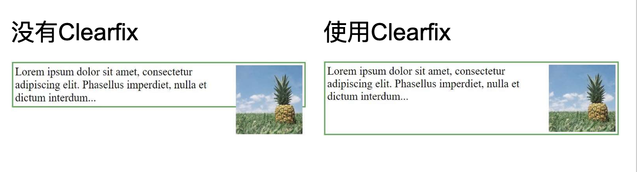
如果一个元素比包含它的元素高,并且它是浮动的,它将“溢出”到其容器之外:
然后,我们可以添加
overflow: auto;到containing(外部的)元素来解决此问题:.clearfix { overflow: auto; }
只要您能够控制边距和填充(否则您可能会看到滚动条),
overflow: autoclearfix就会很好地工作。在新的,现代化的clearfix使用更安全,下面的代码被用于大多数网页:.clearfix::after { content: ""; clear: both; display: table; }在下一章中将了解有关
::after伪元素的更多信息。 -
使用此
float属性,可以轻松并排浮动内容框:* { box-sizing: border-box; } .box { float: left; width: 33.33%; /* three boxes (use 25% for four, and 50% for two, etc) */ padding: 50px; /* if you want space between the images */ }Some text inside the box.
Some text inside the box.
Some text inside the box.
❗️什么是box-sizing?您可以轻松地并排创建三个浮动框。但是,当您添加一些东西来扩大每个框的宽度(例如,填充或边框)时,该框将损坏。该
box-sizing属性允许我们在框的总宽度(和高度)中包括填充和边框,确保填充留在框内并且不会破裂。 -
方框网格还可以用于并排显示图像:
.img-container { float: left; width: 33.33%; /* three containers (use 25% for four, and 50% for two, etc) */ padding: 5px; /* if you want space between the images */ } -
在上一个示例中学习了如何以相等的宽度并排浮动框。但是,创建具有相同高度的浮动框并不容易。快速解决方案是设置一个固定的高度,如下面的示例所示:
.box { height: 500px; }但是,这不是很灵活。如果可以保证这些盒子中始终包含相同的内容,那是可以的。但是很多时候,内容是不一样的。这是CSS3 Flexbox派上用场的地方:因为它可以自动拉伸框使其与最长的框一样长:
Box 1 - This is some text to make sure that the content gets really tall. This is some text to make sure that the content gets really tall.Box 2 - My height will follow Box 1.注意✍🏻:Flexbox的唯一问题是它在Internet Explorer 10或更早版本中不起作用。
-
float与超链接列表一起使用以创建水平菜单。🔗:CSS float -
使用
float属性进行整个Web布局也很常见。.header, .footer { background-color: grey; color: white; padding: 15px; } .column { float: left; padding: 15px; } .clearfix::after { content: ""; clear: both; display: table; } .menu { width: 25%; } .content { width: 75%; } -
更多例子:
带有边框和边距 的图像在段落中向右浮动让图像在段落中向右浮动。在图像上添加边框和边距。
让带有标题的图像向右浮动。
让段落的第一个字母向左浮动并设置字母的样式。
使用float创建带有导航栏,页眉,页脚,左侧内容和主要内容的主页。
-
所有CSS浮动属性:
Property Description box-sizing Defines how the width and height of an element are calculated: should they include padding and borders, or not clear Specifies what elements can float beside the cleared element and on which side float Specifies how an element should float overflow Specifies what happens if content overflows an element’s box overflow-x Specifies what to do with the left/right edges of the content if it overflows the element’s content area overflow-y Specifies what to do with the top/bottom edges of the content if it overflows the element’s content area
25)CSS display: inline-block
-
相比
display: inline,display: inline-block主要区别在于允许在元素上设置宽度和高度。 -
使用时
display: inline-block,将遵守顶部和底部边距/填充,但display: inline不遵守。 -
相比
display: block,display: inline-block主要区别在于该元素后没有添加换行符,因此该元素可以与其他元素相邻。 -
下面的示例列出了
display: inline,display: inline-block和display: block不同的行为:span.a22 { display: inline; /* the default for span */ width: 100px; height: 100px; padding: 5px; border: 1px solid blue; background-color: yellow; } span.b22 { display: inline-block; width: 100px; height: 100px; padding: 5px; border: 1px solid blue; background-color: yellow; } span.c22 { display: block; width: 100px; height: 100px; padding: 5px; border: 1px solid blue; background-color: yellow; }display: inline
Lorem ipsum dolor sit amet, consectetur adipiscing elit. Vestibulum consequat scelerisque elit sit amet consequat. Aliquam erat volutpat. Aliquam venenatis gravida nisl sit amet facilisis. Nullam cursus fermentum velit sed laoreet.display: inline-block
Lorem ipsum dolor sit amet, consectetur adipiscing elit. Vestibulum consequat scelerisque elit sit amet consequat. Aliquam erat volutpat. Aliquam venenatis gravida nisl sit amet facilisis. Nullam cursus fermentum velit sed laoreet.display: block
Lorem ipsum dolor sit amet, consectetur adipiscing elit. Vestibulum consequat scelerisque elit sit amet consequat. Aliquam erat volutpat. Aliquam venenatis gravida nisl sit amet facilisis. Nullam cursus fermentum velit sed laoreet. -
display: inline-block另一种常见的用法是水平而不是垂直显示列表项。以下示例创建水平导航链接:.nav { background-color: yellow; list-style-type: none; text-align: center; padding: 0; margin: 0; } .nav li { display: inline-block; font-size: 20px; padding: 20px; }
26)CSS对齐 align
-
居中对齐元素:要水平居中放置块元素(例如
<div>),请使用margin: auto;,设置元素的宽度将防止其延伸到容器的边缘。然后,元素将占用指定的宽度,剩余空间将在两个边距之间平均分配:.center { margin: auto; width: 50%; border: 3px solid green; padding: 10px; }注意📌:如果
width未设置(或将其设置为100%)该属性,则中心对齐无效。 -
居中对齐文本:要将文本仅居中放置在元素中,请使用
text-align: center;.center { text-align: center; border: 3px solid green; } -
居中图像:要使图像居中,请将左右边距设置为
auto并使其成为一个block元素:img { display: block; margin-left: auto; margin-right: auto; width: 40%; } -
对齐元素的一种方法是使用
position: absolute;.right { position: absolute; right: 0px; width: 300px; border: 3px solid #73AD21; padding: 10px; }注意📌:绝对定位的元素将从正常流中删除,并且可能与元素重叠。
-
左右对齐:使用浮点数,对齐元素的另一种方法是使用
float属性:.right { float: right; width: 300px; border: 3px solid #73AD21; padding: 10px; }注意📌:如果一个元素比包含它的元素高,并且它是浮动的,它将在其容器外溢出。您可以使用“ clearfix ” hack来解决此问题(请参见下面的示例)。
然后,我们可以添加
overflow: auto;到contains元素来解决此问题:.clearfix { overflow: auto; } -
垂直居中-使用填充padding:有许多方法可以在CSS中垂直放置元素。一个简单的解决方案是使用top和bottom
padding:.center { padding: 70px 0; border: 3px solid green; }要垂直和水平居中,请使用
padding和text-align: center:.center { padding: 70px 0; border: 3px solid green; text-align: center; } -
垂直居中-使用线高line-height:另一个技巧是使用
line-height具有等于该height属性的值的属性。.center { line-height: 200px; height: 200px; border: 3px solid green; text-align: center; } /* If the text has multiple lines, add the following: */ .center p { line-height: 1.5; display: inline-block; vertical-align: middle; } -
垂直居中-使用位置和变换:如果
padding和line-height不是选项,则第三个解决方案是使用position和transform属性:.center { height: 200px; position: relative; border: 3px solid green; } .center p { margin: 0; position: absolute; top: 50%; left: 50%; transform: translate(-50%, -50%); }
27)CSS组合器 combinators
- 组合器可以解释选择器之间的关系。一个CSS选择器可以包含多个简单选择器,在简单的选择器之间,我们可以包含一个组合器。
- CSS中有四种不同的组合器:
- 后代选择器(空格)
- 子选择器(>)
- 相邻的同级选择器(+)
- 一般同级选择器(〜)
-
后代选择器匹配作为指定元素后代的所有元素,下面的示例选择
<div>元素内的所有<p>元素:div p { background-color: yellow; } -
child选择器:子选择器选择所有属于指定元素的子元素。下面的示例选择所有
<p>元素,它们是<div>元素的子元素:div > p { background-color: yellow; } -
相邻同级选择器:相邻的同级选择器选择所有作为指定元素的相邻同级的元素。同级元素必须具有相同的父元素,“相邻”表示“紧随其后”。下面的示例选择紧挨
<div>元素放置的所有<p>元素:div + p { background-color: yellow; } -
通用同级选择器:常规的同级选择器选择所有属于指定元素的同级元素。下面的示例选择所有
<p>元素,它们是<div>元素的同级元素:div ~ p { background-color: yellow; } -
所有CSS组合选择器:
Selector Example Example description element element div p Selects all <p>elements inside<div>elementselement>element div > p Selects all <p>elements where the parent is a<div>elementelement+element div + p Selects all <p>elements that are placed immediately after<div>elementselement1~element2 p ~ ul Selects every <ul>element that are preceded by a<p>element
28)CSS伪类
-
伪类用于定义元素的特殊状态。
例如,它可以用于:
- 用户将鼠标悬停在元素上时设置其样式
- 访问和未访问链接的样式不同
- 获得焦点时设置元素样式
伪类的语法:
selector:pseudo-class { property:value; } -
链接可以以不同的方式显示:
/* unvisited link */ a:link { color: #FF0000; } /* visited link */ a:visited { color: #00FF00; } /* mouse over link */ a:hover { color: #FF00FF; } /* selected link */ a:active { color: #0000FF; }注意📌:
a:hover必须在CSS定义之后a:link和 之后a:visited才能生效!为了有效,a:active必须a:hover放在CSS定义中!伪类名称不区分大小写。 -
伪类可以与CSS类结合使用,当您将鼠标悬停在示例中的链接上时,它将更改颜色:
a.highlight:hover { color: #ff0000; } -
:hover在<div>元素上使用伪类的示例:div:hover { background-color: blue; } -
将鼠标悬停在
<div>元素上以显示<p>元素(如工具提示):将鼠标悬停在我上方以显示元素。
Hover over me to show the p elementTada! Here I am!
-
匹配第一个
<p>元素::first-child伪类匹配指定的元素是另一个元素的第一个孩子。在以下示例中,选择器匹配作为任何元素的第一个子元素的任何<p>元素:p:first-child { color: blue; } -
与所有
<p>元素中的第一个<i>元素匹配:在以下示例中,选择器匹配所有<p>元素中的第一个<i>元素:p i:first-child { color: blue; } -
匹配所有第一个子
<p>元素中的所有<i>元素:p:first-child i { color: blue; } -
:lang伪类允许定义不同语言的特殊规则,在下面的示例中,:lang使用lang =“ no”定义<q>元素的引号:<html> <head> <style> q:lang(no) { quotes: "~" "~"; } </style> </head> <body> <p>Some text <q lang="no">A quote in a paragraph</q> Some text.</p> </body> </html> -
更多例子:
向超链接添加不同的样式 此示例演示如何向超链接添加其他样式。
:focus的使用 此示例演示如何使用:focus伪类。
-
所有CSS伪类:
Selector Example Example description :active a:active Selects the active link :checked input:checked Selects every checked <input>element:disabled input:disabled Selects every disabled <input>element:empty p:empty Selects every <p>element that has no children:enabled input:enabled Selects every enabled <input>element:first-child p:first-child Selects every <p>elements that is the first child of its parent:first-of-type p:first-of-type Selects every <p>element that is the first<p>element of its parent:focus input:focus Selects the <input>element that has focus:hover a:hover Selects links on mouse over :in-range input:in-range Selects <input>elements with a value within a specified range:invalid input:invalid Selects all <input>elements with an invalid value:lang(language) p:lang(it) Selects every <p>element with a lang attribute value starting with “it”:last-child p:last-child Selects every <p>elements that is the last child of its parent:last-of-type p:last-of-type Selects every <p>element that is the last<p>element of its parent:link a:link Selects all unvisited links :not(selector) :not(p) Selects every element that is not a <p>element:nth-child(n) p:nth-child(2) Selects every <p>element that is the second child of its parent:nth-last-child(n) p:nth-last-child(2) Selects every <p>element that is the second child of its parent, counting from the last child:nth-last-of-type(n) p:nth-last-of-type(2) Selects every <p>element that is the second<p>element of its parent, counting from the last child:nth-of-type(n) p:nth-of-type(2) Selects every <p>element that is the second<p>element of its parent:only-of-type p:only-of-type Selects every <p>element that is the only<p>element of its parent:only-child p:only-child Selects every <p>element that is the only child of its parent:optional input:optional Selects <input>elements with no “required” attribute:out-of-range input:out-of-range Selects <input>elements with a value outside a specified range:read-only input:read-only Selects <input>elements with a “readonly” attribute specified:read-write input:read-write Selects <input>elements with no “readonly” attribute:required input:required Selects <input>elements with a “required” attribute specified:root root Selects the document’s root element :target #news:target Selects the current active #news element (clicked on a URL containing that anchor name) :valid input:valid Selects all <input>elements with a valid value:visited a:visited Selects all visited links -
所有CSS伪元素:
Selector Example Example description ::after p::after Insert content after every <p>element::before p::before Insert content before every <p>element::first-letter p::first-letter Selects the first letter of every <p>element::first-line p::first-line Selects the first line of every <p>element::selection p::selection Selects the portion of an element that is selected by a user
29)伪元素
-
CSS伪元素用于设置元素的指定部分的样式。
例如,它可以用于:
- 设置元素的第一个字母或线条的样式
- 在元素的内容之前或之后插入内容
-
伪元素的语法:
selector::pseudo-element { property:value; } -
::first-line伪元素用于将特殊的样式添加到文本的第一行。下面的示例在所有
<p>元素中格式化文本的第一行:p::first-line { color: #ff0000; font-variant: small-caps; } -
注意📌:该
::first-line伪元素只能被应用到块级元素。以下属性适用于
::first-line伪元素:- font properties
- color properties
- background properties
- word-spacing
- letter-spacing
- text-decoration
- vertical-align
- text-transform
- line-height
- clear
-
**请注意,双冒号表示法 - **
::first-line与:first-line双冒号代替了CSS3中伪元素的单冒号表示法。这是W3C尝试区分伪类和伪元素的尝试。CSS2和CSS1中的伪类和伪元素都使用了单冒号语法。为了向后兼容,CSS2和CSS1伪元素可以接受单冒号语法。
-
::first-letter伪元素用于将特殊的样式添加到文本的第一个字母。下面的示例设置所有<p>元素中文本的首字母格式:p::first-letter { color: #ff0000; font-size: xx-large; } -
注意📌:
::first-letter伪元素只能被应用到块级元素。以下属性适用于:: first-letter伪元素:
- font properties
- color properties
- background properties
- margin properties
- padding properties
- border properties
- text-decoration
- vertical-align (only if “float” is “none”)
- text-transform
- line-height
- float
- clear
-
伪元素可以与CSS类结合使用:
p.intro::first-letter { color: #ff0000; font-size:200%; }上面的示例将以红色和较大的字体显示class =“ intro”的段落的首字母。
-
几个伪元素也可以组合。在下面的示例中,段落的第一个字母将为红色,字体大小为xx。第一行的其余部分将变成蓝色,并使用小写字母。该段的其余部分将是默认的字体大小和颜色:
p::first-letter { color: #ff0000; font-size: xx-large; } p::first-line { color: #0000ff; font-variant: small-caps; } -
::before伪元素可用于插入一个元素的内容之前的某些内容。下面的示例在每个<h1>元素的内容之前插入一个图像:h1::before { content: url(smiley.gif); } -
::after伪元素可用于插入一个元素的含量后一些内容。下面的示例在每个<h1>元素的内容之后插入一个图像:h1::after { content: url(smiley.gif); } -
::selection伪元素是由用户选择的元件的所述部分相匹配。下面的CSS属性可以适用于::selection:color,background,cursor,和outline。下面的示例使所选文本在黄色背景上变为红色:::selection { color: red; background: yellow; }
30)CSS不透明度/透明度
-
opacity属性指定元素的不透明度/透明度 -
opacity属性的取值范围为0.0-1.0。值越低,越透明。注意✍🏻: IE8和更早的使用
filter:alpha(opacity=x)。x可以采用0-100的值。较低的值可使元素更透明。img { opacity: 0.5; } -
opacity属性通常与:hover选择器一起使用以更改鼠标悬停时的不透明度:img { opacity: 0.5; } img:hover { opacity: 1.0; }第一个CSS块类似于示例1中的代码。此外,我们还添加了当用户将鼠标悬停在其中一个图像上时应该发生的情况。在这种情况下,当用户将鼠标悬停在图像上时,我们希望图像不透明的CSS是
opacity:1;。当鼠标指针离开图像时,图像将再次透明。反向悬停效果的示例:
img:hover { opacity: 0.5; } -
使用
opacity属性为元素的背景添加透明度时,其所有子元素都继承相同的透明度。这可能会使完全透明的元素内的文本难以阅读:div { opacity: 0.3; } -
如果您不希望对子元素应用不透明度,例如上面的示例,请使用RGBA颜色值。下面的示例设置背景色而不是文本的不透明度:
div { background: rgba(76, 175, 80, 0.3) /* Green background with 30% opacity */ }从CSS Colors章节了解到,可以将RGB用作颜色值。除RGB外,还可以将RGB颜色值与alpha通道(RGBA)一起使用该通道指定颜色的不透明度。RGBA颜色值指定为:rgba(red,green,blue,alpha)。alpha参数之间是0.0(完全透明)和1.0(完全不透明)的数。
-
透明框中的文字:
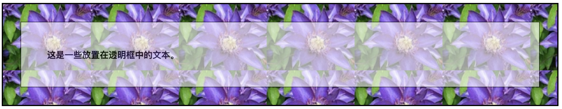
<html> <head> <style> div.background { background: url(klematis.jpg) repeat; border: 2px solid black; } div.transbox { margin: 30px; background-color: #ffffff; border: 1px solid black; opacity: 0.6; } div.transbox p { margin: 5%; font-weight: bold; color: #000000; } </style> </head> <body> <div class="background"> <div class="transbox"> <p>This is some text that is placed in the transparent box.</p> </div> </div> </body> </html>首先,创建一个带有背景图像和边框的
<div>元素(class =“ background”)。如果在第一个<div>中创建另一个<div>(class =“ transbox”)。<div class =“ transbox”>具有背景色和边框,div是透明的。在透明的<div>内,利用<p>元素添加一些文本。
31)CSS导航栏
-
易于使用的导航对于任何网站都很重要。使用CSS,您可以将无聊的HTML菜单转换为美观的导航栏。
-
导航栏需要标准HTML作为基础。在我们的示例中,我们将从标准HTML列表构建导航栏。导航栏基本上是链接列表,因此使用
<ul>和<li>元素很有意义。<ul> <li><a href="default.asp">Home</a></li> <li><a href="news.asp">News</a></li> <li><a href="contact.asp">Contact</a></li> <li><a href="about.asp">About</a></li> </ul> -
现在,从列表中删除项目符号以及边距和填充:
ul { list-style-type: none; margin: 0; padding: 0; }示例说明:
-
list-style-type: none;:删除标记,因为导航栏不需要列表标记 - 设置
margin: 0;和padding: 0;:删除浏览器默认设置
上面示例中的代码是垂直和水平导航栏中使用的标准代码。
-
-
要构建垂直导航栏,除了上面的代码之外,您还可以在列表中设置
<a>元素的样式:li a { display: block; width: 60px; }示例说明:
-
display: block;:将链接显示为块元素可以使整个链接区域都可单击(不仅是文本),还可以让我们指定宽度(如果需要,还可以指定填充,边距,高度等) -
width: 60px;:默认情况下,块元素占据可用的全部宽度。我们要指定60像素的宽度
您还可以设置
<ul>的宽度,并删除<a>的宽度,因为当显示为块元素时,它们将占据可用的全部宽度。这将产生与我们之前的示例相同的结果:ul { list-style-type: none; margin: 0; padding: 0; width: 60px; } li a { display: block; } -
-
垂直导航栏示例:
ul { list-style-type: none; margin: 0; padding: 0; width: 200px; background-color: #f1f1f1; } li a { display: block; color: #000; padding: 8px 16px; text-decoration: none; } /* Change the link color on hover */ li a:hover { background-color: #555; color: white; } -
向当前链接添加“活动”类,以使用户知道他/她在哪个页面上:
.active { background-color: #4CAF50; color: white; } -
添加
text-align:center到<li>或<a>以使链接居中。将border属性添加到<ul>,在导航栏周围添加边框。如果您还希望在导航栏内添加边框,请border-bottom为所有<li>元素添加一个,最后一个元素除外:ul { border: 1px solid #555; } li { text-align: center; border-bottom: 1px solid #555; } li:last-child { border-bottom: none; } -
创建全高“粘性”侧面导航:
ul { list-style-type: none; margin: 0; padding: 0; width: 25%; background-color: #f1f1f1; height: 100%; /* Full height */ position: fixed; /* Make it stick, even on scroll */ overflow: auto; /* Enable scrolling if the sidenav has too much content */ }注意📌:此示例在移动设备上可能无法正常工作。
-
有两种创建水平导航栏的方法:使用内联或浮动列表项。
除了上面的“标准”代码之外,构建水平导航栏的一种方法是将
<li>元素指定为内联:li { display: inline; }示例说明:
display: inline;-默认情况下,<li>元素是块元素。在这里,我们删除每个列表项之前和之后的换行符,以将其显示在一行上。创建水平导航栏的另一种方法是浮动
<li>元素,并为导航链接指定布局:li { float: left; } a { display: block; padding: 8px; background-color: #dddddd; }示例说明:
-
float: left;:使用float使块元素彼此相邻滑动 -
display: block;:将链接显示为块元素可以使整个链接区域都可单击(不仅是文本),而且允许我们指定填充(如果需要,还可以指定高度,宽度,边距等) -
padding: 8px;:由于块元素占据了可用的全部宽度,因此它们不能彼此相邻漂浮。因此,请指定一些填充以使其看起来不错 -
background-color: #dddddd;:为每个元素添加灰色背景色
提示📌:如果要全宽背景色,请将background-color而不是每个
<a>元素添加到<ul>中:ul { background-color: #dddddd; } -
-
创建具有深色背景色的基本水平导航栏,并在用户将鼠标移到链接上方时更改链接的背景色:
ul { list-style-type: none; margin: 0; padding: 0; overflow: hidden; background-color: #333; } li { float: left; } li a { display: block; color: white; text-align: center; padding: 14px 16px; text-decoration: none; } /* Change the link color to #111 (black) on hover */ li a:hover { background-color: #111; } -
向当前链接添加“活动”类,以使用户知道他/她在哪个页面上:
.active { background-color: #4CAF50; } -
通过将列表项浮动到右侧(
float:right;)来使链接右对齐:<ul> <li><a href="#home">Home</a></li> <li><a href="#news">News</a></li> <li><a href="#contact">Contact</a></li> <li style="float:right"><a class="active" href="#about">About</a></li> </ul> -
将
border-right属性添加到<li>以创建链接分隔符:/* Add a gray right border to all list items, except the last item (last-child) */ li { border-right: 1px solid #bbb; } li:last-child { border-right: none; } -
使导航栏保持在页面顶部或底部,即使用户滚动页面也是如此:
固定顶:
ul {
  position: fixed;
  top: 0;
  width: 100%;
}
固定底:
ul { position: fixed; bottom: 0; width: 100%; } -
带有细灰色边框的灰色水平导航栏示例:
ul { border: 1px solid #e7e7e7; background-color: #f3f3f3; } li a { color: #666; } -
添加
position: sticky;到<ul>以创建粘性导航栏。粘性元素根据滚动位置在相对和固定之间切换。它将相对定位,直到在视口中遇到给定的偏移位置为止,然后将其“粘贴”在适当的位置(例如position:fixed)。ul { position: -webkit-sticky; /* Safari */ position: sticky; top: 0; }注意📌: Internet Explorer,Edge 15和更早版本不支持粘性定位。Safari需要-webkit-前缀(请参见上面的示例)。您还必须在指定的至少一个
top,right,bottom或left为粘稠的定位工作。 -
更多例子:导航栏例子
34)CSS下拉菜单
-
使用CSS创建一个可悬停的下拉列表。
-
创建一个下拉框,当用户将鼠标移到元素上时出现。
<style>
.dropdown {
  position: relative;
  display: inline-block;
}

.dropdown-content {
  display: none;
  position: absolute;
  background-color: #f9f9f9;
  min-width: 160px;
  box-shadow: 0px 8px 16px 0px rgba(0,0,0,0.2);
  padding: 12px 16px;
  z-index: 1;
}

.dropdown:hover .dropdown-content {
  display: block;
}
</style>

<div class="dropdown">
  <span>Mouse over me</span>
  <div class="dropdown-content">
    <p>Hello World!</p>
  </div>
</div>
使用任何元素打开下拉内容,例如
<span>或<button>元素。使用容器元素(如<div>)创建下拉内容,并在其中添加任何内容。将<div>元素环绕在元素周围,以使用CSS正确放置下拉内容。.dropdown使用position:relative,当我们想要的下拉内容这是需要正下方的下拉按钮(使用放置position:absolute)。.dropdown-content类保存实际下拉内容。默认情况下它是隐藏的,并且会在悬停时显示。min-width设置为160px。提示:如果希望下拉内容的宽度与下拉按钮一样宽,设置width为100%(overflow:auto启用在小屏幕上滚动)。没有使用边框,而是使用CSSbox-shadow属性使下拉菜单看起来像“卡片”。当用户在该下拉按钮移动鼠标,:hover选择器被用来显示在下拉菜单中。 -
如果希望下拉菜单从右到左而不是从左到右,添加
right: 0;
35)CSS图片库
- CSS可用于创建图片库:CSS创建图片库
36)图像精灵 image sprites
-
图像精灵是把图像的集合放入单个图像中。包含许多图像的网页可能需要很长时间才能加载并生成多个服务器请求,这时使用图像精灵将减少服务器请求的数量并节省带宽。
-
我们使用以下单个图像(“ img_navsprites.gif”)来代替使用三个单独的图像:

使用CSS,我们可以仅显示所需图像的一部分。
在下面的示例中,CSS指定显示“ img_navsprites.gif”图像的哪一部分:
#home {
  width: 46px;
  height: 44px;
  background: url(img_navsprites.gif) 0 0;
}
示例说明:
-
<img id="home" src="img_trans.gif">:仅定义小的透明图像,因为src属性不能为空。显示的图像将是我们在CSS中指定的背景图像 -
width: 46px; height: 44px;-定义我们要使用的图像部分 -
background: url(img_navsprites.gif) 0 0;-定义背景图片及其位置(左侧0px,顶部0px)
这是使用图像精灵的最简单方法,现在我们要使用链接和悬停效果对其进行扩展。
-
-
我们想使用精灵图片(“ img_navsprites.gif”)创建一个导航列表。我们将使用HTML列表,因为它可以是链接并且还支持背景图片:
#navlist {
  position: relative;
}

#navlist li {
  margin: 0;
  padding: 0;
  list-style: none;
  position: absolute;
  top: 0;
}

#navlist li, #navlist a {
  height: 44px;
  display: block;
}

#home {
  left: 0px;
  width: 46px;
  background: url('img_navsprites.gif') 0 0;
}

#prev {
  left: 63px;
  width: 43px;
  background: url('img_navsprites.gif') -47px 0;
}

#next {
  left: 129px;
  width: 43px;
  background: url('img_navsprites.gif') -91px 0;
}
示例说明:
- #navlist {position:relative;} :位置设置为相对,以允许在其中进行绝对定位
- #navlist li {margin:0; padding:0; list-style:none; position:absolute; top:0;}:边距和padding设置为0,删除了list-style,并且所有列表项都位于绝对位置
- #navlist li,#navlist a {height:44px; display:block;}:所有图像的高度均为44px
现在开始为每个特定部分定位和样式:
- #home {left:0px; width:46px;}:一直定位到最左侧,图像的宽度为46px
- #home {background:url(img_navsprites.gif)0 0;}:定义背景图片及其位置(左侧0px,顶部0px)
- #prev {left:63px; width:43px;}:位于右侧63px(#home宽度46px +项目之间的一些额外空间),宽度为43px。
- #prev {background:url(’img_navsprites.gif’)-47px 0;}:将背景图片定义为右侧47px(#home宽度46px + 1px分隔线)
- #next {left:129px; width:43px;}:定位在右侧129px(#prev的开始是63px + #prev的宽度是43px +多余的空格),宽度是43px。
- #next {background:url(’img_navsprites.gif’)-91px 0;}:定义右侧的背景图片91px(#home宽度46px + 1px分隔线+ #prev宽度43px + 1px分隔线)
-
现在,我们想将悬浮效果添加到导航列表中。
提示:
:hover选择器可以在所有的元素中使用,不仅在链接中。我们的新图像(“ img_navsprites_hover.gif”)包含三个导航图像和三个用于悬停效果的图像:
因为这是一个图像,而不是六个单独的文件,所以当用户将鼠标悬停在图像上时,不会有加载延迟。
仅添加三行代码来添加悬停效果:
#home a:hover {
  background: url('img_navsprites_hover.gif') 0 -45px;
}

#prev a:hover {
  background: url('img_navsprites_hover.gif') -47px -45px;
}

#next a:hover {
  background: url('img_navsprites_hover.gif') -91px -45px;
}
示例说明:
- #home a:hover {background:transparent url(’img_navsprites_hover.gif’)0 -45px;}:对于所有三个悬停图像,我们指定了相同的背景位置,仅向下移动了45px。
37)CSS属性选择器
-
可以用于设置具有特定属性或属性值的HTML元素的样式。
-
所述
[attribute]选择器用于选择具有指定的属性的元素,以下示例选择具有<target>属性的所有<a>元素:a[target] { background-color: yellow; } -
所述
[attribute="value"]选择器用于选择具有指定的属性和值的元素。下面的示例选择所有具有target =“ _ blank”属性的<a>元素:a[target="_blank"] { background-color: yellow; } -
[attribute~="value"]选择器用于选择含有指定单词的属性值的元素。下面的示例选择具有title属性的所有元素,其中title属性包含以空格分隔的单词列表,其中一个单词是“ flower”:[title~="flower"] { border: 5px solid yellow; }上面的示例将匹配具有title =“ flower”,title =“ summer flower”和title =“ flower new”的元素,但不匹配title =“ my-flower”或title =“ flowers”的元素。
-
[attribute|="value"]选择器用于选择具有指定属性的元素开始的指定的值。下面的示例选择所有类属性值以“ top”开头的元素:
注意📌:该值必须是一个完整的单词,要么是一个单独的单词,例如class =“ top”,要么是连字符(-),例如class =“ top-text”,但是不匹配class=”topcontent”。
-
[attribute^="value"]选择器用于选择元件,其属性值以指定的值开始。下面的示例选择所有类属性值以“ top”开头的元素:注意📌:该值不必是一个完整的单词!能匹配class=”topcontent”。
[class^="top"] {
  background: yellow;
}
-
所述
[attribute$="value"]选择器用于选择属性值以规定值结尾的元素。下面的示例选择所有类属性值以“ test”结尾的元素:注意📌:该值不必是一个完整的单词! class=”first_test” & class=”my-test” & class=”mytest”都会被选择。
[class$="test"] { background: yellow; } -
[attribute*="value"]选择器用于选择元件,其属性值包含一个指定值。以下示例选择具有包含“ te”的类属性值的所有元素:
注意📌:该值不必是一个完整的单词!
[class*="te"] { background: yellow; } -
属性选择器对于不带类或ID的样式样式很有用:
input[type="text"] { width: 150px; display: block; margin-bottom: 10px; background-color: yellow; } input[type="button"] { width: 120px; margin-left: 35px; display: block; } -
所有CSS属性选择器:
Selector Example Example description [attribute] [target] Selects all elements with a target attribute [attribute=value] [target=_blank] Selects all elements with target=”_blank” [attribute~=value] [title~=flower] Selects all elements with a title attribute containing the word “flower” [attribute|=value] [lang|=en] Selects all elements with a lang attribute value starting with “en” [attribute^=value] a[href^=”https”] Selects every element whose href attribute value begins with “https” [attribute$=value] a[href$=”.pdf”] Selects every element whose href attribute value ends with “.pdf” [attribute**=value*] a[href*=”w3schools”] Selects every element whose href attribute value contains the substring “w3schools”
38)CSS表格
-
使用CSS可以极大地改善HTML表单的外观
-
使用该
width属性确定输入字段的宽度input { width: 100%; }上面的示例适用于所有
<input>元素。如果只想设置特定输入类型的样式,则可以使用属性选择器:-
input[type=text]:仅选择文本字段 -
input[type=password]:仅选择密码字段 -
input[type=number]:仅选择数字字段 - 其他
-
-
使用该
padding属性可在文本字段内添加空间。提示📌:当有很多输入框时,您可能还想添加一些
margin,以在它们之外添加更多空间:input[type=text] { width: 100%; padding: 12px 20px; margin: 8px 0; box-sizing: border-box; }我们已将
border-box属性设置为box-sizing。这样可以确保元素的总宽度和高度中包括填充和最终边框。在CSS Box Sizing章节中阅读有关该box-sizing属性的更多信息。 -
使用
border属性更改边框的大小和颜色,并使用该border-radius属性添加圆角:input[type=text] { border: 2px solid red; border-radius: 4px; }如果只需要底部边框,请使用
border-bottom属性:input[type=text] { border: none; border-bottom: 2px solid red; } -
使用
background-color属性可将背景色添加到输入中,使用该color属性可更改文本色:input[type=text] { background-color: #3CBC8D; color: white; } -
默认情况下,某些浏览器在获得焦点(单击)时会在输入周围添加蓝色轮廓。您可以通过添加
outline: none;到输入中来删除此行为。当
:focus选择焦点时,使用选择器对输入字段进行操作:input[type=text]:focus { background-color: lightblue; }input[type=text]:focus { border: 3px solid #555; } -
如果要在输入中包含图标,请使用
background-image属性并将其与该background-position属性一起放置。还要注意,我们添加了一个较大的左填充来保留图标的空间:input[type=text] { background-color: white; background-image: url('searchicon.png'); background-position: 10px 10px; background-repeat: no-repeat; padding-left: 40px; } -
在此示例中,使用CSS
transition属性为搜索输入获得焦点时的宽度设置动画。您将在CSS Transitions一章中了解有关该属性的更多信息。input[type=text] { transition: width 0.4s ease-in-out; } input[type=text]:focus { width: 100%; } -
样式文本区域:
提示📌:使用该
resize属性可防止调整文本区域的大小(禁用右下角的“抓取器”):textarea { width: 100%; height: 150px; padding: 12px 20px; box-sizing: border-box; border: 2px solid #ccc; border-radius: 4px; background-color: #f8f8f8; resize: none; } -
样式选择菜单:
select { width: 100%; padding: 16px 20px; border: none; border-radius: 4px; background-color: #f1f1f1; } -
样式输入按钮:
input[type=button], input[type=submit], input[type=reset] { background-color: #4CAF50; border: none; color: white; padding: 16px 32px; text-decoration: none; margin: 4px 2px; cursor: pointer; } /* Tip: use width: 100% for full-width buttons */有关如何使用CSS设置按钮样式的更多信息,阅读CSS Buttons Tutorial。
-
调整浏览器窗口的大小以查看效果。当屏幕的宽度小于600px时,使两列相互堆叠而不是彼此相邻。
39)CSS计数器
-
CSS计数器是由CSS维护的“变量”,其值可以通过CSS规则递增(以跟踪其使用次数)。计数器使您可以根据内容在文档中的位置来调整内容的外观。
要使用CSS计数器,我们将使用以下属性:
-
counter-reset:创建或重置计数器 -
counter-increment:增加计数器值 -
content:插入生成的内容 -
counter()或counters()函数:将计数器的值添加到元素
要使用CSS计数器,必须首先使用创建它
counter-reset。下面的示例为页面(在主体选择器中)创建一个计数器,然后为每个
<h2>元素增加计数器值,并在每个<h2>元素的开头添加“ Section < 计数器的值 >:”:body { counter-reset: section; } h2::before { counter-increment: section; content: "Section " counter(section) ": "; } -
-
嵌套计数器:以下示例为页面(节)创建一个计数器,为每个
<h1>元素(子节)创建一个计数器。对于每个<h1>元素,将使用”Section <value of the section counter“对”section”计数器进行计数,对于每个<h2>元素,将对”subsection”计数器进行计数,并使用” <value of the section counter>.<value of the subsection counter>”:body { counter-reset: section; } h1 { counter-reset: subsection; } h1::before { counter-increment: section; content: "Section " counter(section) ". "; } h2::before { counter-increment: subsection; content: counter(section) "." counter(subsection) " "; }计数器也可以用于创建概述列表,因为在子元素中会自动创建一个计数器的新实例。在这里,我们使用该
counters()函数在不同级别的嵌套计数器之间插入一个字符串:ol { counter-reset: section; list-style-type: none; } li::before { counter-increment: section; content: counters(section,".") " "; } -
CSS计数器属性:
Property Description content Used with the ::before and ::after pseudo-elements, to insert generated content counter-increment Increments one or more counter values counter-reset Creates or resets one or more counters
40)网站布局
-
网站通常分为页眉,菜单,内容和页脚
-
标头通常位于网站顶部(或顶部导航菜单的正下方),它通常包含徽标或网站名称。
-
导航栏包含链接列表,以帮助访问者浏览您的网站:
-
本节中的布局通常取决于目标用户。最常见的布局是以下布局之一(或将它们组合在一起):
- 1栏(通常用于移动浏览器)
- 2栏(通常用于平板电脑和笔记本电脑)
- 3列布局(仅用于台式机)
提示📌:要创建2列布局,请将宽度更改为50%。要创建4列布局,请使用25%等。
提示📌:@media规则如何工作?CSS Media Queries阅读有关它的更多信息。
提示📌:创建列布局的一种更现代的方法是使用CSS Flexbox。但是,Internet Explorer 10和更早版本不支持它。如果需要IE6-10支持,请使用浮点数(如上所示)。
要了解有关灵活框布局模块的更多信息,请阅读CSS Flexbox章节。
-
主要内容是您网站上最大,最重要的部分。列宽不相等的情况很常见,因此大部分空间都保留用于主要内容。辅助内容(如果有)通常用作替代导航或指定与主要内容相关的信息。随意更改宽度,仅记住它的总和应为100%。
-
页脚位于页面底部。它通常包含诸如版权和联系信息之类的信息。
-
通过使用上面的一些CSS代码,我们创建了一个自适应的网站布局,该布局在两列和全宽度之间有所不同,具体取决于屏幕宽度。
-
具体例子:CSS网站布局
41)CSS单位
-
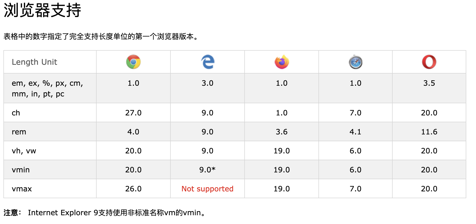
CSS有几种表示长度的不同单位。许多CSS属性采取“长度”的值,例如
width,margin,padding,font-size,等。长度是一个数字,后跟一个长度单位,例如10px,2em等。数字和单位之间不能出现空格。但是,如果值为0,则可以省略单位。对于某些CSS属性,允许使用负数长度。 -
长度单位有两种:绝对单位和相对单位。
-
绝对长度单位是固定的,用任何一个长度表示的长度将恰好与该大小相同。不建议在屏幕上使用绝对长度单位,因为屏幕尺寸变化很大。但是,如果已知输出内容,则可以使用它们,例如用于打印布局。
Unit Description cm centimeters Try it mm millimeters Try it in inches (1in = 96px = 2.54cm) Try it px * pixels (1px = 1/96th of 1in) Try it pt points (1pt = 1/72 of 1in) Try it pc picas (1pc = 12 pt) Try it *像素(px)相对于查看设备。对于低dpi的设备,1px是显示器的一个设备像素(点)。对于打印机和高分辨率屏幕,1px表示多个设备像素。
-
相对长度:
相对长度单位指定相对于另一个长度属性的长度。相对长度单位在不同渲染介质之间缩放更好。
Unit Description em Relative to the font-size of the element (2em means 2 times the size of the current font) Try it ex Relative to the x-height of the current font (rarely used) Try it ch Relative to width of the “0” (zero) Try it rem Relative to font-size of the root element Try it vw Relative to 1% of the width of the viewport* Try it vh Relative to 1% of the height of the viewport* Try it vmin Relative to 1% of viewport’s* smaller dimension Try it vmax Relative to 1% of viewport’s* larger dimension Try it % Relative to the parent element Try it 提示✍🏻: em和rem单元可用于创建完美的可扩展布局! *视口=浏览器窗口大小。如果视口为50厘米宽,则1vw = 0.5厘米。
-
表格中的数字指定了完全支持长度单位的第一个浏览器版本。
42)CSS特异性
-
如果有两个或两个以上指向同一元素的冲突CSS规则,则浏览器将遵循一些规则来确定哪一个是最具体的,因此胜出。将特异性视为得分/等级,可以确定最终将哪些样式声明应用于元素。通用选择器(*)具有较低的特异性,而ID选择器具有较高的特异性!
注意:特殊性是CSS规则不适用于某些元素(尽管您认为应该适用)的常见原因。
-
每个选择器在特异性层次结构中都有其位置。有四个类别定义了选择器的特异性级别:
内联样式 :内联样式直接附加到要设置样式的元素。示例:<h1 style =“ color:#ffffff;”>。
ID :ID是页面元素的唯一标识符,例如#navbar。
类,属性和伪类 :此类别包括.class,[attributes]和伪类,例如:hover,:focus等。
元素和伪元素 :此类别包括元素名称和伪元素,例如h1,div,:before和:after。
-
记住如何计算特异性!从0开始,为style属性添加1000,为每个ID添加100,为每个属性,类或伪类添加10,为每个元素名称或伪元素添加1。
考虑以下三个代码片段:
A: h1 B: #content h1 C: <div id="content"><h1 style="color: #ffffff">Heading</h1></div>A的特异性为1(一个元素) B的特异性为101(一个ID参考和一个元素) C的特异性为1000(在线样式)
由于1 <101 <1000,因此第三条规则(C)具有更高的特异性,因此将被应用。
-
相等特异性:最新的样式很重要 :如果将同一样式两次写入外部样式表中,则样式表中的下部规则将更靠近要样式化的元素,因此将被应用。
h1 {background-color: yellow;} h1 {background-color: red;}后一条规则始终适用。
-
ID选择器比属性选择器具有更高的特异性:
div#a {background-color: green;} #a {background-color: yellow;} div[id=a] {background-color: blue;}第一条规则比其他两条更具体,将被应用。
-
上下文选择器比单个元素选择器更具体:嵌入式样式表更靠近要设置样式的元素。所以在以下情况下:
From external CSS file: #content h1 {background-color: red;} In HTML file: <style> #content h1 { background-color: yellow; } </style>后一个规则将适用。
-
类选择器击败了任意数量的元素选择器 :类选择器(例如.intro击败了h1,p,div等):
.intro {background-color: yellow;} h1 {background-color: red;} -
通用选择器和继承的值具有特异性0:body和类似的值具有零的特异性,继承的值的特异性也为0
🥳CSS基础篇终于看完了,CSS还有advanced、responsive、grid这三个部分,打算另外开一个post啦~