✍🏻CSS下一部分开始啦~学完去看JS咯~
CSS高级 advanced
1)CSS圆角
-
使用CSS
border-radius属性,可以给任何元素“圆角”。 -
CSS
border-radius属性定义元素角的半径。提示📌:此属性使您可以向元素添加圆角!
这是三个示例:
- 具有指定背景颜色的元素的圆角
- 带有边框的元素的圆角
- 具有背景图像的元素的圆角
Rounded corners for an element with a specified background color:
Rounded corners!
Rounded corners for an element with a border:
Rounded corners!
Rounded corners for an element with a background image:
Rounded corners!
#rcorners1 {
  border-radius: 25px;
  background: #73AD21;
  padding: 20px;
  width: 200px;
  height: 150px;
}

#rcorners2 {
  border-radius: 25px;
  border: 2px solid #73AD21;
  padding: 20px;
  width: 200px;
  height: 150px;
}

#rcorners3 {
  border-radius: 25px;
  background: url(paper.gif);
  background-position: left top;
  background-repeat: repeat;
  padding: 20px;
  width: 200px;
  height: 150px;
}
提示:该border-radius属性实际上是 border-top-left-radius,border-top-right-radius,border-bottom-right-radius 和border-bottom-left-radius的简写属性。
-
该
border-radius属性可以具有一到四个值。规则如下:-
四个值:border-radius:15px 50px 30px 5px; (第一个值适用于左上角,第二个值适用于右上角,第三个值适用于右下角,第四个值适用于左下角)
-
三个值:border-radius:15px 50px 30px; (第一个值适用于左上角,第二个值适用于右上角和左下角,第三个值适用于右下角)
-
两个值:border-radius:15px 50px; (第一个值适用于左上角和右下角,第二个值适用于右上角和左下角)
-
一个值:border-radius:15px; (该值适用于所有四个角)
#rcorners1 {
  border-radius: 15px 50px 30px 5px;
  background: #73AD21;
  padding: 20px;
  width: 200px;
  height: 150px;
}

#rcorners2 {
  border-radius: 15px 50px 30px;
  background: #73AD21;
  padding: 20px;
  width: 200px;
  height: 150px;
}

#rcorners3 {
  border-radius: 15px 50px;
  background: #73AD21;
  padding: 20px;
  width: 200px;
  height: 150px;
}

#rcorners4 {
  border-radius: 15px;
  background: #73AD21;
  padding: 20px;
  width: 200px;
  height: 150px;
}
-
-
还可以创建椭圆角:
#rcorners1 { border-radius: 50px / 15px; background: #73AD21; padding: 20px; width: 200px; height: 150px; } #rcorners2 { border-radius: 15px / 50px; background: #73AD21; padding: 20px; width: 200px; height: 150px; } #rcorners3 { border-radius: 50%; background: #73AD21; padding: 20px; width: 200px; height: 150px; } -
CSS圆角属性:
Property Description border-radius A shorthand property for setting all the four border---radius properties border-top-left-radius Defines the shape of the border of the top-left corner border-top-right-radius Defines the shape of the border of the top-right corner border-bottom-right-radius Defines the shape of the border of the bottom-right corner border-bottom-left-radius Defines the shape of the border of the bottom-left corner
2)CSS边框图片
-
使用CSS
border-image属性,可以将图像设置为元素周围的边框。 -
CSS
border-image属性允许您指定要使用的图像,而不是元素周围的普通边框。该属性分为三个部分:
- 用作边框的图像
- 在哪里切片图像
- 定义中间部分应重复还是拉伸
-
我们将使用以下图像(称为“ border.png”):

border-image属性将图像拍摄并将其切成九个部分,例如井字游戏板。然后,将拐角放置在拐角处,并根据您的指定重复或拉伸中间部分。注意📌:要使用
border-image元素,还需要设置border属性!重复图像的中间部分以创建边框:
#borderimg {
  border: 10px solid transparent;
  padding: 15px;
  border-image: url(border.png) 30 round;
}
在这里,图像的中间部分被拉伸以创建边框:

#borderimg {
  border: 10px solid transparent;
  padding: 15px;
  border-image: url(border.png) 30 stretch;
}
提示:
border-image属性实际上是border-image-source,border-image-slice,border-image-width,border-image-outset和border-image-repeat的速记属性。 -
CSS边框图像:不同的slice值会完全改变边框的外观
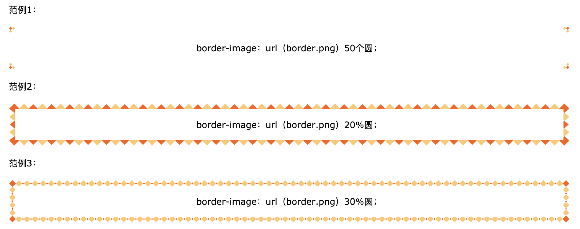
#borderimg1 { border: 10px solid transparent; padding: 15px; border-image: url(border.png) 50 round; } #borderimg2 { border: 10px solid transparent; padding: 15px; border-image: url(border.png) 20% round; } #borderimg3 { border: 10px solid transparent; padding: 15px; border-image: url(border.png) 30% round; } -
CSS边框图像属性:
Property Description border-image A shorthand property for setting all the border-image-* properties border-image-source Specifies the path to the image to be used as a border border-image-slice Specifies how to slice the border image border-image-width Specifies the widths of the border image border-image-outset Specifies the amount by which the border image area extends beyond the border box border-image-repeat Specifies whether the border image should be repeated, rounded or stretched
3)CSS多种背景
-
CSS允许通过
background-image属性为一个元素添加多个背景图像 。不同的背景图像用逗号分隔,并且图像彼此堆叠,其中第一幅图像最靠近查看者。以下示例有两个背景图像,第一个图像是花朵(与底部和右侧对齐),第二个图像是纸张背景(与左上角对齐):#example1 { background-image: url(img_flwr.gif), url(paper.gif); background-position: right bottom, left top; background-repeat: no-repeat, repeat; }可以使用单个背景属性(如上)或
background速记属性来指定多个背景图像。以下示例使用了background简写属性(与上面的示例相同的结果):#example1 { background: url(img_flwr.gif) right bottom no-repeat, url(paper.gif) left top repeat; } -
CSS
background-size属性允许您指定背景图像的大小。可以通过长度,百分比或使用以下两个关键字之一来指定大小:包含或覆盖。下面的示例将背景图像的大小调整为比原始图像小得多(使用像素):#div1 { background: url(img_flower.jpg); background-size: 100px 80px; background-repeat: no-repeat; }对于
background-size另外两个可能的值是contain和cover。contain关键字缩放的背景图像是尽可能的大(但它的宽度和高度二者必须适合在内容区域内)。这样,取决于背景图像和背景定位区域的比例,可能存在一些未被背景图像覆盖的背景区域。cover关键字测量背景图像,使得所述内容区域完全由背景图像覆盖(包括其宽度和高度是等于或超过该内容区域)。这样,背景图像的某些部分可能在背景定位区域中不可见。以下示例说明了
contain和cover的用法:#div1 { background: url(img_flower.jpg); background-size: contain; background-repeat: no-repeat; } #div2 { background: url(img_flower.jpg); background-size: cover; background-repeat: no-repeat; } -
background-size当使用多个背景时,该属性还接受多个背景大小值(使用逗号分隔的列表)。下面的示例指定了三个背景图像,每个图像的背景大小值不同:#example1 { background: url(img_tree.gif) left top no-repeat, url(img_flwr.gif) right bottom no-repeat, url(paper.gif) left top repeat; background-size: 50px, 130px, auto; } -
我们希望网站上的背景图片始终覆盖整个浏览器窗口。要求如下:
- 用图像填充整个页面(无空格)
- 根据需要缩放图像
- 页面中心图片
- 不要引起滚动条
以下示例显示了如何执行此操作;使用
<html>元素(<html>元素始终至少是浏览器窗口的高度)。然后在其上设置固定的居中背景。然后使用background-size属性调整其大小:html { background: url(img_man.jpg) no-repeat center fixed; background-size: cover; } -
还可以在
<div>上使用不同的背景属性来创建英雄图像(带有文本的大图像),并将其放置在所需的位置。.hero-image { background: url(img_man.jpg) no-repeat center; background-size: cover; height: 500px; position: relative; } -
CSS
background-origin属性指定背景图像的位置。该属性采用三个不同的值:
- border-box:背景图片从边框的左上角开始
- padding-box:(默认)背景图像从填充边缘的左上角开始
- content-box:背景图片从内容的左上角开始
以下示例说明了该
background-origin属性:#example1 { border: 10px solid black; padding: 35px; background: url(img_flwr.gif); background-repeat: no-repeat; background-origin: content-box; } -
CSS
background-clip属性指定背景的绘制区域。该属性采用三个不同的值:- border-box:(默认)背景绘制到边框的外部边缘
- padding-box:背景被绘制到填充的外部边缘
- Content-box:在内容框中绘制背景
以下示例说明了该
background-clip属性:#example1 { border: 10px dotted black; padding: 35px; background: yellow; background-clip: content-box; } -
CSS高级背景属性:
Property Description background A shorthand property for setting all the background properties in one declaration background-clip Specifies the painting area of the background background-image Specifies one or more background images for an element background-origin Specifies where the background image(s) is/are positioned background-size Specifies the size of the background image(s)
4)CSS颜色
- CSS支持140多种颜色名称,HEX值,RGB值,RGBA值,HSL值,HSLA值和不透明度。
- 在CSS中,可以使用颜色名称来指定颜色:CSS / HTML支持140种标准颜色名称。
- 可以用于设置背景颜色、文字颜色、边框颜色。
5)CSS渐变
-
CSS渐变使您可以显示两种或多种指定颜色之间的平滑过渡。
-
CSS定义了两种类型的渐变:
- 线性渐变(向下/向上/向左/向右/对角线)
- 径向渐变(由其中心定义)
-
要创建线性渐变,您必须至少定义两个色标。色标是您要呈现平滑过渡的颜色。您还可以设置起点和方向(或角度)以及渐变效果。
background-image: linear-gradient(direction, color-stop1, color-stop2, ...); -
线性渐变-从上到下(默认)
以下示例显示了从顶部开始的线性渐变。它从红色开始,过渡到黄色:
#grad { background-image: linear-gradient(red, yellow); } -
线性渐变-从左到右
以下示例显示了从左侧开始的线性渐变。它从红色开始,过渡到黄色:
#grad { background-image: linear-gradient(to right, red , yellow); } -
线性渐变-对角线
您可以通过指定水平和垂直起始位置来对角渐变。
以下示例显示了从左上角开始(到右下角)的线性渐变。它从红色开始,过渡到黄色:
#grad { background-image: linear-gradient(to bottom right, red, yellow); } -
如果要进一步控制渐变的方向,可以定义一个角度,而不是预定义的方向(从底部,顶部,右侧,左侧,右侧底部等)。
background-image: linear-gradient(angle, color-stop1, color-stop2);该角度被指定为水平线和梯度线之间的角度。
以下示例显示了如何在线性渐变上使用角度:
#grad { background-image: linear-gradient(-90deg, red, yellow); } -
以下示例显示了具有多个色标的线性渐变(从上到下):
#grad { background-image: linear-gradient(red, yellow, green); } -
以下示例显示了如何使用彩虹的颜色和一些文本创建线性渐变(从左到右):
#grad { background-image: linear-gradient(to right, red,orange,yellow,green,blue,indigo,violet); } -
CSS渐变还支持透明度,可用于创建渐变效果。为了增加透明度,我们使用rgba()函数定义色标。rgba()函数中的最后一个参数可以是0到1的值,它定义颜色的透明度:0表示全透明,1表示全彩色(无透明)。
以下示例显示了从左侧开始的线性渐变。它开始完全透明,过渡为全色红色:
#grad { background-image: linear-gradient(to right, rgba(255,0,0,0), rgba(255,0,0,1)); } -
repeating-linear-gradient()函数用于重复线性渐变:
#grad { background-image: repeating-linear-gradient(red, yellow 10%, green 20%); } -
径向渐变由其中心定义。要创建径向渐变,您还必须定义至少两个色标。
background-image: radial-gradient(shape size at position, start-color, ..., last-color);默认情况下,形状为椭圆形,尺寸为最远角,位置为中心。
径向渐变-均匀间隔的色标(默认设置)
以下示例显示了具有均匀间隔的色标的径向渐变:
#grad {
  background-image: radial-gradient(red, yellow, green);
}
径向渐变-不同间距的色标
以下示例显示了具有不同间距色标的径向渐变:
#grad { background-image: radial-gradient(red 5%, yellow 15%, green 60%); } -
shape参数定义形状。它可以取圆形或椭圆形的值。默认值为椭圆。
以下示例显示了一个圆形的径向渐变:
#grad { background-image: radial-gradient(circle, red, yellow, green); } -
size参数定义渐变的大小。它可以采用四个值:
- 最近边
- 最远的一面
- 最近角
- 最远的角落
#grad1 { background-image: radial-gradient(closest-side at 60% 55%, red, yellow, black); } #grad2 { background-image: radial-gradient(farthest-side at 60% 55%, red, yellow, black); } -
repeating-radial-gradient()函数用于重复径向渐变:
#grad {
  background-image: repeating-radial-gradient(red, yellow 10%, green 15%);
}
6)CSS阴影效果
-
CSS
text-shadow属性将阴影应用于文本。最简单的用法是只指定水平阴影(2px)和垂直阴影(2px):
h1 {
  text-shadow: 2px 2px;
}
接下来,为阴影添加颜色:
h1 {
  text-shadow: 2px 2px red;
}
然后,向阴影添加模糊效果:
h1 {
  text-shadow: 2px 2px 5px red;
}
下面的示例显示带有黑色阴影的白色文本:
h1 {
  color: white;
  text-shadow: 2px 2px 4px #000000;
}
以下示例显示了红色的霓虹发光阴影:
h1 { text-shadow: 0 0 3px #FF0000; } -
要在文本中添加多个阴影,您可以添加以逗号分隔的阴影列表。
以下示例显示了红色和蓝色的霓虹灯发光阴影:
h1 {
  text-shadow: 0 0 3px #FF0000, 0 0 5px #0000FF;
}
以下示例显示带有黑色,蓝色和深蓝色阴影的白色文本:
h1 {
  color: white;
  text-shadow: 1px 1px 2px black, 0 0 25px blue, 0 0 5px darkblue;
}
您还可以使用text-shadow属性在某些文本周围创建纯边框(无阴影):
h1 { color: yellow; text-shadow: -1px 0 black, 0 1px black, 1px 0 black, 0 -1px black; } -
CSS
box-shadow属性将阴影应用于元素。最简单的用法是只指定水平阴影和垂直阴影:
div {
  box-shadow: 10px 10px;
}
接下来,为阴影添加颜色:
div {
  box-shadow: 10px 10px grey;
}
接下来,向阴影添加模糊效果:
div {
  box-shadow: 10px 10px 5px grey;
}
还可以将阴影添加到:: before和:: after伪元素中,以创建有趣的效果:
#boxshadow { position: relative; box-shadow: 1px 2px 4px rgba(0, 0, 0, .5); padding: 10px; background: white; } #boxshadow img { width: 100%; border: 1px solid #8a4419; border-style: inset; } #boxshadow::after { content: ''; position: absolute; z-index: -1; /* hide shadow behind image */ box-shadow: 0 15px 20px rgba(0, 0, 0, 0.3); width: 70%; left: 15%; /* one half of the remaining 30% */ height: 100px; bottom: 0; } -
使用该
box-shadow属性创建纸质卡的示例:div.card { width: 250px; box-shadow: 0 4px 8px 0 rgba(0, 0, 0, 0.2), 0 6px 20px 0 rgba(0, 0, 0, 0.19); text-align: center; }
7)CSS文字效果
-
CSS
text-overflow属性指定应如何向用户发信号通知未显示的溢出内容。 -
可以裁剪或者呈现为省略号(…)
This is some long text that will not fit in the box
This is some long text that will not fit in the box
p.test1 {
  white-space: nowrap;
  width: 200px;
  border: 1px solid #000000;
  overflow: hidden;
  text-overflow: clip;
}

p.test2 {
  white-space: nowrap;
  width: 200px;
  border: 1px solid #000000;
  overflow: hidden;
  text-overflow: ellipsis;
}
以下示例显示将鼠标悬停在元素上时如何显示溢出的内容:
  div.test:hover {
  overflow: visible;
  }
-
CSS
word-wrap属性允许将长单词打断并包装到下一行。 如果一个单词太长而无法容纳在一个区域内,它会向外扩展。通过word-wrap属性,您可以强制对文本进行换行,即使这意味着将其拆分为一个单词的中间部分。p { word-wrap: break-word; }This paragraph contains a very long word: thisisaveryveryveryveryveryverylongword. The long word will break and wrap to the next line.
-
CSS
word-break属性指定换行规则。p.test1 { word-break: keep-all; } p.test2 { word-break: break-all; }This paragraph contains some text. This line will-break-at-hyphens.
This paragraph contains some text. The lines will break at any character.
-
CSS
writing-mode属性指定文本行是水平放置还是垂直放置。一些带有span元素的文本具有vertical-rl书写模式。以下示例显示了一些不同的书写模式:
p.test1 { writing-mode: horizontal-tb; } span.test2 { writing-mode: vertical-rl; } p.test2 { writing-mode: vertical-rl; } -
CSS文字效果属性:
Property Description text-align-last Specifies how to align the last line of a text text-justify Specifies how justified text should be aligned and spaced text-overflow Specifies how overflowed content that is not displayed should be signaled to the user word-break Specifies line breaking rules for non-CJK scripts word-wrap Allows long words to be able to be broken and wrap onto the next line writing-mode Specifies whether lines of text are laid out horizontally or vertically
8)CSS web字体
-
Web字体允许Web设计人员使用用户计算机上未安装的字体。找到/购买了想要使用的字体后,只需将字体文件包括在Web服务器上,它将在需要时自动下载给用户。“自有”字体在CSS
@font-face规则中定义。 -
TrueType字体(TTF)
TrueType是Apple和Microsoft在1980年代后期开发的字体标准。TrueType是Mac OS和Microsoft Windows操作系统最常用的字体格式。
OpenType字体(OTF)
OpenType是可缩放计算机字体的格式。它基于TrueType构建,并且是Microsoft的注册商标。如今,OpenType字体在主要计算机平台上普遍使用。
Web开放字体格式(WOFF)
WOFF是用于网页的字体格式。它于2009年开发,现已成为W3C建议书。WOFF本质上是具有压缩和其他元数据的OpenType或TrueType。目标是支持具有带宽限制的网络上的字体从服务器到客户端的分发。
Web开放字体格式(WOFF 2.0)
TrueType / OpenType字体比WOFF 1.0提供更好的压缩。
SVG字体/形状
SVG字体允许在显示文本时将SVG用作字形。SVG 1.1规范定义了一个字体模块,该模块允许在SVG文档中创建字体。您还可以将CSS应用于SVG文档,并且@ font-face规则可以应用于SVG文档中的文本。
嵌入式OpenType字体(EOT)
EOT字体是Microsoft设计的OpenType字体的紧凑形式,用作网页上的嵌入式字体。
-
游览器对字体格式的支持:
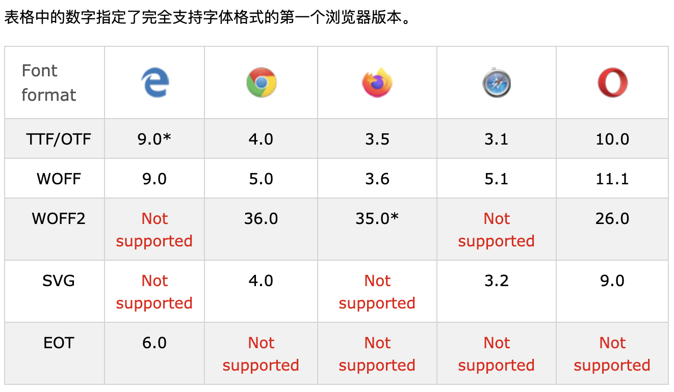
* IE:字体格式仅在设置为“可安装”时有效。
* Firefox:默认情况下不支持,但是可以启用(需要将标志设置为“ true”才能使用WOFF2)。
-
在
@font-face规则中首先定义字体的名称(例如myFirstFont),然后指向字体文件。提示✍🏻:字体URL始终使用小写字母。大写字母可能会在IE中产生意外结果。
-
要将字体用于HTML元素,请通过
font-family属性引用字体的名称(myFirstFont):@font-face { font-family: myFirstFont; src: url(sansation_light.woff); } div { font-family: myFirstFont; } -
您必须添加另一个
@font-face包含粗体文本描述符的规则:@font-face { font-family: myFirstFont; src: url(sansation_bold.woff); font-weight: bold; }文件“ sansation_bold.woff”是另一个字体文件,其中包含Sansation字体的粗体字符。
每当带有字体家族“ myFirstFont”的一段文本呈现为粗体时,浏览器就会使用它。
这样,您可以
@font-face为同一字体设置许多规则。 -
CSS字体描述符:
下表列出了可以在
@font-face规则内定义的所有字体描述符:Descriptor Values Description font-family name Required. Defines a name for the font src URL Required. Defines the URL of the font file font-stretch normal condensed ultra-condensed extra-condensed semi-condensed expanded semi-expanded extra-expanded ultra-expanded Optional. Defines how the font should be stretched. Default is “normal” font-style normal italic oblique Optional. Defines how the font should be styled. Default is “normal” font-weight normal bold 100 200 300 400 500 600 700 800 900 Optional. Defines the boldness of the font. Default is “normal” unicode-range unicode-range Optional. Defines the range of UNICODE characters the font supports. Default is “U+0-10FFFF”
9)CSS 2D转换
-
CSS转换允许您移动,旋转,缩放和倾斜元素。
-
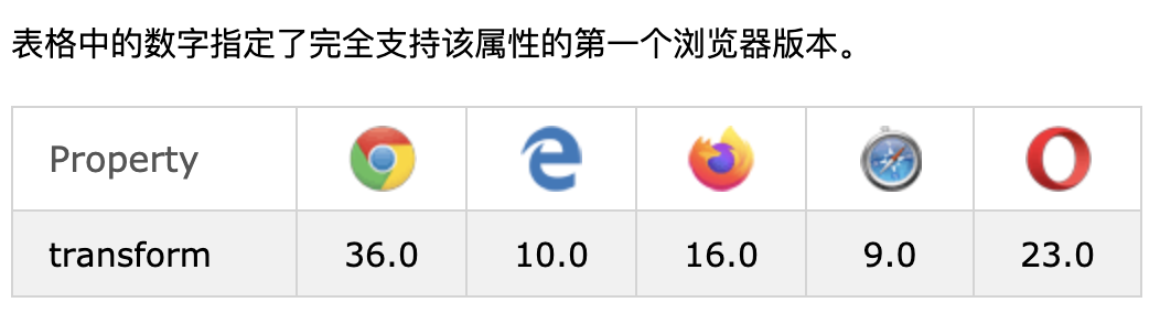
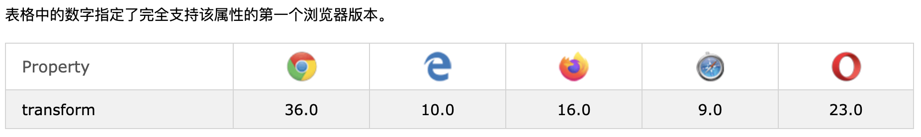
浏览器支持:
-
一些较旧的浏览器(IE 9)需要特定的前缀(-ms-)才能了解2D转换属性:
div { -ms-transform: rotate(20deg); /* IE 9 */ transform: rotate(20deg); /* Standard syntax */ } -
通过CSS
transform属性,您可以使用以下2D转换方法:translate()rotate()scaleX()scaleY()scale()skewX()skewY()skew()matrix()
-
translate()方法将元素从其当前位置移动(根据为X轴和Y轴指定的参数)。以下示例将<div>元素向右移动50个像素,并从其当前位置向下移动100个像素: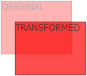
div { transform: translate(50px, 100px); } -
rotate()方法根据给定的角度顺时针或逆时针旋转元素,下面的示例将<div>元素顺时针旋转20度: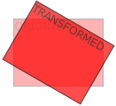
div {
  transform: rotate(20deg);
}
使用负值将逆时针旋转元素,下面的示例将
<div>元素逆时针旋转20度:div { transform: rotate(-20deg); } -
scale()方法增加或减小元素的大小(根据给定的宽度和高度的参数)。下面的示例将<div>元素增加到其原始宽度的两倍和其原始高度的三倍: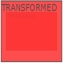
div {
  transform: scale(2, 3);
}
以下示例将
<div>元素减小为其原始宽度和高度的一半:div { transform: scale(0.5, 0.5); } -
scaleX()方法增加或减少元素的宽度。下面的示例将
<div>元素增加为其原始宽度的两倍:div { transform: scaleX(2); }以下示例将
<div>元素减小为其原始宽度的一半:div { transform: scaleX(0.5); } -
该
scaleY()方法增加或减少元素的高度。下面的示例将
<div>元素增加到其原始高度的三倍:div { transform: scaleY(3); }以下示例将
<div>元素减小为其原始高度的一半:div { transform: scaleY(0.5); } -
该
skewX()方法使元素沿X轴倾斜给定角度。以下示例使
<div>元素沿X轴倾斜20度:div { transform: skewX(20deg); } -
skewY()方法使元素沿Y轴倾斜给定角度。以下示例使
<div>元素沿Y轴倾斜20度:div { transform: skewY(20deg); } -
skew()方法使元素沿X和Y轴倾斜给定角度。以下示例使
<div>元素沿X轴倾斜20度,并沿Y轴倾斜10度:div { transform: skew(20deg, 10deg); }如果未指定第二个参数,则其值为零。因此,以下示例使
<div>元素沿X轴倾斜20度:div { transform: skew(20deg); } -
matrix()方法将所有2D变换方法组合为一个。matrix()方法采用六个参数,其中包含数学函数,使您可以旋转,缩放,移动(平移)和倾斜元素。参数如下:matrix(scaleX(),skewY(),skewX(),scaleY(),translateX(),translateY())div { transform: matrix(1, -0.3, 0, 1, 0, 0); } -
CSS转换属性:
Property Description transform Applies a 2D or 3D transformation to an element transform-origin Allows you to change the position on transformed elements -
CSS 2D转换方法:
Function Description matrix(n,n,n,n,n,n) Defines a 2D transformation, using a matrix of six values translate(x,y) Defines a 2D translation, moving the element along the X- and the Y-axis translateX(n) Defines a 2D translation, moving the element along the X-axis translateY(n) Defines a 2D translation, moving the element along the Y-axis scale(x,y) Defines a 2D scale transformation, changing the elements width and height scaleX(n) Defines a 2D scale transformation, changing the element’s width scaleY(n) Defines a 2D scale transformation, changing the element’s height rotate(angle) Defines a 2D rotation, the angle is specified in the parameter skew(x-angle,y-angle) Defines a 2D skew transformation along the X- and the Y-axis skewX(angle) Defines a 2D skew transformation along the X-axis skewY(angle) Defines a 2D skew transformation along the Y-axis
10)CSS 3D转换
-
CSS还支持3D转换。
-
通过CSS
transform属性,您可以使用以下3D转换方法:rotateX()rotateY()rotateZ()
-
rotateX()方法以给定的角度绕其X轴旋转元素:
#myDiv { transform: rotateX(150deg); } -
rotateY()方法以给定的角度绕其Y轴旋转元素:
#myDiv { transform: rotateY(130deg); } -
rotateZ()方法以给定的角度绕其Z轴旋转元素:#myDiv { transform: rotateZ(90deg); } -
CSS转换属性:
Property Description transform Applies a 2D or 3D transformation to an element transform-origin Allows you to change the position on transformed elements transform-style Specifies how nested elements are rendered in 3D space perspective Specifies the perspective on how 3D elements are viewed perspective-origin Specifies the bottom position of 3D elements backface-visibility Defines whether or not an element should be visible when not facing the screen -
CSS 3D转换方法:
Function Description matrix3d (n,n,n,n,n,n,n,n,n,n,n,n,n,n,n,n) Defines a 3D transformation, using a 4x4 matrix of 16 values translate3d(x,y,z) Defines a 3D translation translateX(x) Defines a 3D translation, using only the value for the X-axis translateY(y) Defines a 3D translation, using only the value for the Y-axis translateZ(z) Defines a 3D translation, using only the value for the Z-axis scale3d(x,y,z) Defines a 3D scale transformation scaleX(x) Defines a 3D scale transformation by giving a value for the X-axis scaleY(y) Defines a 3D scale transformation by giving a value for the Y-axis scaleZ(z) Defines a 3D scale transformation by giving a value for the Z-axis rotate3d(x,y,z,angle) Defines a 3D rotation rotateX(angle) Defines a 3D rotation along the X-axis rotateY(angle) Defines a 3D rotation along the Y-axis rotateZ(angle) Defines a 3D rotation along the Z-axis perspective(n) Defines a perspective view for a 3D transformed element
11)CSS过渡
-
CSS过渡允许您在给定的时间内平稳地更改属性值。
-
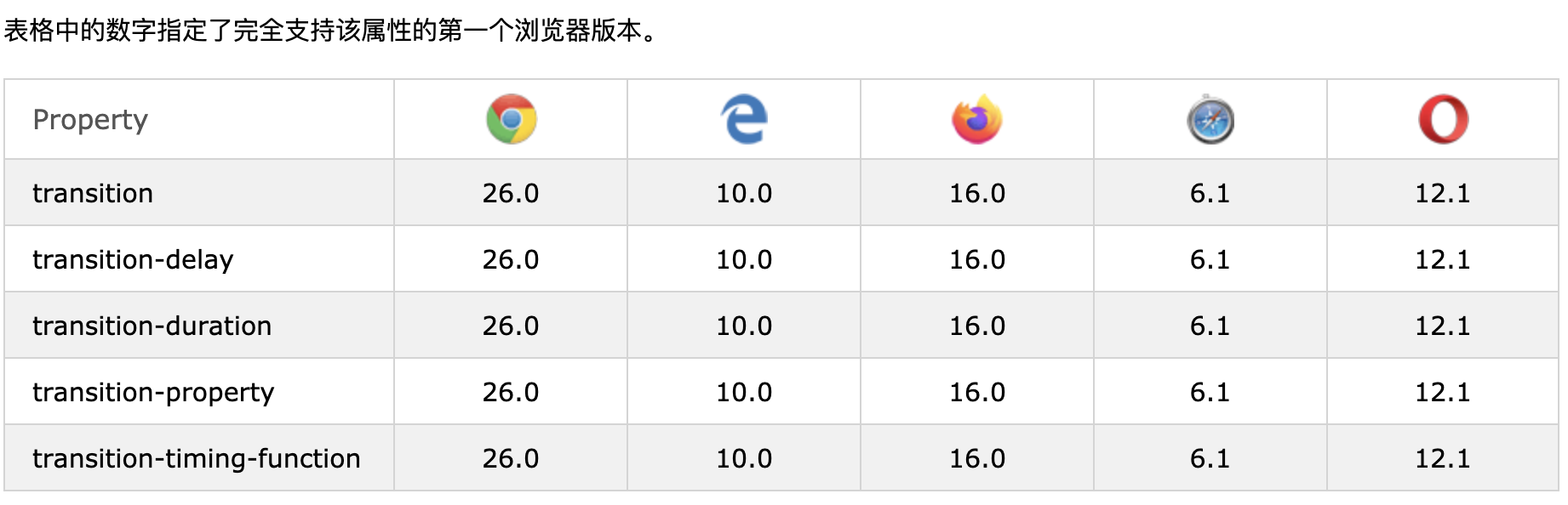
浏览器支持:
-
要创建过渡效果,必须指定两件事:
- 您要添加效果的CSS属性
- 效果的持续时间
注意:如果未指定持续时间部分,则过渡将无效,因为默认值为0。
以下示例显示了100px * 100px红色
<div>元素。<div>元素还为width属性指定了过渡效果,持续时间为2秒:div { width: 100px; height: 100px; background: red; transition: width 2s; }当指定的CSS属性(宽度)更改值时,过渡效果将开始。现在,让我们在用户将鼠标置于
<div>元素上时为width属性指定一个新值:div:hover { width: 300px; }请注意,当光标从元素上移出时,它将逐渐变回其原始样式。
-
下面的示例为width和height属性都添加了过渡效果,宽度为2秒,高度为4秒:
div { transition: width 2s, height 4s; } -
该
transition-timing-function属性指定过渡效果的速度曲线。transition-timing-function属性可以具有以下值:
-
ease:指定一个过渡效果,从慢速开始,然后快速,然后缓慢地结束(默认设置) -
linear:从开始到结束以相同的速度指定过渡效果 -
ease-in:以慢速启动指定过渡效果 -
ease-out:指定过渡效果较慢的结尾 -
ease-in-out:指定过渡效果,起点和终点较慢 -
cubic-bezier(n,n,n,n):让您在三次贝塞尔函数中定义自己的值
以下示例显示了可以使用的一些不同的速度曲线:
#div1 {transition-timing-function: linear;} #div2 {transition-timing-function: ease;} #div3 {transition-timing-function: ease-in;} #div4 {transition-timing-function: ease-out;} #div5 {transition-timing-function: ease-in-out;} -
-
transition-delay属性指定过渡效果的延迟(以秒为单位)。以下示例在启动之前有1秒的延迟:
div { transition-delay: 1s; } -
下面的示例向转换添加过渡效果:
div { transition: width 2s, height 2s, transform 2s; } -
CSS过渡属性可以一一指定,如下所示:
div {
  transition-property: width;
  transition-duration: 2s;
  transition-timing-function: linear;
  transition-delay: 1s;
}
或使用shorthand属性
transition:div { transition: width 2s linear 1s; } -
CSS过渡属性:
Property Description transition A shorthand property for setting the four transition properties into a single property transition-delay Specifies a delay (in seconds) for the transition effect transition-duration Specifies how many seconds or milliseconds a transition effect takes to complete transition-property Specifies the name of the CSS property the transition effect is for transition-timing-function Specifies the speed curve of the transition effect
12)CSS动画
-
CSS允许HTML元素的动画不使用JavaScript或Flash。
-
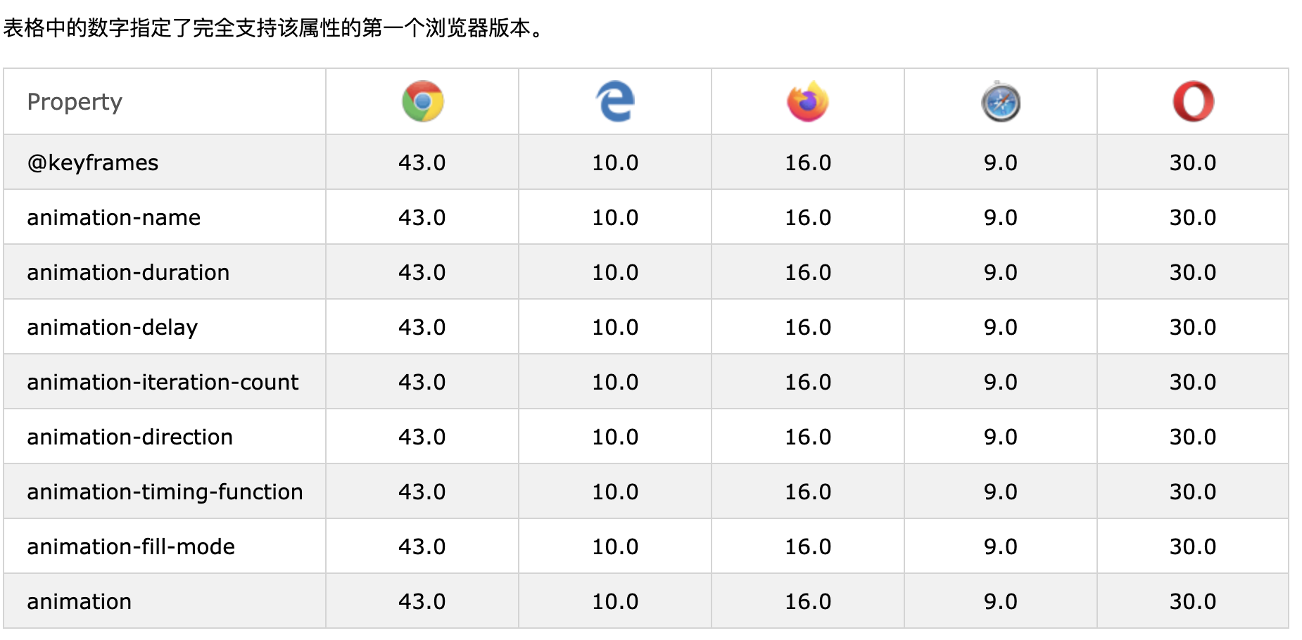
浏览器支持:
-
一些较旧的浏览器需要特定的前缀(-webkit-)才能了解动画属性:
div { width: 100px; height: 100px; background-color: red; animation-name: example; animation-duration: 4s; } @keyframes example { from {background-color: red;} to {background-color: yellow;} } -
动画使元素逐渐从一种样式变为另一种样式。您可以随意更改任意数量的CSS属性。要使用CSS动画,必须首先为动画指定一些关键帧。关键帧包含元素在特定时间将具有的样式。
-
当您在
@keyframes规则内指定CSS样式时,动画将在特定时间从当前样式逐渐更改为新样式。要使动画生效,必须将动画绑定到元素。以下示例将“示例”动画绑定到<div>元素,动画将持续4秒钟,并将<div>元素的背景颜色从“红色”逐渐更改为“黄色”:/* The animation code */ @keyframes example { from {background-color: red;} to {background-color: yellow;} } /* The element to apply the animation to */ div { width: 100px; height: 100px; background-color: red; animation-name: example; animation-duration: 4s; }注意:该
animation-duration属性定义动画应花费多长时间。如果animation-duration未指定该属性,则不会发生动画,因为默认值为0s(0秒)。 在上面的示例中,我们通过使用关键字“ from”和“ to”(代表0%(开始)和100%(完成))指定了样式何时更改。也可以使用百分比。通过使用百分比,您可以根据需要添加任意多个样式更改。下面的示例将在动画完成25%,完成50%以及动画完成100%时更改
<div>元素的背景颜色。/* The animation code */ @keyframes example { 0% {background-color: red;} 25% {background-color: yellow;} 50% {background-color: blue;} 100% {background-color: green;} } /* The element to apply the animation to */ div { width: 100px; height: 100px; background-color: red; animation-name: example; animation-duration: 4s; } -
下面的示例将在动画完成25%,完成50%以及动画完成100%时更改
<div>元素的背景色和位置:/* The animation code */ @keyframes example { 0% {background-color:red; left:0px; top:0px;} 25% {background-color:yellow; left:200px; top:0px;} 50% {background-color:blue; left:200px; top:200px;} 75% {background-color:green; left:0px; top:200px;} 100% {background-color:red; left:0px; top:0px;} } /* The element to apply the animation to */ div { width: 100px; height: 100px; position: relative; background-color: red; animation-name: example; animation-duration: 4s; } -
animation-delay属性指定动画开始的延迟。下面的示例在开始动画之前有2秒的延迟:
div { width: 100px; height: 100px; position: relative; background-color: red; animation-name: example; animation-duration: 4s; animation-delay: 2s; }负值也是允许的。如果使用负值,则动画将开始播放,好像已经播放了N秒。
在下面的示例中,动画将开始播放,就好像它已经播放了2秒钟一样:
div { width: 100px; height: 100px; position: relative; background-color: red; animation-name: example; animation-duration: 4s; animation-delay: -2s; } -
animation-iteration-count属性指定动画应运行的次数。下面的示例将动画运行3次停止:
div { width: 100px; height: 100px; position: relative; background-color: red; animation-name: example; animation-duration: 4s; animation-iteration-count: 3; } -
下面的示例使用值“ infinite”使动画永远持续下去:
div { width: 100px; height: 100px; position: relative; background-color: red; animation-name: example; animation-duration: 4s; animation-iteration-count: infinite; } -
该
animation-direction属性指定动画是向前播放,向后播放还是交替播放。animation-direction属性可以具有以下值:
-
normal:动画正常播放(向前)。这是默认值 -
reverse:动画以反方向播放(向后) -
alternate:动画先往前播放,然后往后 -
alternate-reverse:动画先向后播放,然后向前播放
下面的示例将以相反的方向(向后)运行动画:
div {
  width: 100px;
  height: 100px;
  position: relative;
  background-color: red;
  animation-name: example;
  animation-duration: 4s;
  animation-direction: reverse;
}
下面的示例使用值“ alternate”使动画先向前运行,然后向后运行:
div {
  width: 100px;
  height: 100px;
  position: relative;
  background-color: red;
  animation-name: example;
  animation-duration: 4s;
  animation-iteration-count: 2;
  animation-direction: alternate;
}
以下示例使用值“ alternate-reverse”使动画先向后运行,然后向前运行:
div { width: 100px; height: 100px; position: relative; background-color: red; animation-name: example; animation-duration: 4s; animation-iteration-count: 2; animation-direction: alternate-reverse; }animation-timing-function属性指定动画的速度曲线。animation-timing-function属性可以具有以下值:
-
ease-指定动画的开始速度缓慢,然后快速,然后缓慢结束(默认设置) -
linear-指定动画从头到尾的速度相同 -
ease-in-指定启动缓慢的动画 -
ease-out-指定动画的结尾较慢 -
ease-in-out-指定动画的开始和结束速度较慢 -
cubic-bezier(n,n,n,n)-让您在三次贝塞尔曲线函数中定义自己的值
以下示例显示了可以使用的一些不同的速度曲线:
#div1 {animation-timing-function: linear;} #div2 {animation-timing-function: ease;} #div3 {animation-timing-function: ease-in;} #div4 {animation-timing-function: ease-out;} #div5 {animation-timing-function: ease-in-out;} -
-
CSS动画不会在第一个关键帧播放之前或在最后一个关键帧播放之后影响元素。animation-fill-mode属性可以覆盖此行为。
该
animation-fill-mode属性在不播放动画时(在开始之前,结束之后或同时在两者上)指定目标元素的样式。animation-fill-mode属性可以具有以下值:
-
none: 默认值。动画在执行之前或之后不会对元素应用任何样式 -
forwards:元素将保留由最后一个关键帧设置的样式值(取决于动画方向和动画迭代次数) -
backwards:元素将获取由第一个关键帧设置的样式值(取决于动画方向),并在动画延迟期间保留此值 -
both:动画将遵循向前和向后的规则,在两个方向上扩展动画属性
下面的示例使
<div>元素在动画结束时保留最后一个关键帧的样式值:div { width: 100px; height: 100px; background: red; position: relative; animation-name: example; animation-duration: 3s; animation-fill-mode: forwards; }下面的示例使
<div>元素获得动画开始之前(动画延迟期间)第一个关键帧设置的样式值:div { width: 100px; height: 100px; background: red; position: relative; animation-name: example; animation-duration: 3s; animation-delay: 2s; animation-fill-mode: backwards; }下面的示例使
<div>元素获得动画开始之前第一个关键帧设置的样式值,并在动画结束时保留最后一个关键帧的样式值:div { width: 100px; height: 100px; background: red; position: relative; animation-name: example; animation-duration: 3s; animation-delay: 2s; animation-fill-mode: both; } -
-
下面的示例使用六个动画属性:
div {
  animation-name: example;
  animation-duration: 5s;
  animation-timing-function: linear;
  animation-delay: 2s;
  animation-iteration-count: infinite;
  animation-direction: alternate;
}
通过使用shorthand
animation属性,可以实现与上述相同的动画效果 :div { animation: example 5s linear 2s infinite alternate; } -
CSS动画属性:下表列出了@keyframes规则和所有CSS动画属性
Property Description @keyframes Specifies the animation code animation A shorthand property for setting all the animation properties animation-delay Specifies a delay for the start of an animation animation-direction Specifies whether an animation should be played forwards, backwards or in alternate cycles animation-duration Specifies how long time an animation should take to complete one cycle animation-fill-mode Specifies a style for the element when the animation is not playing (before it starts, after it ends, or both) animation-iteration-count Specifies the number of times an animation should be played animation-name Specifies the name of the @keyframes animation animation-play-state Specifies whether the animation is running or paused animation-timing-function Specifies the speed curve of the animation
13)CSS工具提示
-
创建一个工具提示,当用户将鼠标移到元素上时显示:
<style>
/* Tooltip container */
.tooltip {
  position: relative;
  display: inline-block;
  border-bottom: 1px dotted black; /* If you want dots under the hoverable text */
}

/* Tooltip text */
.tooltip .tooltiptext {
  visibility: hidden;
  width: 120px;
  background-color: black;
  color: #fff;
  text-align: center;
  padding: 5px 0;
  border-radius: 6px;

  /* Position the tooltip text - see examples below! */
  position: absolute;
  z-index: 1;
}

/* Show the tooltip text when you mouse over the tooltip container */
.tooltip:hover .tooltiptext {
  visibility: visible;
}
</style>

<div class="tooltip">Hover over me
  <span class="tooltiptext">Tooltip text</span>
</div>
Hover over me Tooltip textHTML:使用容器元素(如
<div>)并将"tooltip"类添加 到其中。当用户将鼠标悬停在此<div>上时,它将显示工具提示文本。工具提示文本使用放置在嵌入式元素(如<span>)中class="tooltiptext"。
CSS:在tooltip类的使用position:relative,这是需要的工具提示文本位置(position:absolute)。 注意:有关如何放置工具提示的信息,请参见以下示例。
tooltiptext类保存实际提示文本。默认情况下它是隐藏的,并且在悬停时将可见(请参阅下文)。我们还为它添加了一些基本样式:120px宽度,黑色背景色,白色文本颜色,居中文本以及5px顶部和底部填充。 border-radius属性用于在工具提示文本中添加圆角。
:hover选择器被用来显示工具提示文本当用户移动鼠标经过<div>使用class="tooltip"。
-
在此示例中,工具提示位于
left:105%“可悬停”文本(<div>)的右侧。另请注意,top:-5px用于将其放置在其容器元素的中间。我们使用数字5是因为工具提示文本的顶部和底部填充为5px。如果增加其填充,还需要增加该top属性的值,以确保它停留在中间(如果需要的话)。如果要将工具提示放在左侧,则同样适用。.tooltip .tooltiptext { top: -5px; left: 105%; }左工具提示:
.tooltip .tooltiptext {
  top: -5px;
  right: 105%;
}
如果您希望工具提示出现在顶部或底部,请参见以下示例。请注意,我们使用的
margin-left属性值为负60像素。这是将工具提示居中于可悬停文字上方/下方。设置为工具提示宽度的一半(120/2 = 60)。.tooltip .tooltiptext { width: 120px; bottom: 100%; left: 50%; margin-left: -60px; /* Use half of the width (120/2 = 60), to center the tooltip */ }底部工具提示:
.tooltip .tooltiptext { width: 120px; top: 100%; left: 50%; margin-left: -60px; /* Use half of the width (120/2 = 60), to center the tooltip */ } -
要创建从工具提示的特定侧面显示的箭头,请在工具提示后添加“空”内容,以及伪元素类
::after和content属性。箭头本身是使用边框创建的。这将使工具提示看起来像气泡。本示例演示如何在工具提示的底部添加箭头:
.tooltip .tooltiptext::after {
  content: " ";
  position: absolute;
  top: 100%; /* At the bottom of the tooltip */
  left: 50%;
  margin-left: -5px;
  border-width: 5px;
  border-style: solid;
  border-color: black transparent transparent transparent;
}
将箭头放置在工具提示内:
top: 100%将箭头放置在工具提示的底部。left: 50%将箭头居中。注意✍🏻:该
border-width属性指定箭头的大小。如果您更改此设置,请将其margin-left值也更改为相同的值。这将使箭头居中。border-color用于将内容转换成一个箭头。我们将顶部边框设置为黑色,其余设置为透明。如果所有面都是黑色,则最终将得到一个黑色方形框。本示例演示了如何在工具提示的顶部添加箭头。请注意,这次我们设置了底部边框颜色:
.tooltip .tooltiptext::after {
  content: " ";
  position: absolute;
  bottom: 100%;  /* At the top of the tooltip */
  left: 50%;
  margin-left: -5px;
  border-width: 5px;
  border-style: solid;
  border-color: transparent transparent black transparent;
}
此示例演示如何在工具提示的左侧添加箭头:
.tooltip .tooltiptext::after {
  content: " ";
  position: absolute;
  top: 50%;
  right: 100%; /* To the left of the tooltip */
  margin-top: -5px;
  border-width: 5px;
  border-style: solid;
  border-color: transparent black transparent transparent;
}
此示例演示如何在工具提示的右侧添加箭头:
.tooltip .tooltiptext::after { content: " "; position: absolute; top: 50%; left: 100%; /* To the right of the tooltip */ margin-top: -5px; border-width: 5px; border-style: solid; border-color: transparent transparent transparent black; } -
如果您想在即将显示的工具提示文本中淡入淡出,可以将CSS
transition属性与opacity属性一起使用,并在指定的秒数(在我们的屏幕中为1秒)内,从完全不可见变为100%可见例):.tooltip .tooltiptext { opacity: 0; transition: opacity 1s; } .tooltip:hover .tooltiptext { opacity: 1; }
14)CSS图像样式
-
使用
border-radius属性创建圆形的图像:带圆角的:
img {
  border-radius: 8px;
}
带圆圈的图像:
img { border-radius: 50%; } -
使用
border属性创建缩略图。img { border: 1px solid #ddd; border-radius: 4px; padding: 5px; width: 150px; } <img src="paris.jpg" alt="Paris">可以将缩略图设置为链接
-
自适应图像将自动调整以适合屏幕尺寸,调整浏览器窗口的大小以查看效果:
如果要根据需要缩小图像,但绝不要放大到大于原始大小,请添加以下内容:
img { max-width: 100%; height: auto; } -
要使图像居中,请将左右边距设置为
auto并使其成为一个block元素:img { display: block; margin-left: auto; margin-right: auto; width: 50%; } -
图像卡:
Cinque Terre

Northern Lights
div.polaroid { width: 80%; background-color: white; box-shadow: 0 4px 8px 0 rgba(0, 0, 0, 0.2), 0 6px 20px 0 rgba(0, 0, 0, 0.19); } img {width: 100%} div.container { text-align: center; padding: 10px 20px; } -
opacity属性的取值范围为0.0-1.0。值越低,越透明。 -
在图片上添加文字:图片上加文字
-
图像滤镜:CSS
filter属性将视觉效果(例如模糊和饱和度)添加到元素。注意📌: Internet Explorer或Edge 12不支持filter属性。
将所有图像的颜色更改为黑白(100%灰色):
img { filter: grayscale(100%); } -
图像悬停叠加:
- 淡入文字
- 在盒子中淡入淡出
- 滑入(顶部)
- 滑入(底部)
- 滑入(左边)
- 滑入(右边)
🔗:CSS图像样式
-
翻转图像:
img:hover { transform: scaleX(-1); }🔗:CSS图像样式
-
CSS可用于创建图像库。本示例使用媒体查询来重新排列不同屏幕尺寸的图像。调整浏览器窗口的大小以查看效果:
.responsive { padding: 0 6px; float: left; width: 24.99999%; } @media only screen and (max-width: 700px){ .responsive { width: 49.99999%; margin: 6px 0; } } @media only screen and (max-width: 500px){ .responsive { width: 100%; } } -
这是演示CSS和JavaScript如何一起工作的示例。首先,使用CSS创建模式窗口(对话框),并默认将其隐藏。
然后,当用户单击图像时,使用JavaScript显示模态窗口并在模态内部显示图像:
// Get the modal
var modal = document.getElementById('myModal');

// Get the image and insert it inside the modal - use its "alt" text as a caption
var img = document.getElementById('myImg');
var modalImg = document.getElementById("img01");
var captionText = document.getElementById("caption");
img.onclick = function(){
  modal.style.display = "block";
  modalImg.src = this.src;
  captionText.innerHTML = this.alt;
}

// Get the <span> element that closes the modal
var span = document.getElementsByClassName("close")[0];

// When the user clicks on <span> (x), close the modal
span.onclick = function() {
  modal.style.display = "none";
}
15)CSS object-fit属性
-
CSS
object-fit属性用于指定如何调整<img>或<video>的大小以适合其容器。这个属性告诉内容以各种方式填充容器。例如“保留该长宽比”或“展开并占用尽可能多的空间”。
-
图像被压缩以适合容器,原始宽高比被破坏。如果我们对它使用
object-fit: cover;,将剪切图像的侧面,保留长宽比,并填充空间。img { width: 200px; height: 400px; object-fit: cover; } -
object-fit属性可以具有以下值:-
fill:这是默认设置。替换内容的大小可填充元素的内容框。如有必要,将拉伸或挤压物体以适合容器 -
contain:替换的内容按比例缩放以保持其纵横比,同时适合容器 -
cover:替换内容的大小确定为在填充元素的整个内容框时保持其纵横比,该对象将被裁剪以适合容器 -
none:替换的内容未调整大小 -
scale-down:内容的大小就像未指定内容或包含内容一样(将导致较小的对象大小)
下面的示例演示了该
object-fit属性的所有可能值:.fill {object-fit: fill;} .contain {object-fit: contain;} .cover {object-fit: cover;} .scale-down {object-fit: scale-down;} .none {object-fit: none;} -
16)CSS按钮
-
按钮示例:
.button { background-color: #4CAF50; /* Green */ border: none; color: white; padding: 15px 32px; text-align: center; text-decoration: none; display: inline-block; font-size: 16px; } -
background-color属性可以更改按钮的背景色:.button1 {background-color: #4CAF50;} /* Green */ .button2 {background-color: #008CBA;} /* Blue */ .button3 {background-color: #f44336;} /* Red */ .button4 {background-color: #e7e7e7; color: black;} /* Gray */ .button5 {background-color: #555555;} /* Black */ -
使用
font-size属性更改按钮的字体大小:.button1 {font-size: 10px;} .button2 {font-size: 12px;} .button3 {font-size: 16px;} .button4 {font-size: 20px;} .button5 {font-size: 24px;} -
使用
padding属性更改按钮的填充:.button1 {padding: 10px 24px;} .button2 {padding: 12px 28px;} .button3 {padding: 14px 40px;} .button4 {padding: 32px 16px;} .button5 {padding: 16px;} -
使用该
border-radius属性可将圆角添加到按钮:.button1 {border-radius: 2px;} .button2 {border-radius: 4px;} .button3 {border-radius: 8px;} .button4 {border-radius: 12px;} .button5 {border-radius: 50%;} -
使用
border属性为按钮添加彩色边框:.button1 { background-color: white; color: black; border: 2px solid #4CAF50; /* Green */ } ... -
:hover将鼠标移到按钮上时,使用选择器可以更改按钮的样式。提示✍🏻:使用
transition-duration属性可以确定“悬停”效果的速度:.button { transition-duration: 0.4s; } .button:hover { background-color: #4CAF50; /* Green */ color: white; } ... -
使用
box-shadow属性可将阴影添加到按钮:.button1 { box-shadow: 0 8px 16px 0 rgba(0,0,0,0.2), 0 6px 20px 0 rgba(0,0,0,0.19); } .button2:hover { box-shadow: 0 12px 16px 0 rgba(0,0,0,0.24), 0 17px 50px 0 rgba(0,0,0,0.19); } -
使用该
opacity属性可以向按钮添加透明度(创建“禁用”外观)。提示✍🏻:您还可以添加
cursor值为“不允许” 的属性,当将鼠标悬停在按钮上时,该属性将显示“禁用标志”:.disabled { opacity: 0.6; cursor: not-allowed; } -
默认情况下,按钮的大小取决于其文本内容(与内容的宽度一样)。使用
width属性更改按钮的宽度:.button1 {width: 250px;} .button2 {width: 50%;} .button3 {width: 100%;} -
删除边距并添加
float:left到每个按钮以创建一个按钮组:.button { float: left; } -
使用
border属性创建带边框的按钮组:.button { float: left; border: 1px solid green; } -
垂直按钮组:使用
display:block而不是float:left将按钮彼此下方分组,而不是并排.button { display: block; } -
动画按钮:
在悬停时添加箭头:
在点击时添加“按下”效果:
在悬停时淡入:
.button3 { background-color: #f4511e; border: none; color: white; padding: 16px 32px; text-align: center; font-size: 16px; margin: 4px 2px; opacity: 0.6; transition: 0.3s; display: inline-block; text-decoration: none; cursor: pointer; }
.button3:hover {opacity: 1} </style>
在点击时添加“波纹”效果:
17)CSS分页
-
如果您的网站页面很多,则可能希望在每个页面上添加某种分页:
.pagination { display: inline-block; } .pagination a { color: black; float: left; padding: 8px 16px; text-decoration: none; }.active类突出显示当前页面,并:hover在将鼠标移到页面上时使用选择器更改每个页面链接的颜色:.pagination a.active { background-color: #4CAF50; color: white; } .pagination a:hover:not(.active) {background-color: #ddd;}border-radius如果需要舍入的“活动”和“悬停”按钮,请添加属性:.pagination a { border-radius: 5px; } .pagination a.active { border-radius: 5px; }transition属性添加到页面链接以在悬停时创建过渡效果:.pagination a { transition: background-color .3s; } -
使用
border属性为分页添加边框:.pagination a { border: 1px solid #ddd; /* Gray */ } -
在分页的第一个和最后一个链接中添加圆角边框:
.pagination a:first-child { border-top-left-radius: 5px; border-bottom-left-radius: 5px; } .pagination a:last-child { border-top-right-radius: 5px; border-bottom-right-radius: 5px; } -
如果您不想对页面链接进行分组,请添加
margin属性:.pagination a { margin: 0 4px; /* 0 is for top and bottom. Feel free to change it */ } -
使用
font-size属性更改分页的大小:.pagination a { font-size: 22px; } -
要使分页居中,请将容器元素(如
<div>)包裹text-align:center.center { text-align: center; } -
另一种形式是面包屑:
ul.breadcrumb {
  padding: 8px 16px;
  list-style: none;
  background-color: #eee;
}

ul.breadcrumb li {display: inline;}

ul.breadcrumb li+li:before {
  padding: 8px;
  color: black;
  content: "/\00a0";
}
18)CSS多列
-
CSS多列布局允许轻松定义多列文本,就像报纸一样。
-
column-count属性指定元素应划分为的列数,下面的示例将<div>元素中的文本分为3列:div { column-count: 3; } -
该
column-gap属性指定列之间的间隙,以下示例指定列之间的间距为40像素:div { column-gap: 40px; } -
column-rule-style属性指定列之间的规则样式:div { column-rule-style: solid; }column-rule-width属性指定列之间的规则宽度:div { column-rule-width: 1px; }column-rule-color属性指定列之间的规则颜色:div { column-rule-color: lightblue; }column-rule属性是用于设置上面所有column-rule- *属性的简写属性。以下示例设置列之间的规则的宽度,样式和颜色:
div { column-rule: 1px solid lightblue; } -
column-span属性指定元素应跨越多少列。下面的示例指定
<h2>元素应跨所有列:h2 { column-span: all; } -
column-width属性为列指定建议的最佳宽度。以下示例指定列的建议最佳宽度应为100px:
div { column-width: 100px; } -
下表列出了所有的多列属性:
Property Description column-count Specifies the number of columns an element should be divided into column-fill Specifies how to fill columns column-gap Specifies the gap between the columns column-rule A shorthand property for setting all the column-rule-* properties column-rule-color Specifies the color of the rule between columns column-rule-style Specifies the style of the rule between columns column-rule-width Specifies the width of the rule between columns column-span Specifies how many columns an element should span across column-width Specifies a suggested, optimal width for the columns columns A shorthand property for setting column-width and column-count
19)CSS用户界面
-
resize属性指定元素是否(以及如何)由用户调整大小。 -
下面的示例使用户仅调整
<div>元素的宽度大小:div { resize: horizontal; overflow: auto; }下面的示例使用户仅调整
<div>元素的高度大小:div { resize: vertical; overflow: auto; }以下示例使用户可以调整
<div>元素的高度和宽度:div { resize: both; overflow: auto; }在许多浏览器中,
<textarea>默认情况下可调整大小。在这里,我们使用了resize属性来禁用可缩放性:textarea { resize: none; } -
outline-offset属性在轮廓和元素的边缘或边框之间添加空间。注意📌:轮廓与边框不同!与边框不同的是,轮廓线绘制在元素边框之外,并且可能与其他内容重叠。同样,轮廓也不是元素尺寸的一部分;元素的总宽度和高度不受轮廓线宽度的影响。
下面的示例使用outline-offset属性在边框和轮廓之间添加空间:
div.ex1 { margin: 20px; border: 1px solid black; outline: 4px solid red; outline-offset: 15px; } div.ex2 { margin: 10px; border: 1px solid black; outline: 5px dashed blue; outline-offset: 5px; } -
CSS用户界面属性:
Property Description outline-offset Adds space between an outline and the edge or border of an element resize Specifies whether or not an element is resizable by the user
20)CSS变量
-
CSS中的变量应在定义其范围的CSS选择器中声明。对于全局范围,可以使用:root或body选择器。
变量名称必须以两个破折号(-)开头,并且区分大小写!
该
var()函数的语法如下:var(*custom-name, value*)Value Description custom-name Required. The custom property’s name (must start with two dashes) value Optional. The fallback value (used if the custom property is invalid) 下面的示例首先定义一个名为“ –main-bg-color”的全局自定义属性,然后使用var()函数在样式表中稍后插入该自定义属性的值:
:root {
  --main-bg-color: coral;
}

#div1 {
  background-color: var(--main-bg-color);
}

#div2 {
  background-color: var(--main-bg-color);
}
下面的示例使用var()函数插入几个自定义属性值:
:root {
  --main-bg-color: coral;
  --main-txt-color: blue;
  --main-padding: 15px;
}

#div1 {
  background-color: var(--main-bg-color);
  color: var(--main-txt-color);
  padding: var(--main-padding);
}

#div2 {
  background-color: var(--main-bg-color);
  color: var(--main-txt-color);
  padding: var(--main-padding);
}
21)box大小
-
CSS
box-sizing属性允许我们在元素的总宽度和高度中包括填充和边框。 -
默认情况下,元素的宽度和高度的计算如下:
宽度+填充padding+边界border=元素的实际宽度 高度+填充padding+边界border=元素的实际高度
这意味着:当您设置元素的宽度/高度时,该元素通常看起来比您设置的要大(因为元素的边框和内边距已添加到元素的指定宽度/高度中)。
下图显示了两个具有相同指定宽度和高度的
<div>元素:This div is smaller (width is 300px and height is 100px).This div is bigger (width is also 300px and height is 100px).上面的两个
<div>元素最终在结果中具有不同的大小(因为div2指定了填充):
  .div1 {
    width: 300px;
    height: 100px;
    border: 1px solid blue;
  }

  .div2 {
    width: 300px;
    height: 100px;
    padding: 50px;
    border: 1px solid red;
  }
-
box-sizing属性允许我们在元素的总宽度和高度中包括填充和边框。如果在元素上进行设置
box-sizing: border-box;,则宽度和高度中包括填充和边框:Both divs are the same size now!
这是与上述相同的示例,并把box-sizing: border-box; 添加到两个<div>元素中:
.div1 {
    width: 300px;
    height: 100px;
    border: 1px solid blue;
    box-sizing: border-box;
  }

  .div2 {
    width: 300px;
    height: 100px;
    padding: 50px;
    border: 1px solid red;
    box-sizing: border-box;
  }
由于使用的box-sizing: border-box;效果要好得多,因此许多开发人员希望页面上的所有元素都可以这种方式工作。下面的代码确保以这种更直观的方式调整所有元素的大小。许多浏览器许多表单元素已经使用box-sizing: border-box;(但不是全部,这就是为什么输入和文本区域的宽度为100%看起来不同)。
将其应用于所有元素是安全且明智的:
* {
    box-sizing: border-box;
  }
22)Flexbox
-
在“ Flexbox布局”模块之前,有四种布局模式:
- Block,用于网页中的部分
- Inline,用于文本
- Table,用于二维表数据
- Positioned,用于元素的明确位置
灵活的盒式布局模块,可以更轻松地设计灵活的响应式布局结构,而无需使用浮动或定位。
-
要开始使用Flexbox模型,您需要首先定义一个Flex容器。上面的元素表示一个带有三个flex项目的flex容器(蓝色区域)。
<div class="flex-container"> <div>1</div> <div>2</div> <div>3</div> </div> -
通过将
display属性设置为flex,flex容器变得灵活:.flex-container { display: flex; } -
Flex容器属性有:
-
flex-direction属性定义容器要在哪个方向上堆叠弹性项目。列值垂直堆叠,从上到下:
.flex-container {
  display: flex;
  flex-direction: column;
}
列值反向垂直堆叠,从下到上:
.flex-container {
  display: flex;
  flex-direction: column-reverse;
}
行值水平堆叠弹性项目(从左到右):
.flex-container {
  display: flex;
  flex-direction: row;
}
反向行值水平堆放的柔性物品(从右到左):
.flex-container { display: flex; flex-direction: row-reverse; } -
flex-wrap属性指定弹性项目是否应该包装。下面的示例包含12个flex项目,以更好地演示该
flex-wrap属性。.flex-container { display: flex; flex-wrap: wrap; }nowrap值指定Flex项目将不会换行(这是默认值):
.flex-container {
  display: flex;
  flex-wrap: nowrap;
}
Wrap-reverse指定灵活的项目将在必要时包裹,以相反的顺序:
.flex-container { display: flex; flex-wrap: wrap-reverse; } -
flex-flow属性是用于设置flex-direction和flex-wrap属性的简写属性。.flex-container { display: flex; flex-flow: row wrap; } -
justify-content属性用于对齐弹性项目:Center对准在容器中心的柔性物品:
.flex-container {
  display: flex;
  justify-content: center;
}
flex-start对齐在容器开始的柔性物品(这是默认值):
.flex-container {
  display: flex;
  justify-content: flex-start;
}
Flex-end对准在容器的末端弯曲项目:
.flex-container {
  display: flex;
  justify-content: flex-end;
}
Space-around显示与空间柔性物品之前,之间以及之后的几行:
.flex-container {
  display: flex;
  justify-content: space-around;
}
Space-between显示所述柔性物品与线之间的空间:
.flex-container { display: flex; justify-content: space-between; } -
align-items属性用于垂直对齐弹性项目。center对准容器中间的柔性物品:
.flex-container {
  display: flex;
  height: 200px;
  align-items: center;
}
Center-start对齐在容器的顶部的弯曲项目:
.flex-container {
  display: flex;
  height: 200px;
  align-items: flex-start;
}
Flex-end对齐在容器底部的柔性物品:
.flex-container {
  display: flex;
  height: 200px;
  align-items: flex-end;
}
Stretch伸展弯曲的物品填充容器(这是默认值):
.flex-container {
  display: flex;
  height: 200px;
  align-items: stretch;
}
Baseline把柔性物品,如它们的基线对齐:
.flex-container { display: flex; height: 200px; align-items: baseline; }注意📌:该示例使用不同的字体大小来证明项目已按文本基线对齐。
-
align-content属性用于对齐柔线。space-content显示弯曲线在它们之间相等空间:
.flex-container {
  display: flex;
  height: 600px;
  flex-wrap: wrap;
  align-content: space-between;
}
Space-around显示弯曲线在空间之前,之间,之后:
.flex-container {
  display: flex;
  height: 600px;
  flex-wrap: wrap;
  align-content: space-around;
}
stretch拉伸弯曲线占用的剩余空间(这是默认值):
.flex-container {
  display: flex;
  height: 600px;
  flex-wrap: wrap;
  align-content: stretch;
}
Center 显示所述容器的中间的弯曲线:
.flex-container {
  display: flex;
  height: 600px;
  flex-wrap: wrap;
  align-content: center;
}
Flex-start在容器的开始显示弯曲线:
.flex-container {
  display: flex;
  height: 600px;
  flex-wrap: wrap;
  align-content: flex-start;
}
Flex-end将显示在容器的端部的弯曲线:
.flex-container { display: flex; height: 600px; flex-wrap: wrap; align-content: flex-end; } -
在以下示例中,我们将解决一个非常常见的样式问题:完美居中。
解决方案:将
justify-content和align-items属性都设置为 居中,然后flex项目将完美居中:.flex-container { display: flex; height: 300px; justify-content: center; align-items: center; } -
flex容器的直接子元素会自动变为弹性(flex)项目。
<div class="flex-container">
  <div>1</div>
  <div>2</div>
  <div>3</div>
  <div>4</div>
</div>
弹性项目属性:
-
order属性指定弹性项目的顺序。代码中的第一个弹性项目不必在布局中显示为第一项。序号值必须是数字,默认值为0。<div class="flex-container"> <div style="order: 3">1</div> <div style="order: 2">2</div> <div style="order: 4">3</div> <div style="order: 1">4</div> </div> -
flex-grow属性指定弹性项目相对于其余弹性项目将增长多少。该值必须是数字,默认值为0。使第三个弹性项目的增长速度比其他弹性项目快八倍:
<div class="flex-container"> <div style="flex-grow: 1">1</div> <div style="flex-grow: 1">2</div> <div style="flex-grow: 8">3</div> </div> -
flex-shrink属性指定弹性项目相对于其余弹性项目将收缩多少。该值必须是数字,默认值为1。不要让第三个弹性项目收缩得比其他弹性项目大:
<div class="flex-container"> <div>1</div> <div>2</div> <div style="flex-shrink: 0">3</div> <div>4</div> <div>5</div> <div>6</div> <div>7</div> <div>8</div> <div>9</div> <div>10</div> </div> -
flex-basis属性指定弹性项目的初始长度。将第三个弹性项目的初始长度设置为200像素:
<div class="flex-container"> <div>1</div> <div>2</div> <div style="flex-basis: 200px">3</div> <div>4</div> </div> -
flex属性是一个flex-grow,flex-shrink和flex-basis属性的速记属性。使第三个flex项目不可增长(0),不可收缩(0),并且初始长度为200像素:
<div class="flex-container"> <div>1</div> <div>2</div> <div style="flex: 0 0 200px">3</div> <div>4</div> </div> -
align-self属性指定柔性容器内所选项目的对齐方式。align-self属性将覆盖容器align-items属性设置的默认对齐方式。在这些示例中,我们使用200像素高的容器,以更好地演示该
align-self属性:在容器中间对齐第三个伸缩项目:
<div class="flex-container">
  <div>1</div>
  <div>2</div>
  <div style="align-self: center">3</div>
  <div>4</div>
</div>
将第二个伸缩项目在容器的顶部对齐,将第三个伸缩项目在容器的底部对齐:
<div class="flex-container"> <div>1</div> <div style="align-self: flex-start">2</div> <div style="align-self: flex-end">3</div> <div>4</div> </div> -
CSS flexbox属性:
Property Description display Specifies the type of box used for an HTML element flex-direction Specifies the direction of the flexible items inside a flex container justify-content Horizontally aligns the flex items when the items do not use all available space on the main-axis align-items Vertically aligns the flex items when the items do not use all available space on the cross-axis flex-wrap Specifies whether the flex items should wrap or not, if there is not enough room for them on one flex line align-content Modifies the behavior of the flex-wrap property. It is similar to align-items, but instead of aligning flex items, it aligns flex lines flex-flow A shorthand property for flex-direction and flex-wrap order Specifies the order of a flexible item relative to the rest of the flex items inside the same container align-self Used on flex items. Overrides the container’s align-items property flex A shorthand property for the flex-grow, flex-shrink, and the flex-basis properties
23)CSS媒体查询
-
@media规则,在CSS2引入,使得它可以定义不同的媒体类型的不同样式规则。不幸的是,除了打印媒体类型之外,这些媒体类型从未得到过设备的大量支持。 -
CSS3中的媒体查询扩展了CSS2媒体类型的概念:它们不查找设备类型,而是关注设备的功能。
媒体查询可用于检查许多事情,例如:
- 视口的宽度和高度
- 设备的宽度和高度
- 方向(平板电脑/手机处于横向还是纵向模式?)
- 解析度
-
媒体查询由一种媒体类型组成,并且可以包含一个或多个表达式,这些表达式可以解析为true或false。
@media not|only mediatype and (expressions) {
  CSS-Code;
}
如果指定的媒体类型与正在显示文档的设备类型匹配,并且媒体查询中的所有表达式为true,则查询结果为true。当媒体查询为true时,将遵循正常的级联规则应用相应的样式表或样式规则。除非您使用not或only运算符,否则媒体类型是可选的,并且
all将隐含该类型。您还可以针对不同的媒体使用不同的样式表:
<link rel="stylesheet" media="mediatype and|not|only (expressions)" href="print.css"> -
CSS3 media类型
Value Description all Used for all media type devices print Used for printers screen Used for computer screens, tablets, smart-phones etc. speech Used for screenreaders that “reads” the page out loud -
使用媒体查询的一种方法是在样式表的内部有一个备用CSS部分。
下面的示例在视口宽度为480像素或更宽时将背景颜色更改为浅绿色(如果视口小于480像素,则背景颜色将为粉红色):
@media screen and (min-width: 480px) {
  body {
    background-color: lightgreen;
  }
}
以下示例显示了一个菜单,如果视口的宽度为480像素或更宽,则该菜单将浮动到页面的左侧(如果视口小于480像素,则该菜单将位于内容的顶部):
@media screen and (min-width: 480px) {
  #leftsidebar {width: 200px; float: left;}
  #main {margin-left: 216px;}
}
24)MQ示例
CSS响应式
1)RWD简介
-
响应式网页设计使您的网页在所有设备上看起来都不错。响应式网页设计仅使用HTML和CSS,响应式网页设计不是程序或JavaScript。
-
它可以使用许多不同的设备查看网页:台式机,平板电脑和电话。无论使用哪种设备,您的网页都应该看起来不错,并且易于使用。网页不应遗漏信息以适合较小的设备,而应使其内容适合任何设备。
-
当您使用CSS和HTML调整大小,隐藏,缩小,放大或移动内容以使其在任何屏幕上看起来都很好时,它称为响应式Web设计。
2)RWD视口
-
视口是用户在网页上的可见区域。视口随设备而异,并且在移动电话上会比在计算机屏幕上小。在平板电脑和手机之前,网页仅设计用于计算机屏幕,并且网页具有静态设计和固定大小是很常见的。
-
然后,当我们开始使用平板电脑和手机上网时,固定大小的网页太大了,无法容纳视口。要解决此问题,这些设备上的浏览器会按比例缩小整个网页以适合屏幕大小。这不是完美的,但是可以快速解决。
-
HTML5引入了一种使Web设计人员可以通过
<meta>标签控制视口的方法 。您应该
<meta>在所有网页中包含以下视口元素:<meta name="viewport" content="width=device-width, initial-scale=1.0">一个
<meta>视口元素对如何控制网页的尺寸和缩放给出了浏览器说明。width=device-width部分将页面的宽度设置为跟随设备的屏幕宽度(视设备而定)。initial-scale=1.0部分设置浏览器首次加载页面时的初始缩放级别。 -
用户习惯在台式机和移动设备上垂直滚动网站,而不能水平滚动!因此,如果用户被迫水平滚动或缩小以查看整个网页,则会导致糟糕的用户体验。
要遵循的一些附加规则:
1.请勿使用较大的固定宽度元素:例如,如果图像的宽度大于视口的宽度,则可能导致视口水平滚动。切记调整此内容以适合视口的宽度。
2.不要让内容依赖于特定的视口宽度来呈现效果很好 :由于屏幕尺寸和CSS像素宽度在设备之间差异很大,因此内容不应依赖于特定的视口宽度来呈现效果很好。
3.使用CSS媒体查询为小屏幕和大屏幕应用不同的样式 :为页面元素设置较大的CSS绝对绝对宽度将导致该元素对于较小设备上的视口太宽。而是考虑使用相对宽度值,例如width:100%。另外,请注意使用较大的绝对定位值。这可能会导致元素掉落到小型设备的视口之外。
3)RWD网格视图
-
许多网页都基于网格视图,这意味着该页面分为几列。在设计网页时,使用网格视图非常有帮助。这样可以更轻松地在页面上放置元素。
-
响应式网格视图通常具有12列,总宽度为100%,并且在调整浏览器窗口大小时会缩小和扩展。
-
我们开始构建一个响应式网格视图。
首先,请确保所有HTML元素的
box-sizing属性都设置为border-box。这样可以确保元素的总宽度和高度中包括填充和边框。在CSS中添加以下代码:
* {
  box-sizing: border-box;
}
以下示例显示了一个简单的响应式网页,其中包含两列:
.menu {
  width: 25%;
  float: left;
}
.main {
  width: 75%;
  float: left;
}
如果网页仅包含两列,则上面的示例很好。但是,我们希望使用具有12列的响应式网格视图,以更好地控制网页。首先,我们必须计算一列的百分比:100%/ 12列= 8.33%。然后,我们为12列中的每列创建一个类,
class="col-"并为一个数字定义该部分应跨越的列数:.col-1 {width: 8.33%;} .col-2 {width: 16.66%;} .col-3 {width: 25%;} .col-4 {width: 33.33%;} .col-5 {width: 41.66%;} .col-6 {width: 50%;} .col-7 {width: 58.33%;} .col-8 {width: 66.66%;} .col-9 {width: 75%;} .col-10 {width: 83.33%;} .col-11 {width: 91.66%;} .col-12 {width: 100%;}所有这些列应在左侧浮动,并具有15px的填充:
[class*="col-"] {
  float: left;
  padding: 15px;
  border: 1px solid red;
}
每行都应该用包裹
<div>。行内的列数总应总计为12:<div class="row"> <div class="col-3">...</div> <!-- 25% --> <div class="col-9">...</div> <!-- 75% --> </div>行内的所有列都向左浮动,因此从页面流中移出,其他元素将被放置,就好像这些列不存在一样。为防止这种情况,我们将添加一种清除流程的样式:
.row::after {
  content: "";
  clear: both;
  display: table;
}
我们还想添加一些样式和颜色以使其看起来更好:
html { font-family: "Lucida Sans", sans-serif; } .header { background-color: #9933cc; color: #ffffff; padding: 15px; } .menu ul { list-style-type: none; margin: 0; padding: 0; } .menu li { padding: 8px; margin-bottom: 7px; background-color :#33b5e5; color: #ffffff; box-shadow: 0 1px 3px rgba(0,0,0,0.12), 0 1px 2px rgba(0,0,0,0.24); } .menu li:hover { background-color: #0099cc; }注意📌:当将浏览器窗口调整为非常小的宽度时,示例中的网页看起来并不理想。在下一章中,将学习如何解决该问题。
4)RWD媒体查询
-
媒体查询是CSS3中引入的一种CSS技术。
@media仅当满足特定条件时,它才使用规则包括CSS属性块。 -
如果浏览器窗口为600px或更小,则背景颜色为浅蓝色:
@media only screen and (max-width: 600px) { body { background-color: lightblue; } } -
在本教程的前面,我们制作了一个包含行和列的网页,该网页具有响应性,但在小屏幕上看起来效果不佳。
媒体查询可以帮助您。我们可以添加一个断点,其中设计的某些部分在断点的每一侧将表现不同。
使用媒体查询在768px处添加断点:

/* For desktop: */ .col-1 {width: 8.33%;} .col-2 {width: 16.66%;} .col-3 {width: 25%;} .col-4 {width: 33.33%;} .col-5 {width: 41.66%;} .col-6 {width: 50%;} .col-7 {width: 58.33%;} .col-8 {width: 66.66%;} .col-9 {width: 75%;} .col-10 {width: 83.33%;} .col-11 {width: 91.66%;} .col-12 {width: 100%;} @media only screen and (max-width: 768px) { /* For mobile phones: */ [class*="col-"] { width: 100%; } } -
移动优先是指在针对台式机或任何其他设备进行设计之前针对移动设备进行设计(这将使页面在较小的设备上显示更快)。这意味着我们必须在CSS中进行一些更改。
替代当宽度小于768px改变样式,我们选择当宽度大于768px修改设计,这将使我们的设计成为“移动优先”:
/* For mobile phones: */ [class*="col-"] { width: 100%; } @media only screen and (min-width: 768px) { /* For desktop: */ .col-1 {width: 8.33%;} .col-2 {width: 16.66%;} .col-3 {width: 25%;} .col-4 {width: 33.33%;} .col-5 {width: 41.66%;} .col-6 {width: 50%;} .col-7 {width: 58.33%;} .col-8 {width: 66.66%;} .col-9 {width: 75%;} .col-10 {width: 83.33%;} .col-11 {width: 91.66%;} .col-12 {width: 100%;} } -
您可以根据需要添加任意多个断点。我们还将在平板电脑和手机之间插入一个断点。
-
为此,我们增加了一个媒体查询(600像素),并为大于600像素(但小于768像素)的设备添加了一组新类:
请注意,两组类几乎是相同的,唯一的区别是名称(
col-和col-s-):/* For mobile phones: */ [class*="col-"] { width: 100%; } @media only screen and (min-width: 600px) { /* For tablets: */ .col-s-1 {width: 8.33%;} .col-s-2 {width: 16.66%;} .col-s-3 {width: 25%;} .col-s-4 {width: 33.33%;} .col-s-5 {width: 41.66%;} .col-s-6 {width: 50%;} .col-s-7 {width: 58.33%;} .col-s-8 {width: 66.66%;} .col-s-9 {width: 75%;} .col-s-10 {width: 83.33%;} .col-s-11 {width: 91.66%;} .col-s-12 {width: 100%;} } @media only screen and (min-width: 768px) { /* For desktop: */ .col-1 {width: 8.33%;} .col-2 {width: 16.66%;} .col-3 {width: 25%;} .col-4 {width: 33.33%;} .col-5 {width: 41.66%;} .col-6 {width: 50%;} .col-7 {width: 58.33%;} .col-8 {width: 66.66%;} .col-9 {width: 75%;} .col-10 {width: 83.33%;} .col-11 {width: 91.66%;} .col-12 {width: 100%;} }我们有两组相同的类似乎很奇怪,但是这给了我们HTML的机会来决定在每个断点处的列将发生什么:
对于台式机:
第一和第三部分将分别跨越3列。中间部分将跨越6列。
对于平板电脑:
第一部分将跨越3列,第二部分将跨越9列,第三部分将显示在前两部分的下方,并且将跨越12列:
<div class="row"> <div class="col-3 col-s-3">...</div> <div class="col-6 col-s-9">...</div> <div class="col-3 col-s-12">...</div> </div> -
很多屏幕和设备的高度和宽度不同,因此很难为每个设备创建精确的断点。为了简单起见,您可以针对五个组:
/* Extra small devices (phones, 600px and down) */ @media only screen and (max-width: 600px) {...} /* Small devices (portrait tablets and large phones, 600px and up) */ @media only screen and (min-width: 600px) {...} /* Medium devices (landscape tablets, 768px and up) */ @media only screen and (min-width: 768px) {...} /* Large devices (laptops/desktops, 992px and up) */ @media only screen and (min-width: 992px) {...} /* Extra large devices (large laptops and desktops, 1200px and up) */ @media only screen and (min-width: 1200px) {...} -
媒体查询还可以用于根据浏览器的方向更改页面的布局。
您可以拥有一组CSS属性,这些属性仅在浏览器窗口的宽度大于其高度时才适用,即所谓的“横向”方向:
@media only screen and (orientation: landscape) { body { background-color: lightblue; } } -
媒体查询的另一种常见用法是在不同屏幕尺寸隐藏元素:
/* If the screen size is 600px wide or less, hide the element */ @media only screen and (max-width: 600px) { div.example { display: none; } } -
您还可以使用媒体查询来更改不同屏幕尺寸上的元素的字体大小:
/* If the screen size is 601px or more, set the font-size of <div> to 80px */ @media only screen and (min-width: 601px) { div.example { font-size: 80px; } } /* If the screen size is 600px or less, set the font-size of <div> to 30px */ @media only screen and (max-width: 600px) { div.example { font-size: 30px; } }
5)RWD图像
-
如果将
width属性设置为百分比,并且将高度设置为“auto”,则图像将响应并按比例放大和缩小:img { width: 100%; height: auto; }请注意,在上面的示例中,图像可以放大到大于其原始大小。在许多情况下,更好的解决方案是改为使用
max-width属性。 -
如果将该
max-width属性设置为100%,则图像将按比例缩小,但绝不会放大到大于其原始大小:img { max-width: 100%; height: auto; } -
背景图像还可以响应调整大小和缩放比例。这里我们将展示三种不同的方法:
-
如果将该
background-size属性设置为“contain”,则背景图像将缩放,并尝试适合内容区域。但是,图像将保持其长宽比(图像的宽度和高度之间的比例关系):div { width: 100%; height: 400px; background-image: url('img_flowers.jpg'); background-repeat: no-repeat; background-size: contain; border: 1px solid red; } -
如果将该
background-size属性设置为“ 100%100%”,则背景图像将拉伸以覆盖整个内容区域:div { width: 100%; height: 400px; background-image: url('img_flowers.jpg'); background-size: 100% 100%; border: 1px solid red; } -
如果该
background-size属性设置为“ cover”,则背景图像将缩放以覆盖整个内容区域。请注意,“ cover”值保持宽高比,并且可能会裁剪背景图像的某些部分:div { width: 100%; height: 400px; background-image: url('img_flowers.jpg'); background-size: cover; border: 1px solid red; }
-
-
大图像在大型计算机屏幕上可以完美显示,但在小型设备上则无用。为什么必须缩小图像时又加载大图像?为减少负载或出于任何其他原因,您可以使用媒体查询在不同的设备上显示不同的图像。
/* For width smaller than 400px: */ body { background-image: url('img_smallflower.jpg'); } /* For width 400px and larger: */ @media only screen and (min-width: 400px) { body { background-image: url('img_flowers.jpg'); } }您可以使用media查询
min-device-width(而不是min-width)来检查设备宽度,而不是浏览器宽度。然后,当您调整浏览器窗口的大小时,图像将不会更改: -
HTML5引入了
<picture>元素,该元素可以定义多个图像。<picture>元素的工作原理类似于<video>和<audio>元素。您设置了不同的来源,并且符合首选项的第一个来源是所使用的来源:<picture> <source srcset="img_smallflower.jpg" media="(max-width: 400px)"> <source srcset="img_flowers.jpg"> <img src="img_flowers.jpg" alt="Flowers"> </picture>srcset属性是必需的,并且定义图像的来源。media属性是可选的,并且接受您在CSS @media rule中找到的媒体查询 。您还应该用
<img>为不支持该<picture>元素的浏览器定义一个元素。
6)RWD视频
-
如果将该
width属性设置为100%,则视频播放器将响应并放大和缩小。video { width: 100%; height: auto; }请注意,在上面的示例中,视频播放器可以放大到大于其原始大小。在许多情况下,更好的解决方案是改为使用
max-width属性。 -
如果将该
max-width属性设置为100%,则视频播放器将按比例缩小,但绝不会放大到大于其原始大小:video { max-width: 100%; height: auto; } -
我们想在示例网页中添加视频,视频将被调整大小以始终占据所有可用空间:
video { width: 100%; height: auto; }
7)RWD框架
- 现有许多提供响应式设计的CSS框架,它们是免费的,并且易于使用。
- 创建响应式设计的一种好方法是使用响应式样式表,例如W3.CSS。W3.CSS使开发任何大小的站点变得容易。如:台式机,笔记本电脑,平板电脑或手机。
- 另一种常用框架是bootstrap。
8)RWD模版
CSS网格
1)网格介绍
-
CSS网格布局模块提供了一个基于网格的布局系统,该系统具有行和列,可以更轻松地设计网页,而无需使用浮动和定位。
-
网格布局由一个父元素和一个或多个子元素组成。
<div class="grid-container"> <div class="grid-item">1</div> <div class="grid-item">2</div> <div class="grid-item">3</div> <div class="grid-item">4</div> <div class="grid-item">5</div> <div class="grid-item">6</div> <div class="grid-item">7</div> <div class="grid-item">8</div> <div class="grid-item">9</div> </div> -
当HTML元素的
display属性设置为 grid或inline-grid时,它便成为网格容器。.grid-container { display: grid; }.grid-container { display: inline-grid; }网格容器的所有直接孩子将自动成为网格元素。
-
网格项的垂直线称为列。
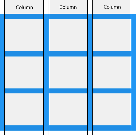
-
网格项目的水平线称为行。
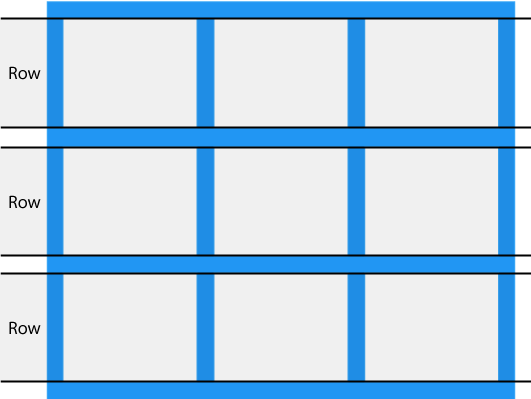
-
每列/行之间的间隔称为gaps。
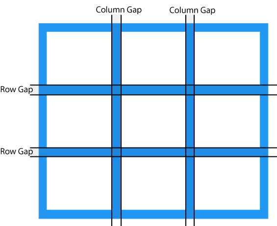
可以通过使用以下属性之一来调整间隙大小:
- grid-column-gap
- grid-row-gap
- grid-gap
grid-column-gap属性设置列之间的间隙:
.grid-container { display: grid; grid-column-gap: 50px; }grid-row-gap属性设置行之间的间隙:
.grid-container { display: grid; grid-row-gap: 50px; }grid-gap属性是grid-column-gap和grid-row-gap属性的简写:
.grid-container { display: grid; grid-gap: 50px 100px; }grid-gap属性也可以用于设置行列间隙,用一个值来设置:
.grid-container { display: grid; grid-gap: 50px; } -
列之间的线称为列线,行之间的线称为行线。
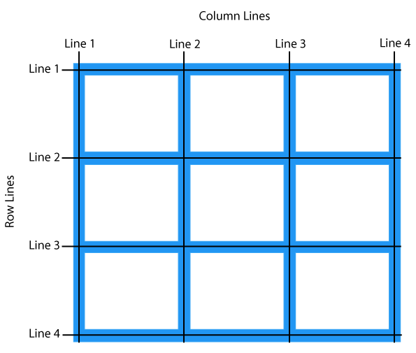
将网格项目放置在网格容器中时,请参考行号。
将网格项放在第1列,并使其在第3列结束:
.item1 { grid-column-start: 1; grid-column-end: 3; }将网格项放置在第1行,并使其在第3行结束:
.item1 { grid-row-start: 1; grid-row-end: 3; }
2)网格容器
-
要使HTML元素充当网格容器,您必须将display属性设置为grid或inline-grid。网格容器由放置在列和行内的网格项目组成。
-
grid-template-columns属性定义网格布局中的列数,并且可以定义每列的宽度。该值是一个以空格分隔的列表,其中每个值定义相应列的长度。如果希望网格布局包含4列,请指定4列的宽度,如果所有列的宽度都应相同,则指定为“auto”。制作一个包含4列的网格:
.grid-container { display: grid; grid-template-columns: auto auto auto auto; }注意📌:如果在4列网格中有4个以上的项目,则网格将自动添加新行以将这些项目放入其中。
grid-template-columns属性还可用于指定列的大小(宽度)。.grid-container { display: grid; grid-template-columns: 80px 200px auto 40px; } -
grid-template-rows属性定义每行的高度。该值是一个以空格分隔的列表,其中每个值定义相应行的高度:
.grid-container { display: grid; grid-template-rows: 80px 200px; } -
justify-content属性用于在容器内对齐整个网格。注意📌:网格的总宽度必须小于容器的宽度,以使justify-content属性生效。
.grid-container { display: grid; justify-content: space-evenly; }.grid-container { display: grid; justify-content: space-around; }.grid-container { display: grid; justify-content: space-between; }.grid-container { display: grid; justify-content: center; }.grid-container { display: grid; justify-content: start; }.grid-container { display: grid; justify-content: end; } -
align-content属性用于 垂直对齐容器内的整个网格。注意📌:网格的总高度必须小于容器的高度,以使align-content属性生效。
.grid-container { display: grid; height: 400px; align-content: center; }.grid-container { display: grid; height: 400px; align-content: space-evenly; }.grid-container { display: grid; height: 400px; align-content: space-around; }.grid-container { display: grid; height: 400px; align-content: space-between; }.grid-container { display: grid; height: 400px; align-content: start; }.grid-container { display: grid; height: 400px; align-content: end; }
4)网格元素
-
网格容器包含网格项目。默认情况下,容器在每一行的每一列都有一个网格项目,但是您可以设置网格项目的样式,以便它们可以跨越多个列和/或行。
-
grid-column属性定义将项目放置在哪一列上,可以定义项目的开始位置以及项目的结束位置。注意📌: grid-column是grid-column-start和grid-column-end属性的简写属性。
如果要放置元素,可以使用行号,或者
span定义跨越多少行。.item1 { grid-column: 1 / 5; }使“ item1”从第1列开始,并跨越3列:
.item1 { grid-column: 1 / span 3; }使“ item2”从第2列开始并跨越3列:
.item2 { grid-column: 2 / span 3; } -
grid-row属性定义将项目放置在哪一行。您可以定义项目的开始位置以及项目的结束位置。注意📌:grid-row是grid-row-start和grid-row-end属性的简写属性。
使“ item1”在第1行开始,在第4行结束:
.item1 { grid-row: 1 / 4; }使“ item1”从第1行开始并跨2行:
.item1 { grid-row: 1 / span 2; } -
grid-area属性可用作grid-row-start,grid-column-start,grid-row-end和grid-column-end属性的简写属性。使“ item8”从第1行和第2列开始,在第5行和第6列结束:
.item8 { grid-area: 1 / 2 / 5 / 6; }使“ item8”从第2行和第1开始,跨越两行和三列:
.item8 { grid-area: 2 / 1 / span 2 / span 3; } -
grid-area属性还可用于为网格项目分配名称。可以通过grid-template-areas网格容器的属性来引用已命名的网格项目。Item1的名称为“ myArea”,并跨越五列网格布局中的所有五列:
.item1 { grid-area: myArea; } .grid-container { grid-template-areas: 'myArea myArea myArea myArea myArea'; }每行都由撇号(’‘)定义
每行中的列均定义在撇号内,并以空格分隔。
注意📌:句点表示没有名称的网格项目。
让“ myArea”跨越五列网格布局中的两列(句号代表没有名称的项目):
.item1 { grid-area: myArea; } .grid-container { grid-template-areas: 'myArea myArea . . .'; }要定义两行,请在另一组撇号内定义第二行的列:
使“ item1”跨越两列和两行:
.grid-container { grid-template-areas: 'myArea myArea . . .' 'myArea myArea . . .'; }命名所有项目,并制作一个随时可用的网页模板:
.item1 { grid-area: header; } .item2 { grid-area: menu; } .item3 { grid-area: main; } .item4 { grid-area: right; } .item5 { grid-area: footer; } .grid-container { grid-template-areas: 'header header header header header header' 'menu main main main right right' 'menu footer footer footer footer footer'; } -
网格布局允许我们将元素放置在我们喜欢的任何位置。
HTML代码中的第一项不必显示为网格中的第一项。
.item1 { grid-area: 1 / 3 / 2 / 4; } .item2 { grid-area: 2 / 3 / 3 / 4; } .item3 { grid-area: 1 / 1 / 2 / 2; } .item4 { grid-area: 1 / 2 / 2 / 3; } .item5 { grid-area: 2 / 1 / 3 / 2; } .item6 { grid-area: 2 / 2 / 3 / 3; }可以使用媒体查询来重新排列某些屏幕尺寸的顺序:
@media only screen and (max-width: 500px) { .item1 { grid-area: 1 / span 3 / 2 / 4; } .item2 { grid-area: 3 / 3 / 4 / 4; } .item3 { grid-area: 2 / 1 / 3 / 2; } .item4 { grid-area: 2 / 2 / span 2 / 3; } .item5 { grid-area: 3 / 1 / 4 / 2; } .item6 { grid-area: 2 / 3 / 3 / 4; } }
🎉经历了一段漫长的时光,终于看完CSS啦!接下来就可以准备看最重要的JavaScript啦~冲鸭!